FabCon is coming to Atlanta
Join us at FabCon Atlanta from March 16 - 20, 2026, for the ultimate Fabric, Power BI, AI and SQL community-led event. Save $200 with code FABCOMM.
Register now!- Power BI forums
- Get Help with Power BI
- Desktop
- Service
- Report Server
- Power Query
- Mobile Apps
- Developer
- DAX Commands and Tips
- Custom Visuals Development Discussion
- Health and Life Sciences
- Power BI Spanish forums
- Translated Spanish Desktop
- Training and Consulting
- Instructor Led Training
- Dashboard in a Day for Women, by Women
- Galleries
- Data Stories Gallery
- Themes Gallery
- Contests Gallery
- QuickViz Gallery
- Quick Measures Gallery
- Visual Calculations Gallery
- Notebook Gallery
- Translytical Task Flow Gallery
- TMDL Gallery
- R Script Showcase
- Webinars and Video Gallery
- Ideas
- Custom Visuals Ideas (read-only)
- Issues
- Issues
- Events
- Upcoming Events
The Power BI Data Visualization World Championships is back! Get ahead of the game and start preparing now! Learn more
- Power BI forums
- Forums
- Get Help with Power BI
- Desktop
- Re: Scatter Chart - X and Y text value axis, Z num...
- Subscribe to RSS Feed
- Mark Topic as New
- Mark Topic as Read
- Float this Topic for Current User
- Bookmark
- Subscribe
- Printer Friendly Page
- Mark as New
- Bookmark
- Subscribe
- Mute
- Subscribe to RSS Feed
- Permalink
- Report Inappropriate Content
Scatter Chart - X and Y text value axis, Z numeric axis
Hi everyone,
I want to make a scatter chart having for X-axis text values and for Y-axis text values too. Of course, I need a numerical value which would be on the size (Z-axis).
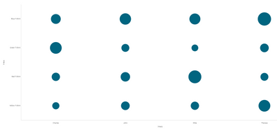
In order to illustrate what I'm looking for, I put you some screenshots of what I would like to achieve:
Fictious Sample
Target result
What I wish to do is realizable on Qlik. It is called Grid Chart. (screenshot of the Target Result above)
Is it possible to do it on Power BI?
I haven't found any way to do it until now. Do you have any ideas/solutions for me?
Thank you for your help,
Freaz
Solved! Go to Solution.
- Mark as New
- Bookmark
- Subscribe
- Mute
- Subscribe to RSS Feed
- Permalink
- Report Inappropriate Content
Hi @Anonymous ,
On the scatter plot relates to variable so when you have an increase in the value of one you can check the other one variation.
Using the standard value on PBI what you can do is the following:
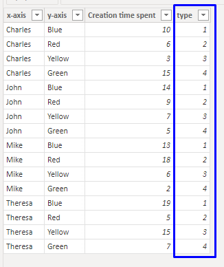
- Add an ID column for each colour of t-shirt
- Now create your Scatter plot with the following settings:
- X-axis - X-axis column - no summarization
- Y-Axis - Type column
- Legend - Y-axis column
- Size - Creation time column
- Y-axis max - 5
- Y-axis min - 0
- X-axis - X-axis column - no summarization
Result is below:
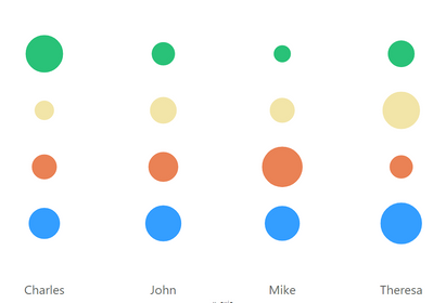
Now what you can do is to force the colour on each of value and turn off the y-axis and the legend final result like this:
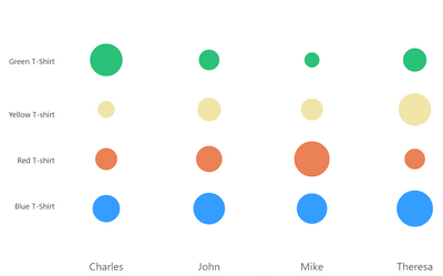
If you want to have the values on each of the rows you can add a text field in front of each one with the text and doing a group of the visualizations will seem like a single visual:
Regards
Miguel Félix
Did I answer your question? Mark my post as a solution!
Proud to be a Super User!
Check out my blog: Power BI em Português- Mark as New
- Bookmark
- Subscribe
- Mute
- Subscribe to RSS Feed
- Permalink
- Report Inappropriate Content
Hi @Anonymous ,
On the Index column select the summarization of sum:
The size of the bubles should be the sum of the Creation Time Spent.
Regarding the data labels there is not that option on the scatter plot.
Regards
Miguel Félix
Did I answer your question? Mark my post as a solution!
Proud to be a Super User!
Check out my blog: Power BI em Português- Mark as New
- Bookmark
- Subscribe
- Mute
- Subscribe to RSS Feed
- Permalink
- Report Inappropriate Content
Hi @Anonymous ,
On the scatter plot relates to variable so when you have an increase in the value of one you can check the other one variation.
Using the standard value on PBI what you can do is the following:
- Add an ID column for each colour of t-shirt
- Now create your Scatter plot with the following settings:
- X-axis - X-axis column - no summarization
- Y-Axis - Type column
- Legend - Y-axis column
- Size - Creation time column
- Y-axis max - 5
- Y-axis min - 0
- X-axis - X-axis column - no summarization
Result is below:
Now what you can do is to force the colour on each of value and turn off the y-axis and the legend final result like this:
If you want to have the values on each of the rows you can add a text field in front of each one with the text and doing a group of the visualizations will seem like a single visual:
Regards
Miguel Félix
Did I answer your question? Mark my post as a solution!
Proud to be a Super User!
Check out my blog: Power BI em Português- Mark as New
- Bookmark
- Subscribe
- Mute
- Subscribe to RSS Feed
- Permalink
- Report Inappropriate Content
Hi @MFelix ,
Thanks a lot for your answer. I tried your solution but it returns me the following error :
Have I done something wrong?
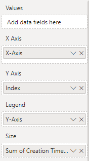
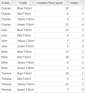
Here's what I put in the chart's fields and the updated table with an index column :
I also have another question, how to display the size value within the dots?
Have a nice day.
Freaz
- Mark as New
- Bookmark
- Subscribe
- Mute
- Subscribe to RSS Feed
- Permalink
- Report Inappropriate Content
Hi @Anonymous ,
On the Index column select the summarization of sum:
The size of the bubles should be the sum of the Creation Time Spent.
Regarding the data labels there is not that option on the scatter plot.
Regards
Miguel Félix
Did I answer your question? Mark my post as a solution!
Proud to be a Super User!
Check out my blog: Power BI em Português- Mark as New
- Bookmark
- Subscribe
- Mute
- Subscribe to RSS Feed
- Permalink
- Report Inappropriate Content
Helpful resources

Power BI Dataviz World Championships
The Power BI Data Visualization World Championships is back! Get ahead of the game and start preparing now!

Power BI Monthly Update - November 2025
Check out the November 2025 Power BI update to learn about new features.

| User | Count |
|---|---|
| 59 | |
| 43 | |
| 42 | |
| 23 | |
| 17 |
| User | Count |
|---|---|
| 190 | |
| 122 | |
| 96 | |
| 66 | |
| 47 |

