FabCon is coming to Atlanta
Join us at FabCon Atlanta from March 16 - 20, 2026, for the ultimate Fabric, Power BI, AI and SQL community-led event. Save $200 with code FABCOMM.
Register now!- Power BI forums
- Get Help with Power BI
- Desktop
- Service
- Report Server
- Power Query
- Mobile Apps
- Developer
- DAX Commands and Tips
- Custom Visuals Development Discussion
- Health and Life Sciences
- Power BI Spanish forums
- Translated Spanish Desktop
- Training and Consulting
- Instructor Led Training
- Dashboard in a Day for Women, by Women
- Galleries
- Data Stories Gallery
- Themes Gallery
- Contests Gallery
- QuickViz Gallery
- Quick Measures Gallery
- Visual Calculations Gallery
- Notebook Gallery
- Translytical Task Flow Gallery
- TMDL Gallery
- R Script Showcase
- Webinars and Video Gallery
- Ideas
- Custom Visuals Ideas (read-only)
- Issues
- Issues
- Events
- Upcoming Events
The Power BI Data Visualization World Championships is back! Get ahead of the game and start preparing now! Learn more
- Power BI forums
- Forums
- Get Help with Power BI
- Desktop
- Re: Scatter Chart Problems
- Subscribe to RSS Feed
- Mark Topic as New
- Mark Topic as Read
- Float this Topic for Current User
- Bookmark
- Subscribe
- Printer Friendly Page
- Mark as New
- Bookmark
- Subscribe
- Mute
- Subscribe to RSS Feed
- Permalink
- Report Inappropriate Content
Scatter Chart Problems
Hello,
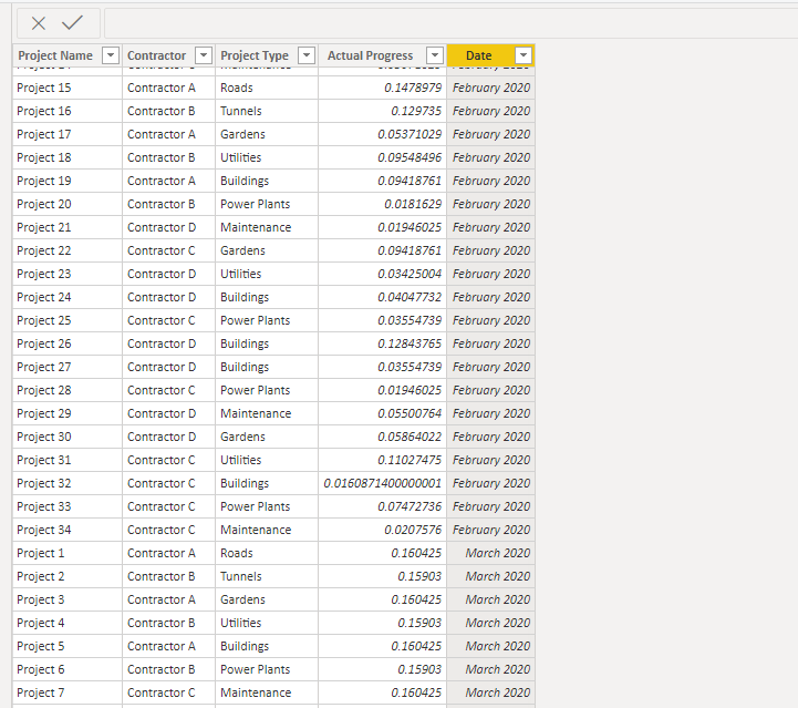
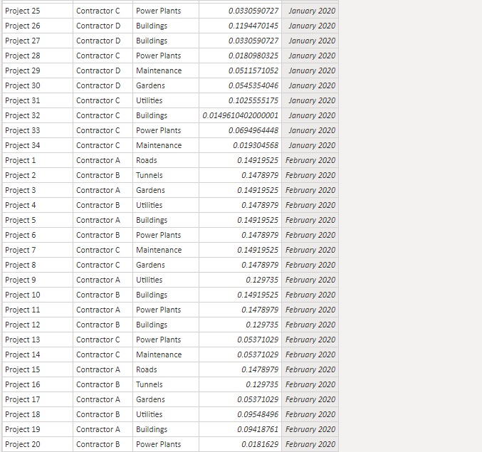
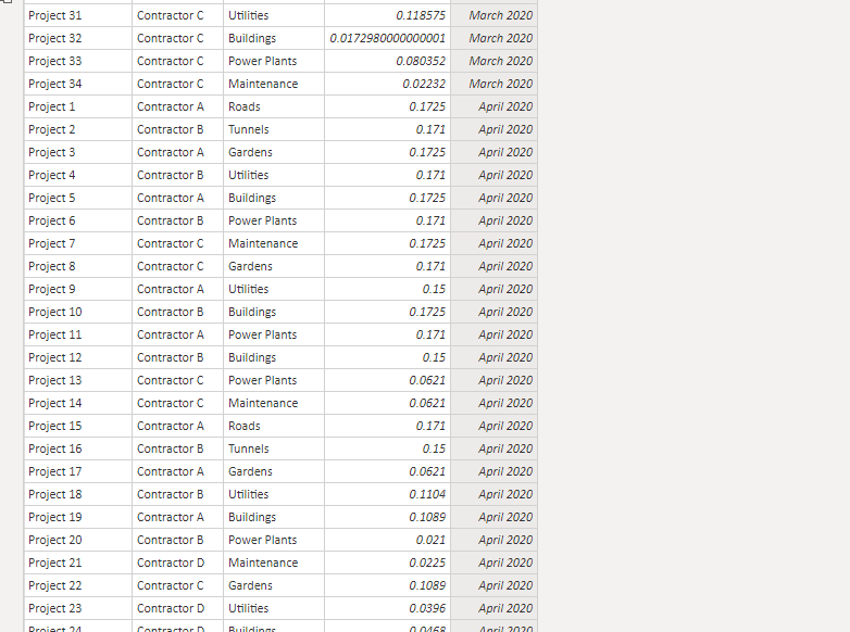
I have a data for a contractor, project,, Project type, actual progress and date
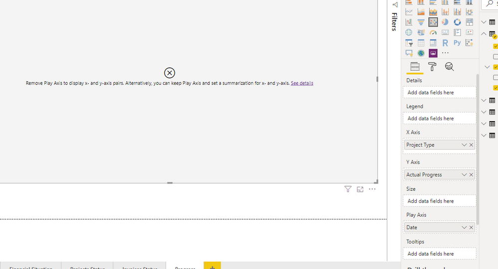
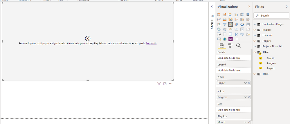
The date I have for four months Jan, Feb, March, April then I have actual progress percentage for each project and next to it the contarctor. I want to create a scatter chart which I can play the months and in the x axis will show the projects names, and the y axis shows the progress to play how much progress the contractors are doing over time. When I try to build the chart I get the followin
- Mark as New
- Bookmark
- Subscribe
- Mute
- Subscribe to RSS Feed
- Permalink
- Report Inappropriate Content
The problemthat I am experiencing is that on my powerbi desktop, the details facility does not exist.Can anyone help me?
- Mark as New
- Bookmark
- Subscribe
- Mute
- Subscribe to RSS Feed
- Permalink
- Report Inappropriate Content
The X and Y values need to be numeric in a scatterplot.
Hope it helps.
Kind regards Steve
Proud to be a Super User!
Awesome Keyboard Shortcusts in Power BI, thumbs up if you like the article
My Community Blog Articles (check them out!)
My Blog - Power M code to automatically detect column types -
How to create test data using DAX!
- Mark as New
- Bookmark
- Subscribe
- Mute
- Subscribe to RSS Feed
- Permalink
- Report Inappropriate Content
- Mark as New
- Bookmark
- Subscribe
- Mute
- Subscribe to RSS Feed
- Permalink
- Report Inappropriate Content
Hi,
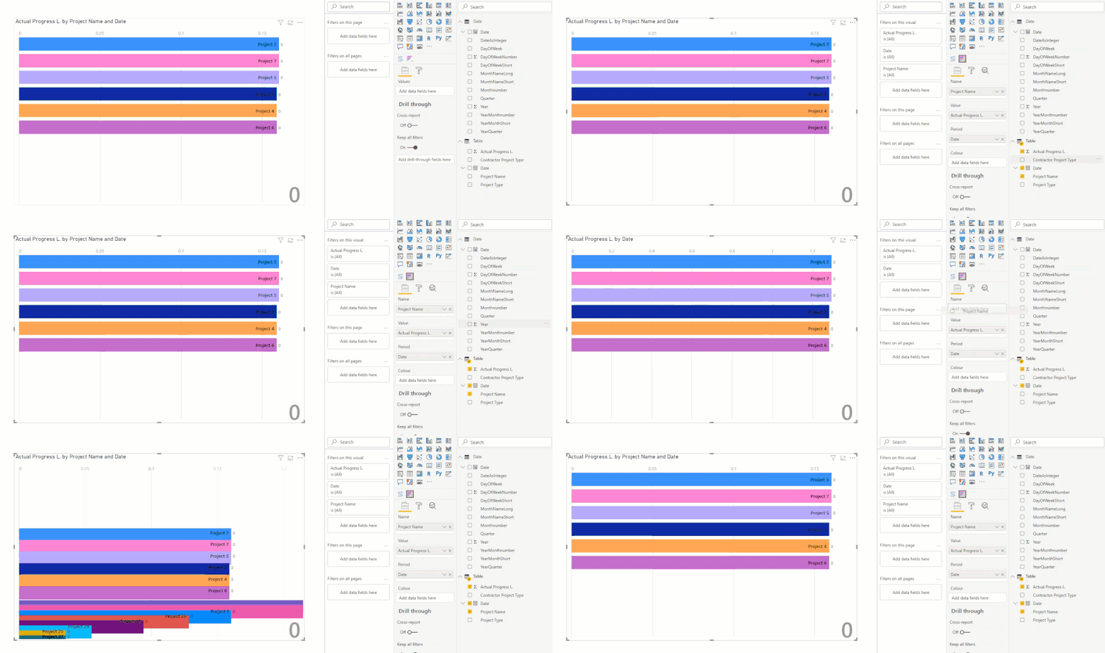
Since the scatterplot any accepts 2 numeric values, one for the x-axis and one for the y-axis. You are probably looking for a different (custom) chart like, 'Animated Bar chart race', which animates bar charts. As seen below:
Power BI file
Hope it helps. Pls mark as solution if so, thumbs up for the effort appreciated.
Kind regards, Steve.
Proud to be a Super User!
Awesome Keyboard Shortcusts in Power BI, thumbs up if you like the article
My Community Blog Articles (check them out!)
My Blog - Power M code to automatically detect column types -
How to create test data using DAX!
- Mark as New
- Bookmark
- Subscribe
- Mute
- Subscribe to RSS Feed
- Permalink
- Report Inappropriate Content
I wanted something like the video attached but instead of total sales it will show the projects name and instead of sales units it will show the progress ...
- Mark as New
- Bookmark
- Subscribe
- Mute
- Subscribe to RSS Feed
- Permalink
- Report Inappropriate Content
In that case you need to create an artificial x-value:
Then you can play the results for the y-value, colour by project name.
Link to Power BI file here.
Please mark as solution if this helps you. Thumbs up for the effort are appreciated.
Kind regards, Steve.
Proud to be a Super User!
Awesome Keyboard Shortcusts in Power BI, thumbs up if you like the article
My Community Blog Articles (check them out!)
My Blog - Power M code to automatically detect column types -
How to create test data using DAX!
- Mark as New
- Bookmark
- Subscribe
- Mute
- Subscribe to RSS Feed
- Permalink
- Report Inappropriate Content
Please let us know if this works for you.
Proud to be a Super User!
Awesome Keyboard Shortcusts in Power BI, thumbs up if you like the article
My Community Blog Articles (check them out!)
My Blog - Power M code to automatically detect column types -
How to create test data using DAX!
- Mark as New
- Bookmark
- Subscribe
- Mute
- Subscribe to RSS Feed
- Permalink
- Report Inappropriate Content
- Mark as New
- Bookmark
- Subscribe
- Mute
- Subscribe to RSS Feed
- Permalink
- Report Inappropriate Content
Too bad, I see month is a text value and not a number btw.
Proud to be a Super User!
Awesome Keyboard Shortcusts in Power BI, thumbs up if you like the article
My Community Blog Articles (check them out!)
My Blog - Power M code to automatically detect column types -
How to create test data using DAX!
- Mark as New
- Bookmark
- Subscribe
- Mute
- Subscribe to RSS Feed
- Permalink
- Report Inappropriate Content
The date column is a text field? These cannot be played. Can you make it a date or a number?
Proud to be a Super User!
Awesome Keyboard Shortcusts in Power BI, thumbs up if you like the article
My Community Blog Articles (check them out!)
My Blog - Power M code to automatically detect column types -
How to create test data using DAX!
- Mark as New
- Bookmark
- Subscribe
- Mute
- Subscribe to RSS Feed
- Permalink
- Report Inappropriate Content
@stevedep it is date
You can experiment your self if you make a simple table with three columns, project name, date, progress and just try it for two months it wont even work
I just need to play the progress of each project by month
- Mark as New
- Bookmark
- Subscribe
- Mute
- Subscribe to RSS Feed
- Permalink
- Report Inappropriate Content
Hi @Anonymous ,
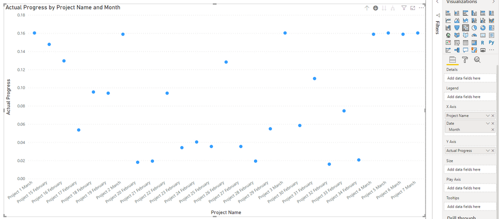
Try to show like this:
Best Regards,
Yingjie Li
If this post helps then please consider Accept it as the solution to help the other members find it more quickly.
- Mark as New
- Bookmark
- Subscribe
- Mute
- Subscribe to RSS Feed
- Permalink
- Report Inappropriate Content
Thank you for your replay. If I want to show it the same way as you suggested then I will lose the biggest benefit of the scatter chart which is showing the progress changes over time through the play axis.
The three axises that I need are:
The project name x axis
The progress percentage on Y axis
The month on the play axis.
Helpful resources

Power BI Dataviz World Championships
The Power BI Data Visualization World Championships is back! Get ahead of the game and start preparing now!

| User | Count |
|---|---|
| 40 | |
| 35 | |
| 34 | |
| 31 | |
| 28 |
| User | Count |
|---|---|
| 136 | |
| 102 | |
| 68 | |
| 66 | |
| 58 |
