Get certified for free when you join Fabric Data Days 2026 and dive into Fabric, Power BI, SQL, AI, and other essential data skills.
Join nowJuly 28 - August 9 | Final Round of the Power BI Dataviz World Championships. This is your chance. Learn more
| Name | Date | Value |
| MaTMP | 1/1/2022 8:00 PM | 50.04 |
| MaTMP | 1/1/2022 7:45PM | 50.06 |
| MaTMP | 1/1/2022 7:30 PM | 50.6 |
| OaTMP | 1/1/2022 8:00 PM | 33.49 |
| OaTMP | 1/1/2022 7:45PM | 34.10 |
| OaTMP | 1/1/2022 7:30 PM | 33.80 |
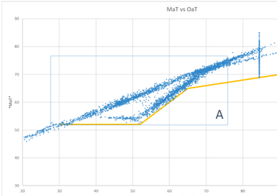
Here is sample data that i am using to create a Scatter Graph. I am tring to have the MaTMP and OaTMP on the 2 axis and doing it by the date/time. I have created 2 measure for these two points
I dont want to use the legend since there is 96 rows per day and i needing to trend this over a full year. Below is what i am trying to recreate. Any help would be appreciated.
Solved! Go to Solution.
@Anonymous Create 2 columns:
If you love stickers, then you will definitely want to check out our community sticker challenge, Barcelona edition!
Check out the July 2026 Power BI update to learn about new features.
| User | Count |
|---|---|
| 29 | |
| 28 | |
| 20 | |
| 20 | |
| 19 |
| User | Count |
|---|---|
| 35 | |
| 26 | |
| 20 | |
| 18 | |
| 17 |