- Power BI forums
- Updates
- News & Announcements
- Get Help with Power BI
- Desktop
- Service
- Report Server
- Power Query
- Mobile Apps
- Developer
- DAX Commands and Tips
- Custom Visuals Development Discussion
- Health and Life Sciences
- Power BI Spanish forums
- Translated Spanish Desktop
- Power Platform Integration - Better Together!
- Power Platform Integrations (Read-only)
- Power Platform and Dynamics 365 Integrations (Read-only)
- Training and Consulting
- Instructor Led Training
- Dashboard in a Day for Women, by Women
- Galleries
- Community Connections & How-To Videos
- COVID-19 Data Stories Gallery
- Themes Gallery
- Data Stories Gallery
- R Script Showcase
- Webinars and Video Gallery
- Quick Measures Gallery
- 2021 MSBizAppsSummit Gallery
- 2020 MSBizAppsSummit Gallery
- 2019 MSBizAppsSummit Gallery
- Events
- Ideas
- Custom Visuals Ideas
- Issues
- Issues
- Events
- Upcoming Events
- Community Blog
- Power BI Community Blog
- Custom Visuals Community Blog
- Community Support
- Community Accounts & Registration
- Using the Community
- Community Feedback
Register now to learn Fabric in free live sessions led by the best Microsoft experts. From Apr 16 to May 9, in English and Spanish.
- Power BI forums
- Forums
- Get Help with Power BI
- Desktop
- Re: Sankey Diagram - Link Tooltip to show the weig...
- Subscribe to RSS Feed
- Mark Topic as New
- Mark Topic as Read
- Float this Topic for Current User
- Bookmark
- Subscribe
- Printer Friendly Page
- Mark as New
- Bookmark
- Subscribe
- Mute
- Subscribe to RSS Feed
- Permalink
- Report Inappropriate Content
Sankey Diagram - Link Tooltip to show the weight with commas (thousand separated)
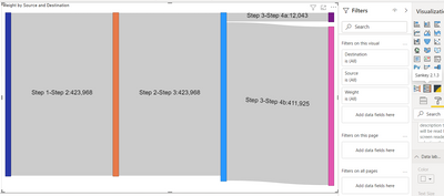
For my current assignment, I'm using Sankey diagram in Power BI reports to show the volume flow. Sankey diagram is working good. On hover of the individual nodes, data labels units can be controlled but the toolip on hovering over the links, it shows the actual numbers with commas (thousand separator) even after changing the format of the measure. Since the volume flowing between steps are in millions. It is very hard to read the actual numbers without comma separator. Can someone help me to add the comma separator to values into sankey diagram ?
Many Thanks in Adavance.
Solved! Go to Solution.
- Mark as New
- Bookmark
- Subscribe
- Mute
- Subscribe to RSS Feed
- Permalink
- Report Inappropriate Content
It works - somewhat - with Sankey 2.1.3
I would recommend you study the visual code and make your own adjustments as needed.
- Mark as New
- Bookmark
- Subscribe
- Mute
- Subscribe to RSS Feed
- Permalink
- Report Inappropriate Content
Hi Ibendlin,
I'm using this Sankey chart - https://appsource.microsoft.com/en-us/product/power-bi-visuals/WA104380777
Please find the sample data that is being used for my use case. Date and slicers will be used to filter the sankey diagram.
| Date | Slicer 1 | Slicer 2 | Slicer 3 | Source | Destination | Weight |
| 1/2/2021 | M | B | U | Step 1 | Step 2 | 21,403 |
| 1/2/2021 | M | C | U | Step 1 | Step 2 | 402,565 |
| 1/2/2021 | M | B | U | Step 2 | Step 3 | 21,403 |
| 1/2/2021 | M | C | U | Step 2 | Step 3 | 402,565 |
| 1/2/2021 | M | C | U | Step 3 | Step 4a | 11,144 |
| 1/2/2021 | M | B | U | Step 3 | Step 4a | 899 |
| 1/2/2021 | M | C | U | Step 3 | Step 4b | 391,421 |
| 1/2/2021 | M | B | U | Step 3 | Step 4b | 20,504 |
v-henryk-mstf,
I cannot use customized column on turning the actual values to Millions because the data is summarized at multiple levels and it can be filtered by date slicers & other slicers so the value becomes dynamic from Millions to thousands to hundreds. On top, end users would like to see the actual values rather the converted ones.
Any help is greatly appreciated.
Thanks,
Soms
- Mark as New
- Bookmark
- Subscribe
- Mute
- Subscribe to RSS Feed
- Permalink
- Report Inappropriate Content
It works - somewhat - with Sankey 2.1.3
I would recommend you study the visual code and make your own adjustments as needed.
- Mark as New
- Bookmark
- Subscribe
- Mute
- Subscribe to RSS Feed
- Permalink
- Report Inappropriate Content
Hi @Anonymous ,
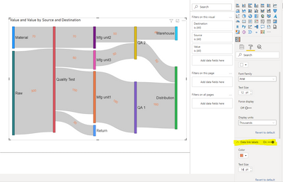
According to my test, for Sankey visual, the data displayed on the "Data link label" cannot be changed, and the unit displayed is the same as the unit of the corresponding field of the original data model.

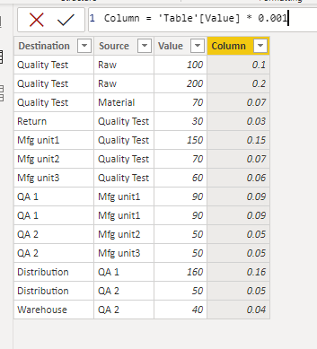
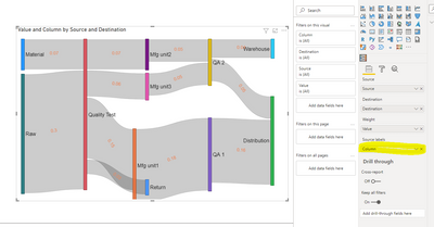
But you can try to customize a column, set its unit format, and then add it to the "Source label", or be able to display the results you want.
If the problem is still not resolved, please provide detailed error information and let me know immediately. Looking forward to your reply.
Best Regards,
Henry
If this post helps, then please consider Accept it as the solution to help the other members find it more quickly.
- Mark as New
- Bookmark
- Subscribe
- Mute
- Subscribe to RSS Feed
- Permalink
- Report Inappropriate Content
Which Sankey visual are you using? Please provide sample data in usable format (not as a picture - maybe insert into a table?) and show the expected outcome.
Helpful resources

Microsoft Fabric Learn Together
Covering the world! 9:00-10:30 AM Sydney, 4:00-5:30 PM CET (Paris/Berlin), 7:00-8:30 PM Mexico City

Power BI Monthly Update - April 2024
Check out the April 2024 Power BI update to learn about new features.

| User | Count |
|---|---|
| 107 | |
| 105 | |
| 79 | |
| 71 | |
| 66 |
| User | Count |
|---|---|
| 141 | |
| 107 | |
| 100 | |
| 82 | |
| 74 |


