Join the #PBI10 DataViz contest
Power BI is turning 10, and we’re marking the occasion with a special community challenge. Use your creativity to tell a story, uncover trends, or highlight something unexpected.
Get started- Power BI forums
- Get Help with Power BI
- Desktop
- Service
- Report Server
- Power Query
- Mobile Apps
- Developer
- DAX Commands and Tips
- Custom Visuals Development Discussion
- Health and Life Sciences
- Power BI Spanish forums
- Translated Spanish Desktop
- Training and Consulting
- Instructor Led Training
- Dashboard in a Day for Women, by Women
- Galleries
- Webinars and Video Gallery
- Data Stories Gallery
- Themes Gallery
- Contests Gallery
- Quick Measures Gallery
- Notebook Gallery
- Translytical Task Flow Gallery
- R Script Showcase
- Ideas
- Custom Visuals Ideas (read-only)
- Issues
- Issues
- Events
- Upcoming Events
Join us for an expert-led overview of the tools and concepts you'll need to become a Certified Power BI Data Analyst and pass exam PL-300. Register now.
- Power BI forums
- Forums
- Get Help with Power BI
- Desktop
- Salary expenses with Time intervals
- Subscribe to RSS Feed
- Mark Topic as New
- Mark Topic as Read
- Float this Topic for Current User
- Bookmark
- Subscribe
- Printer Friendly Page
- Mark as New
- Bookmark
- Subscribe
- Mute
- Subscribe to RSS Feed
- Permalink
- Report Inappropriate Content
Salary expenses with Time intervals
Hello,
I would like to know if you can help me. I need to know my monthly salaries expenses in the last 10 years and the evolution of the average salary in my company.
In my database, each employee has several lines with the registration of the various salaries they have received over time.
Employee | Start | End | Salary |
1 | 01/01/2005 | 31/12/2005 | 1 900,00 € |
1 | 01/01/2006 | 31/12/2006 | 1 950,00 € |
1 | 01/01/2007 | 31/12/2007 | 2 000,00 € |
1 | 01/01/2008 | 31/12/2015 | 2 050,00 € |
1 | 01/01/2016 | 31/12/9999 | 2 100,00 € |
2 | 01/01/2014 | 31/12/2015 | 5 250,00 € |
2 | 01/02/2010 | 31/12/2013 | 2 000,00 € |
2 | 01/01/2016 | 31/12/9999 | 5 250,00 € |
3 | 01/10/2008 | 31/12/2009 | 950,00 € |
3 | 01/01/2010 | 31/03/2010 | 1 000,00 € |
3 | 01/04/2010 | 30/09/2010 | 1 200,00 € |
3 | 01/10/2010 | 31/07/2011 | 1 390,00 € |
3 | 01/03/2014 | 30/04/2015 | 2 680,00 € |
3 | 01/08/2011 | 28/02/2014 | 2 600,00 € |
3 | 01/05/2015 | 31/12/2015 | 4 000,00 € |
3 | 01/01/2016 | 31/12/9999 | 4 500,00 € |
Solved! Go to Solution.
- Mark as New
- Bookmark
- Subscribe
- Mute
- Subscribe to RSS Feed
- Permalink
- Report Inappropriate Content
Hi @aempa,
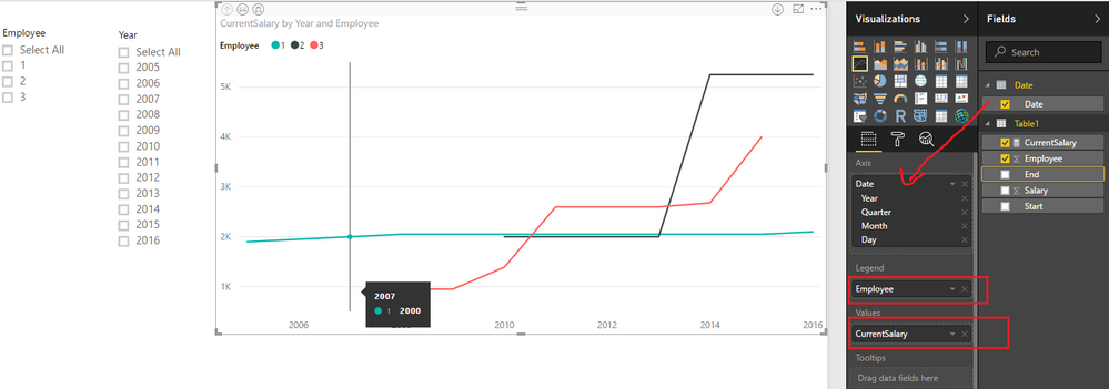
According to your description, you should be able to follow steps below to show the monthly salaries expenses and get the evolution on the Line Chart visual.
1. Add an individual Calendar table if you don't have one yet.
Date = CALENDARAUTO()
2. Use the formula below to create a measure, and show the measure on the Line visual with Date[Date] column as Axis, Employee column as Legend.
CurrentSalary =
VAR currentDate =
    MAX ( 'Date'[Date] )
RETURN
    CALCULATE (
        MAX ( Table1[Salary] ),
        FILTER ( Table1, Table1[Start] <= currentDate && Table1[End] >= currentDate )
    )
Here is the sample pbix file for your reference. ![]()
Regards
- Mark as New
- Bookmark
- Subscribe
- Mute
- Subscribe to RSS Feed
- Permalink
- Report Inappropriate Content
Thank you,
This is the perfect solucion.
- Mark as New
- Bookmark
- Subscribe
- Mute
- Subscribe to RSS Feed
- Permalink
- Report Inappropriate Content
This article might help you: http://www.sqlbi.com/articles/analyzing-events-with-a-duration-in-dax/
Imke Feldmann (The BIccountant)
If you liked my solution, please give it a thumbs up. And if I did answer your question, please mark this post as a solution. Thanks!
How to integrate M-code into your solution -- How to get your questions answered quickly -- How to provide sample data -- Check out more PBI- learning resources here -- Performance Tipps for M-queries
Helpful resources

Join our Fabric User Panel
This is your chance to engage directly with the engineering team behind Fabric and Power BI. Share your experiences and shape the future.

Power BI Monthly Update - June 2025
Check out the June 2025 Power BI update to learn about new features.

| User | Count |
|---|---|
| 81 | |
| 80 | |
| 59 | |
| 35 | |
| 34 |
| User | Count |
|---|---|
| 100 | |
| 62 | |
| 56 | |
| 47 | |
| 41 |

