Join us at FabCon Vienna from September 15-18, 2025
The ultimate Fabric, Power BI, SQL, and AI community-led learning event. Save €200 with code FABCOMM.
Get registered- Power BI forums
- Get Help with Power BI
- Desktop
- Service
- Report Server
- Power Query
- Mobile Apps
- Developer
- DAX Commands and Tips
- Custom Visuals Development Discussion
- Health and Life Sciences
- Power BI Spanish forums
- Translated Spanish Desktop
- Training and Consulting
- Instructor Led Training
- Dashboard in a Day for Women, by Women
- Galleries
- Data Stories Gallery
- Themes Gallery
- Contests Gallery
- Quick Measures Gallery
- Notebook Gallery
- Translytical Task Flow Gallery
- TMDL Gallery
- R Script Showcase
- Webinars and Video Gallery
- Ideas
- Custom Visuals Ideas (read-only)
- Issues
- Issues
- Events
- Upcoming Events
Compete to become Power BI Data Viz World Champion! First round ends August 18th. Get started.
- Power BI forums
- Forums
- Get Help with Power BI
- Desktop
- Re: SWITCH or VAR Function for multi-data types in...
- Subscribe to RSS Feed
- Mark Topic as New
- Mark Topic as Read
- Float this Topic for Current User
- Bookmark
- Subscribe
- Printer Friendly Page
- Mark as New
- Bookmark
- Subscribe
- Mute
- Subscribe to RSS Feed
- Permalink
- Report Inappropriate Content
SWITCH or VAR Function for multi-data types in single table for rows and columns?
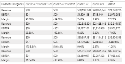
Hey there - I have a data table where I need to consolidate multiple data types, both whole numbers in large dollar amounts and also percents all on the same row and/or column. The data type is set to decimal, and I'm using some switch logic to change the data type based on the measure category i created. E.g, Revenue = $, Margin = %, but I also need the Revenue measure to switch to percent if it's associated with a specific category...as you can see below the two categories are 20205+7 vs. 20203+9 and 20205+7 vs. 2019A.
E.g., the R, E and M categories are measures in a switch function based on a data table that has field headers which look like this:
region, subregion, financial category, financial type, scenario, amount
So, i spread out the financial types as columns and then created a switch measure based on other created measures for revenue, ebitda and the margin, which almost works, except i still need additional logic in my revenue measure so that it knows to switch to percent if a revenue amount is associated with a specific type of financial category so it's displayed as a percent and not a dollar total as in the table below.
Any ideas or helpful guidance would be appreciated!
Solved! Go to Solution.
- Mark as New
- Bookmark
- Subscribe
- Mute
- Subscribe to RSS Feed
- Permalink
- Report Inappropriate Content
Hey thanks, I actually figured it out on my own after some trial and error....I'll explain @Icey . Your proposed solution was close, but I had essentially already done the exact same thing before I post, but it doesn't consider different data formats for Revenue or EBITDA by Financial Type, i.e., $ and % on the same row as well as the same column.
But here's the fix:
Initially, I had created simple, calculated measures for Revenue, EBITDA and Margin %. Then I created aliases or Data Formatted Measures using each of those three original measures for every Financial Type Sort Order ID that represented all of the Financial Types (15 in total): Revenue Formatted, EBITDA Formatted and Margin Formatted. So, basically, the alias would change the data format to % or $ of the original measure based on the Financial Type's Sort Order ID, i.e 1 = $, 2 = %, 3 = $, et al..
E.g.,
Then, I used another SWITCH(VALUES)/FORMAT function to combine/consolidate all three Formatted Measures into one single Measure I used as the "Value" in my table matrix, and it worked perfectly, but I'm sure there's a cleaner way to accomplish all of this.
I did the following:
I dropped the 'Switch Measure' into the Values of the Matrix table and boom, it worked flawlessly...here's a screen grab of what it looks like now:
Again, for a static, monthly dashboard with minimal, simple applied slicers, this works, I just don't know how sustainable it is for more complex or ambitious BI dev work.
Any advice or critiques would be appreciated!
- Mark as New
- Bookmark
- Subscribe
- Mute
- Subscribe to RSS Feed
- Permalink
- Report Inappropriate Content
Hi @williamadams12 ,
My understanding is that you want to show different data type in the same column. If my understanding is correct, please continue to look on, if my understanding is wrong, please let me know and provide the relevant sample data, preferably in the form of a screenshot or chart.
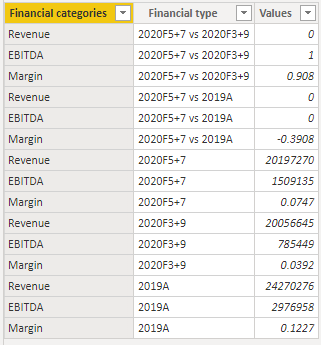
1. My sample data is as below.
2. You can write your measure like so.
Revenue =
SWITCH (
    MAX ( 'Table'[Financial categories] ),
    "Revenue", FORMAT ( MAX ( 'Table'[Values] ), "$00" ),
    "EBITDA", FORMAT ( MAX ( 'Table'[Values] ), "$00" ),
    "Margin", FORMAT ( MAX ( 'Table'[Values] ), "0.00%" )
)
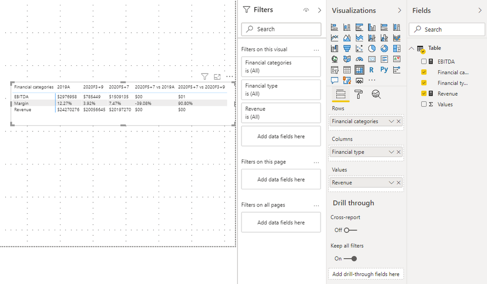
3. Put the measure into matrix.
You can check more details from here.
Best Regards,
Icey
If this post helps, then please consider Accept it as the solution to help the other members find it more quickly.
- Mark as New
- Bookmark
- Subscribe
- Mute
- Subscribe to RSS Feed
- Permalink
- Report Inappropriate Content
Hey thanks, I actually figured it out on my own after some trial and error....I'll explain @Icey . Your proposed solution was close, but I had essentially already done the exact same thing before I post, but it doesn't consider different data formats for Revenue or EBITDA by Financial Type, i.e., $ and % on the same row as well as the same column.
But here's the fix:
Initially, I had created simple, calculated measures for Revenue, EBITDA and Margin %. Then I created aliases or Data Formatted Measures using each of those three original measures for every Financial Type Sort Order ID that represented all of the Financial Types (15 in total): Revenue Formatted, EBITDA Formatted and Margin Formatted. So, basically, the alias would change the data format to % or $ of the original measure based on the Financial Type's Sort Order ID, i.e 1 = $, 2 = %, 3 = $, et al..
E.g.,
Then, I used another SWITCH(VALUES)/FORMAT function to combine/consolidate all three Formatted Measures into one single Measure I used as the "Value" in my table matrix, and it worked perfectly, but I'm sure there's a cleaner way to accomplish all of this.
I did the following:
I dropped the 'Switch Measure' into the Values of the Matrix table and boom, it worked flawlessly...here's a screen grab of what it looks like now:
Again, for a static, monthly dashboard with minimal, simple applied slicers, this works, I just don't know how sustainable it is for more complex or ambitious BI dev work.
Any advice or critiques would be appreciated!
- Mark as New
- Bookmark
- Subscribe
- Mute
- Subscribe to RSS Feed
- Permalink
- Report Inappropriate Content
@williamadams12 , Not very clear to me.
One is:- show on row In Matrix -
https://www.burningsuit.co.uk/blog/2019/04/7-secrets-of-the-matrix-visual/
the second same measure has a different format
This one is for a different purpose, but it can help
https://www.youtube.com/watch?v=vlnx7QUVYME
- Mark as New
- Bookmark
- Subscribe
- Mute
- Subscribe to RSS Feed
- Permalink
- Report Inappropriate Content
in your matrix visual put all the individual measures into the Values sink and then in the visual settings choose "Show on rows".


