FabCon is coming to Atlanta
Join us at FabCon Atlanta from March 16 - 20, 2026, for the ultimate Fabric, Power BI, AI and SQL community-led event. Save $200 with code FABCOMM.
Register now!- Power BI forums
- Get Help with Power BI
- Desktop
- Service
- Report Server
- Power Query
- Mobile Apps
- Developer
- DAX Commands and Tips
- Custom Visuals Development Discussion
- Health and Life Sciences
- Power BI Spanish forums
- Translated Spanish Desktop
- Training and Consulting
- Instructor Led Training
- Dashboard in a Day for Women, by Women
- Galleries
- Data Stories Gallery
- Themes Gallery
- Contests Gallery
- QuickViz Gallery
- Quick Measures Gallery
- Visual Calculations Gallery
- Notebook Gallery
- Translytical Task Flow Gallery
- TMDL Gallery
- R Script Showcase
- Webinars and Video Gallery
- Ideas
- Custom Visuals Ideas (read-only)
- Issues
- Issues
- Events
- Upcoming Events
Vote for your favorite vizzies from the Power BI Dataviz World Championship submissions. Vote now!
- Power BI forums
- Forums
- Get Help with Power BI
- Desktop
- Running Total On Graph
- Subscribe to RSS Feed
- Mark Topic as New
- Mark Topic as Read
- Float this Topic for Current User
- Bookmark
- Subscribe
- Printer Friendly Page
- Mark as New
- Bookmark
- Subscribe
- Mute
- Subscribe to RSS Feed
- Permalink
- Report Inappropriate Content
Running Total On Graph
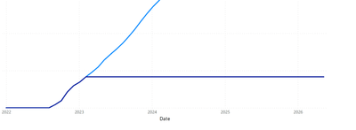
Sorry for the basic picture, I am trying to display a running total graphically, the darker blue represents Actual amounts, and the light Blue represents Projections. They should always follow each other as the projection changes based upon the actual amount. I would like for the Actual Line to stop when it no longer is following the Projection. I have found a work around by using a variable date, however different reporting schedules has caused this to become a less then ideal fix. Please let me know if there is a simple way to get the darker blue line to stop, based on when it deviates from the light blue.
- Mark as New
- Bookmark
- Subscribe
- Mute
- Subscribe to RSS Feed
- Permalink
- Report Inappropriate Content
Try using an if statement
IF(SELECTEDVALUE([date_column]) > [date_to_stop_graph], CALCULATE())
Replace the 'CALCULATE()' statement with your running total calculation.
Helpful resources

Power BI Dataviz World Championships
Vote for your favorite vizzies from the Power BI World Championship submissions!

Join our Community Sticker Challenge 2026
If you love stickers, then you will definitely want to check out our Community Sticker Challenge!

Power BI Monthly Update - January 2026
Check out the January 2026 Power BI update to learn about new features.

| User | Count |
|---|---|
| 64 | |
| 56 | |
| 43 | |
| 20 | |
| 17 |
| User | Count |
|---|---|
| 123 | |
| 108 | |
| 44 | |
| 32 | |
| 26 |

