FabCon is coming to Atlanta
Join us at FabCon Atlanta from March 16 - 20, 2026, for the ultimate Fabric, Power BI, AI and SQL community-led event. Save $200 with code FABCOMM.
Register now!- Power BI forums
- Get Help with Power BI
- Desktop
- Service
- Report Server
- Power Query
- Mobile Apps
- Developer
- DAX Commands and Tips
- Custom Visuals Development Discussion
- Health and Life Sciences
- Power BI Spanish forums
- Translated Spanish Desktop
- Training and Consulting
- Instructor Led Training
- Dashboard in a Day for Women, by Women
- Galleries
- Data Stories Gallery
- Themes Gallery
- Contests Gallery
- QuickViz Gallery
- Quick Measures Gallery
- Visual Calculations Gallery
- Notebook Gallery
- Translytical Task Flow Gallery
- TMDL Gallery
- R Script Showcase
- Webinars and Video Gallery
- Ideas
- Custom Visuals Ideas (read-only)
- Issues
- Issues
- Events
- Upcoming Events
The Power BI Data Visualization World Championships is back! Get ahead of the game and start preparing now! Learn more
- Power BI forums
- Forums
- Get Help with Power BI
- Desktop
- Rolling Quarters
- Subscribe to RSS Feed
- Mark Topic as New
- Mark Topic as Read
- Float this Topic for Current User
- Bookmark
- Subscribe
- Printer Friendly Page
- Mark as New
- Bookmark
- Subscribe
- Mute
- Subscribe to RSS Feed
- Permalink
- Report Inappropriate Content
Rolling Quarters
Hello,
I'm fairly new to PBI Desktop and I'm struggling with a "rolling quarter" implementation in PBI...
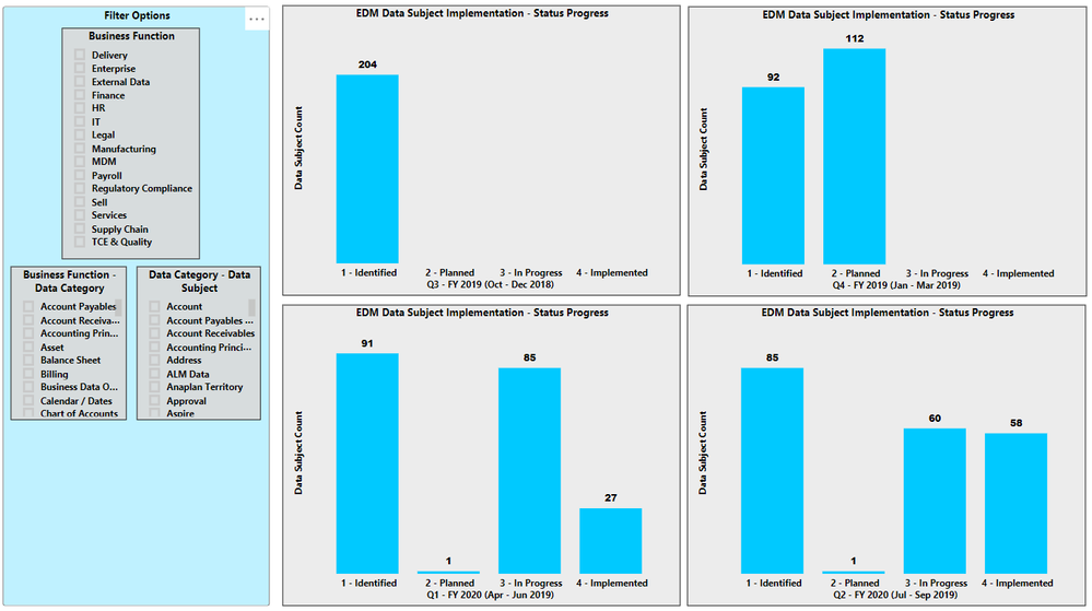
I have 4 graphs that show the status progess of Data Subject implementation in our database at the end of each quarter. The data comes from an excel spreadsheet.
The spreadsheet currently contains the data as shown in the screen capture. I.e. Business Function, Data Category, Data Subject, and the 4 quarters.
When the data for the end of Q3 - FY2020 becomes available, the spreadsheet needs to be updated and the PBI Graphs then should show Q4 - FY2019 through Q3 - FY2020.
What is the best way to organize the spreadsheet and apply this to the PBI graphs?
- Mark as New
- Bookmark
- Subscribe
- Mute
- Subscribe to RSS Feed
- Permalink
- Report Inappropriate Content
Hi @Anonymous ,
Have you solved your problem?
If you have solved, please always accept the replies making sense as solution to your question so that people who may have the same question can get the solution directly.
If you still need help, please share some data sample and your desired output so that we could help further on it.
Best Regards,
Cherry
If this post helps, then please consider Accept it as the solution to help the other members find it more quickly.
- Mark as New
- Bookmark
- Subscribe
- Mute
- Subscribe to RSS Feed
- Permalink
- Report Inappropriate Content
@Anonymous - In your Date table, you can add a "Relative Quarter" column, which will indicate "how many quarters ago" any date falls into. You will need to apply some logic to determine what is the most recent closed quarter. Then, in your visuals, you can filter based on the relative quarter.
Helpful resources

Power BI Dataviz World Championships
The Power BI Data Visualization World Championships is back! Get ahead of the game and start preparing now!

| User | Count |
|---|---|
| 38 | |
| 36 | |
| 33 | |
| 33 | |
| 29 |
| User | Count |
|---|---|
| 132 | |
| 86 | |
| 85 | |
| 68 | |
| 64 |


