FabCon is coming to Atlanta
Join us at FabCon Atlanta from March 16 - 20, 2026, for the ultimate Fabric, Power BI, AI and SQL community-led event. Save $200 with code FABCOMM.
Register now!- Power BI forums
- Get Help with Power BI
- Desktop
- Service
- Report Server
- Power Query
- Mobile Apps
- Developer
- DAX Commands and Tips
- Custom Visuals Development Discussion
- Health and Life Sciences
- Power BI Spanish forums
- Translated Spanish Desktop
- Training and Consulting
- Instructor Led Training
- Dashboard in a Day for Women, by Women
- Galleries
- Data Stories Gallery
- Themes Gallery
- Contests Gallery
- QuickViz Gallery
- Quick Measures Gallery
- Visual Calculations Gallery
- Notebook Gallery
- Translytical Task Flow Gallery
- TMDL Gallery
- R Script Showcase
- Webinars and Video Gallery
- Ideas
- Custom Visuals Ideas (read-only)
- Issues
- Issues
- Events
- Upcoming Events
The Power BI Data Visualization World Championships is back! Get ahead of the game and start preparing now! Learn more
- Power BI forums
- Forums
- Get Help with Power BI
- Desktop
- Re: Reveal Page Background with transparent Data C...
- Subscribe to RSS Feed
- Mark Topic as New
- Mark Topic as Read
- Float this Topic for Current User
- Bookmark
- Subscribe
- Printer Friendly Page
- Mark as New
- Bookmark
- Subscribe
- Mute
- Subscribe to RSS Feed
- Permalink
- Report Inappropriate Content
Reveal Page Background with transparent Data Color
Hi,
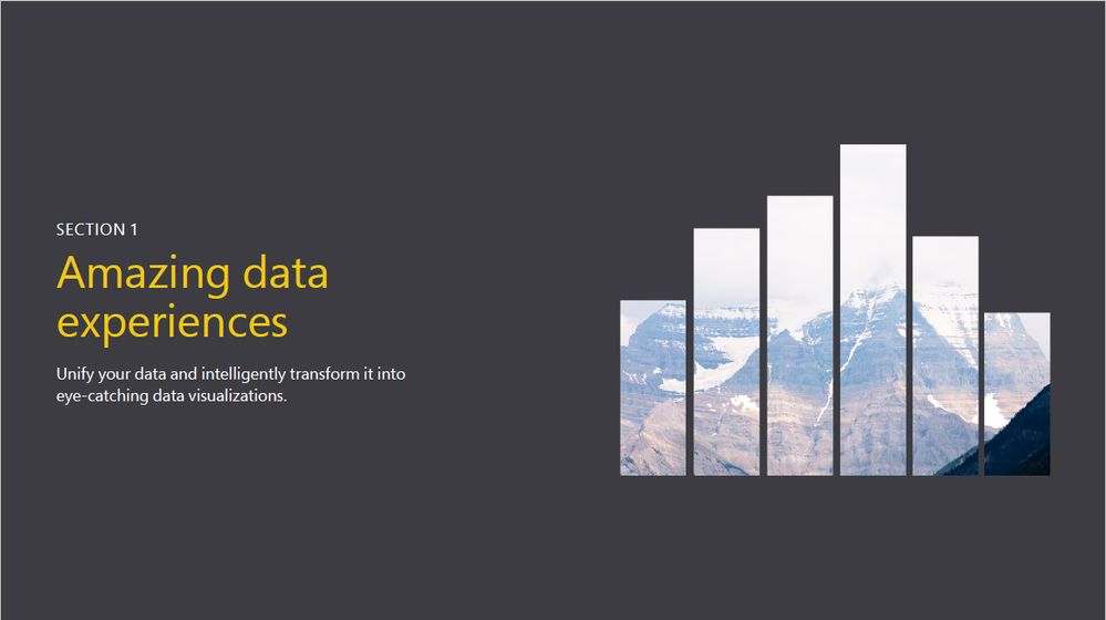
I would like to recreate the same effect as in a Microsoft Power BI guide (see picture below).
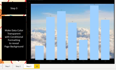
I imagined it would take 3 steps:
Step 1 - add background to page - this works
Step 2 - create chart - this works as well
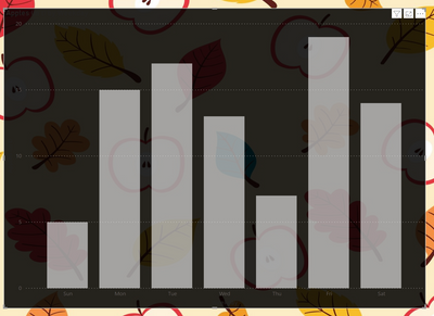
Step 3 - make bars transparent - now here is the problem! If I change the bars to transparent (I use conditional formatting by a measure), the chart background is visible instead of the page background! Practically, my bars disappeare! I hoped that the chart background is surrounding the bars instead of filling the background layer, so I can peak through the chart to see the background scenery.
Can you please help me with a workaround? This question bugs me pretty much because Microsoft suggests it's possible 😉
Please find my PBI file here
https://1drv.ms/u/s!AhXv3usXHZ51jfIF3Kc0YC0ydkgdeA?e=6QsFhk
Your help is much appreciated!
P.S. if you don't agree that this is a cool artistic effect pls don't ruin this thread and don't post your "solution". THX! 🙂
- Mark as New
- Bookmark
- Subscribe
- Mute
- Subscribe to RSS Feed
- Permalink
- Report Inappropriate Content
Hi @brigittagemes ,
First of all let me tell you that people are here to help you, and altough they may not give you the expected result you need they deserve respect since they are taking they're time for free to help you.
@AllisonKennedy is a great PBI user and that's why she is a Super User because her assistance to others has been recognized by the ones she helps.
Regarding your question I believe this can be solved by using the additonal values after the colour codes so instead of 00 you place the 25 you will get 25%, 75 will 75% and so on.
Final, result will be has attached not really sure if this is whatt you need but seems to do the work your measure should look like this
Transparent Color = "#FFFFFF95"
Regards
Miguel Félix
Did I answer your question? Mark my post as a solution!
Proud to be a Super User!
Check out my blog: Power BI em Português- Mark as New
- Bookmark
- Subscribe
- Mute
- Subscribe to RSS Feed
- Permalink
- Report Inappropriate Content
@MFelix I believe a lot of users feel disappointed and discouraged beacuse of the self-promoting "professionals" who put more emphasis on the "look up my services here and there" part than providing a valueable response. This forum should be about knowledge sharing and not free advertising!
Back to the topic: thanks for the insight, unfortunately that is not exactly the effect on the Microsoft Power BI material.
https://twitter.com/MSPowerBI/status/1290391998189404161
I don't care if this was created by a graphic designer in Adobe Illustrator, I still wish to recreate it in Power BI.
The background should not be transparent, not even slightly. On the other hand, the bars should be completely transparent, showing the page background without blur.
Actually I gave up to find a workaround and instead posted a recommendation on the Power BI Ideas page to request the feature (probably won't happen since the topic doesn't bother a lot of people)
https://ideas.powerbi.com/ideas/idea/?ideaid=c20cd397-41e0-ea11-bf22-501ac524580f
Cheers
- Mark as New
- Bookmark
- Subscribe
- Mute
- Subscribe to RSS Feed
- Permalink
- Report Inappropriate Content
Hi @brigittagemes ,
The specific image you show is made on Adobe or PowerPoint software, on Power BI theres is currently not a direct way of doing this is just a small adaptation or using custom visualizations so it's not a easy workaround, again to my knowledge.
I understand your question about the self promoting "professionals" but I don't believe is what @AllisonKennedy was doing and for sure even if you have those "professionals" talking to you if you are nice and respectufull to them is a point on your favor.
If you want I can try and check if there is another workaround, and can let you know later. Regarding the idea you did a good thing to post it also you can create your on https://charticulator.com/app/index.html.
Regards
Miguel Félix
Did I answer your question? Mark my post as a solution!
Proud to be a Super User!
Check out my blog: Power BI em Português- Mark as New
- Bookmark
- Subscribe
- Mute
- Subscribe to RSS Feed
- Permalink
- Report Inappropriate Content
@MFelix Respect cannot be demanded, not with that condescending tone! It has to be earned, but You defenetely do not qulaify. Muted for bullying.
P.S. You won't be able to build a custom visual as long as the background is handled as a fill layer.
- Mark as New
- Bookmark
- Subscribe
- Mute
- Subscribe to RSS Feed
- Permalink
- Report Inappropriate Content
Hi @brigittagemes,
It may not what you are exactly looking for. But here is some relevent design.
I Added an image to chart "plot area" and this is how the report looks like.
The .pbix is in following link : PBIX File
Thank you,
V Karumanchi
- Mark as New
- Bookmark
- Subscribe
- Mute
- Subscribe to RSS Feed
- Permalink
- Report Inappropriate Content
Please @mention me in your reply if you want a response.
Copying DAX from this post? Click here for a hack to quickly replace it with your own table names
Has this post solved your problem? Please Accept as Solution so that others can find it quickly and to let the community know your problem has been solved.
If you found this post helpful, please give Kudos C
I work as a Microsoft trainer and consultant, specialising in Power BI and Power Query.
www.excelwithallison.com
- Mark as New
- Bookmark
- Subscribe
- Mute
- Subscribe to RSS Feed
- Permalink
- Report Inappropriate Content
@AllisonKennedy if you "don't know of a way to make this happen" then this is not a solution, pls don't spam the thread.
- Mark as New
- Bookmark
- Subscribe
- Mute
- Subscribe to RSS Feed
- Permalink
- Report Inappropriate Content
I am sorry you feel my reply is 'spam'. I do not like to make absolute statements that things are not possible, as Power BI changes frequently and it's difficult to know everything, but the more people, especially SuperUsers who can confirm that they also do not know of a way to make this happen, the closer this post will be to 'solved' as eventually if enough people agree it cannot be done then it is probably not possible.
I did offer an alternative option with custom visual infographics.
Are you able to share any additional information on what the Microsoft Power BI guide you have posted in your screenshot is about and what learnings it guides you to? Perhaps this can give us a hint on where to look.
Otherwise, as I said in my original post, I do think it would be neat, but this looks to me like a PowerPoint graphic. They have not included any surrounding Power BI report or dashboard effects to indicate to me that it is possible in Power BI.
To do this in other Office applications, you can use the Office 365 built in Insert Icons: https://support.microsoft.com/en-us/office/insert-icons-in-microsoft-office-e2459f17-3996-4795-996e-....
Please @mention me in your reply if you want a response.
Copying DAX from this post? Click here for a hack to quickly replace it with your own table names
Has this post solved your problem? Please Accept as Solution so that others can find it quickly and to let the community know your problem has been solved.
If you found this post helpful, please give Kudos C
I work as a Microsoft trainer and consultant, specialising in Power BI and Power Query.
www.excelwithallison.com
- Mark as New
- Bookmark
- Subscribe
- Mute
- Subscribe to RSS Feed
- Permalink
- Report Inappropriate Content
Sorry, muting you for time-wasting spam
Helpful resources

Power BI Dataviz World Championships
The Power BI Data Visualization World Championships is back! Get ahead of the game and start preparing now!

| User | Count |
|---|---|
| 39 | |
| 39 | |
| 37 | |
| 29 | |
| 24 |
| User | Count |
|---|---|
| 120 | |
| 95 | |
| 70 | |
| 69 | |
| 65 |


