FabCon is coming to Atlanta
Join us at FabCon Atlanta from March 16 - 20, 2026, for the ultimate Fabric, Power BI, AI and SQL community-led event. Save $200 with code FABCOMM.
Register now!- Power BI forums
- Get Help with Power BI
- Desktop
- Service
- Report Server
- Power Query
- Mobile Apps
- Developer
- DAX Commands and Tips
- Custom Visuals Development Discussion
- Health and Life Sciences
- Power BI Spanish forums
- Translated Spanish Desktop
- Training and Consulting
- Instructor Led Training
- Dashboard in a Day for Women, by Women
- Galleries
- Data Stories Gallery
- Themes Gallery
- Contests Gallery
- QuickViz Gallery
- Quick Measures Gallery
- Visual Calculations Gallery
- Notebook Gallery
- Translytical Task Flow Gallery
- TMDL Gallery
- R Script Showcase
- Webinars and Video Gallery
- Ideas
- Custom Visuals Ideas (read-only)
- Issues
- Issues
- Events
- Upcoming Events
The Power BI Data Visualization World Championships is back! Get ahead of the game and start preparing now! Learn more
- Power BI forums
- Forums
- Get Help with Power BI
- Desktop
- Resourcing Hierarchy Visualisation
- Subscribe to RSS Feed
- Mark Topic as New
- Mark Topic as Read
- Float this Topic for Current User
- Bookmark
- Subscribe
- Printer Friendly Page
- Mark as New
- Bookmark
- Subscribe
- Mute
- Subscribe to RSS Feed
- Permalink
- Report Inappropriate Content
Resourcing Hierarchy Visualisation
Hi guys, totally new to PowerBI and despite some hefty Googling I cannot work out if it can do what I am hoping it can do.
We monitor our teams and vacancies using Excel right now, in a table like this:
NAME: LEVEL: ROLE: MANAGER:
| Tom | Director | Account Owner | NA |
| Sarah | Senior Manager | Stakeholder Lead | Tom |
| Tim | Manager | Stakeholder Manager | Sarah |
| Steve | Senior Manager | Compliance Lead | Tom |
| Sue | Senior Manager | Project Lead | Tom |
| Paul | Manager | Project Manager | Sue |
| VACANCY | Manager | Project Manager | Sue |
| VACANCY | Senior Manager | Programme Lead | Tom |
My question is... can Power BI represent this visually, automatically, in the same way you might be able to create a hierarchy Smart Art structure in PowerPoint.
If so, I don't need detail, I can learn that in my own time, but a rough idea of how to structure it would be really useful. Thanks!
Solved! Go to Solution.
- Mark as New
- Bookmark
- Subscribe
- Mute
- Subscribe to RSS Feed
- Permalink
- Report Inappropriate Content
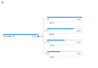
Please consider the hierarchy tree visual, the effect is like this:
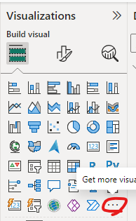
You can click the '...' in the Visualizations pane, and search for it.
This link may help:
xViz Hierarchy Tree/Advanced Decomposition Tree - Power BI Visual
Here are some links for your reference:
Solved: How to Create Organization Chart in Power BI Deskt... - Microsoft Fabric Community
Create a hierarchy - Microsoft Support
Create visuals with PowerPoint SmartArt for Power BI - BI Samurai
Best Regards
Zhengdong Xu
If this post helps, then please consider Accept it as the solution to help the other members find it more quickly.
- Mark as New
- Bookmark
- Subscribe
- Mute
- Subscribe to RSS Feed
- Permalink
- Report Inappropriate Content
i think you can do it by creating hierarchy.
You can create a hierarchy based on the Manager column to represent the organizational structure. To do this:
- go to the Data view.
- Right-click on the Manager column and select New Hierarchy.
- Drag the Name column into the hierarchy to create a multi level hierarchy.
for Visualizations:- Use the Hierarchy Slicer visual to allow users to interactively filter the data based on the organizational hierarchy.
- Use a matrix visual to display the hierarchical relationship in a tabular format, with managers at higher levels and their subordinates listed below.
- You can also explore custom visuals from the Power BI marketplace for more advanced visualizations of hierarchical data.
If this helped, Follow this blog for more insightful information about data analytics
https://analyticpulse.blogspot.com/
Please Subscribe AnalyticPulse on YouTube for future updates:
https://www.youtube.com/@AnalyticPulse
Please subscribe CogniJourney On Youtube For Daily fun facts:
https://www.youtube.com/@CogniJourney
Helpful resources

Power BI Dataviz World Championships
The Power BI Data Visualization World Championships is back! Get ahead of the game and start preparing now!

| User | Count |
|---|---|
| 38 | |
| 37 | |
| 34 | |
| 31 | |
| 27 |
| User | Count |
|---|---|
| 136 | |
| 99 | |
| 73 | |
| 66 | |
| 65 |


