FabCon is coming to Atlanta
Join us at FabCon Atlanta from March 16 - 20, 2026, for the ultimate Fabric, Power BI, AI and SQL community-led event. Save $200 with code FABCOMM.
Register now!- Power BI forums
- Get Help with Power BI
- Desktop
- Service
- Report Server
- Power Query
- Mobile Apps
- Developer
- DAX Commands and Tips
- Custom Visuals Development Discussion
- Health and Life Sciences
- Power BI Spanish forums
- Translated Spanish Desktop
- Training and Consulting
- Instructor Led Training
- Dashboard in a Day for Women, by Women
- Galleries
- Data Stories Gallery
- Themes Gallery
- Contests Gallery
- QuickViz Gallery
- Quick Measures Gallery
- Visual Calculations Gallery
- Notebook Gallery
- Translytical Task Flow Gallery
- TMDL Gallery
- R Script Showcase
- Webinars and Video Gallery
- Ideas
- Custom Visuals Ideas (read-only)
- Issues
- Issues
- Events
- Upcoming Events
Get Fabric Certified for FREE during Fabric Data Days. Don't miss your chance! Request now
- Power BI forums
- Forums
- Get Help with Power BI
- Desktop
- Re: Resizing Bar Width in Clustered Column Chart
- Subscribe to RSS Feed
- Mark Topic as New
- Mark Topic as Read
- Float this Topic for Current User
- Bookmark
- Subscribe
- Printer Friendly Page
- Mark as New
- Bookmark
- Subscribe
- Mute
- Subscribe to RSS Feed
- Permalink
- Report Inappropriate Content
Resizing Bar Width in Clustered Column Chart
I'm building a clustered column chart (photo below), and would like to resize the width of the bars in that chart if possible, but I am not having any luck finding a way to do this. I know that other version of this has been asked and answered already (http://community.powerbi.com/t5/Desktop/chart-column-width/m-p/17749#M5116), but the answer to those questions was "you are missing a field for your Axis", meanwhile I already have an axis value.
Any help? Thanks!
Solved! Go to Solution.
- Mark as New
- Bookmark
- Subscribe
- Mute
- Subscribe to RSS Feed
- Permalink
- Report Inappropriate Content
@TarcMaylor,
There is no method that could be used to change width of column unless we resize the whole chart to make the column wider. There is also an idea about adjusting blank space, you can vote it up.
Regards,
- Mark as New
- Bookmark
- Subscribe
- Mute
- Subscribe to RSS Feed
- Permalink
- Report Inappropriate Content
1- Select the visual and go to format tab, under format tab go to X-axis
2- In X- axis, there is one option known as Layout (you can also search Layout in the search bar option under format tab)
3- In layout increase the size as per your requirement.
Hope, it resolves your query.
- Mark as New
- Bookmark
- Subscribe
- Mute
- Subscribe to RSS Feed
- Permalink
- Report Inappropriate Content
If the x-axis is reading from a date format:
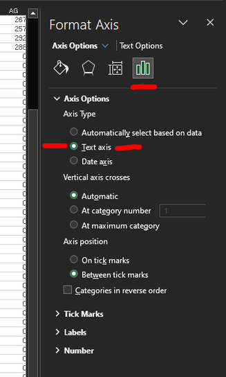
- Double click on the x-axis in your chart to show the "Format Axis" fly-out on the right side of the window
- If it's not already expanded, go to "Axis Options" and under "Axis Type" and select "Text Axis". This immediatly widened the columns to what I would normally expect and it allowed further manipulation with Gap Width and Overlap settings.
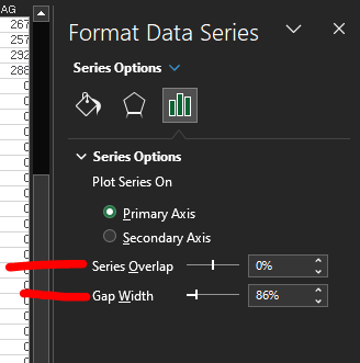
Double-click on the columns to bring up this fly-out to adjust Series Overlap and Gap Width:
- Mark as New
- Bookmark
- Subscribe
- Mute
- Subscribe to RSS Feed
- Permalink
- Report Inappropriate Content
As usual with Power BI, no true answers.
- Mark as New
- Bookmark
- Subscribe
- Mute
- Subscribe to RSS Feed
- Permalink
- Report Inappropriate Content
Step - 1
Select Clustered Column Chart from Visualizations, drag your data columns into visual
Step - 2
Click on your visual, goto Format and enable X-axis,
Step - 3
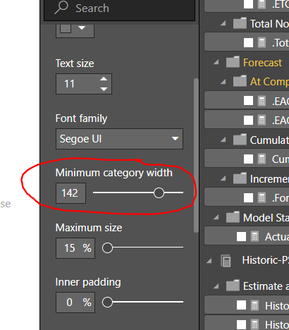
In X axis settings you can see Minimum Category width and inner padding tweak them as your wish
Problem solved 😊
- Mark as New
- Bookmark
- Subscribe
- Mute
- Subscribe to RSS Feed
- Permalink
- Report Inappropriate Content
You have to make sure under X axis that the Type is "Categorical" and not "Continuous" otherwise it won't let you adjust the category width.
- Mark as New
- Bookmark
- Subscribe
- Mute
- Subscribe to RSS Feed
- Permalink
- Report Inappropriate Content
cluster column chart bars is supposed to render categorical data and not contineous data. if you can catogories data and add that category field in column legend well then you can adjust spacing and width.
for example
if you have quarter on x axis and month as column legend then for each quarter you expect 3 bars in clustered column bar with some spacing and then next quarter, however clusted column chart will display 3 bars but white space for 9+1 more bars. as a quarter has only 3 months data and for rest 9 months it render 0 value which looks like white space.
a year data -> 4 quarters -> 12 months(means 12 category)
Work around to fix this -> make new field as 'month category' which includes only respective months for quarter.
a year data -> 4 quarters -> 3 months type( means 3 category)
3 months type would be ->
month 1 ->which represnt first month of a quarter -> Jan, Apr, Jul, Oct
month 2 -> which represnt second month of a quarter -> Feb, May, Aug, Nov
month 3 -> which represnt third month of a quarter -> March, June, Sep, Dec
now keeping this month type field in 'column legend' well will display 3 bars and one white space for each quarter
- Mark as New
- Bookmark
- Subscribe
- Mute
- Subscribe to RSS Feed
- Permalink
- Report Inappropriate Content
Thanks for correct answer, finally this solved the problem. 😀
- Mark as New
- Bookmark
- Subscribe
- Mute
- Subscribe to RSS Feed
- Permalink
- Report Inappropriate Content
my problem was to display multiple column legends with more width, I created new column with category and replaced in column legend.
example ->converted "Quarter(month) = Q1 ( 1,2,3), Q2 (4,5,6), Q3 (7,8,9), Q4(10,11,12)"
to
Quarter(Month type) = Q1 ( 1,2,3), Q2 ( 1,2,3, Q3 ( 1,2,3), Q4( 1,2,3)
- Mark as New
- Bookmark
- Subscribe
- Mute
- Subscribe to RSS Feed
- Permalink
- Report Inappropriate Content
Go to Format option and type Padding. In X-axis, you will find inner padding %. Now, change the % and you can see the width of the column altered. 
- Mark as New
- Bookmark
- Subscribe
- Mute
- Subscribe to RSS Feed
- Permalink
- Report Inappropriate Content
Also under X-axis adjusting "Minimum Category Width" helps better than reducing the padding I found.
- Mark as New
- Bookmark
- Subscribe
- Mute
- Subscribe to RSS Feed
- Permalink
- Report Inappropriate Content
Has anyone found a better solution or workaround to this? Adjusting the inner padding or column width made very little change for me. Another chart type that can support field based target with conditional coloring on the bars (below or above target) would be fine.
- Mark as New
- Bookmark
- Subscribe
- Mute
- Subscribe to RSS Feed
- Permalink
- Report Inappropriate Content
Trying to get this right as well. I find the parameters of X axis are not doing anything. All I get is this silly looking chart:
- Mark as New
- Bookmark
- Subscribe
- Mute
- Subscribe to RSS Feed
- Permalink
- Report Inappropriate Content
@TarcMaylor,
You are able to change width of the whole chart as shown in screenshot below. However, it is not possible to resize bar width of a single bar, an idea about this issue has been submitted in this link, please vote it up.
Regards,
Lydia
- Mark as New
- Bookmark
- Subscribe
- Mute
- Subscribe to RSS Feed
- Permalink
- Report Inappropriate Content
- Mark as New
- Bookmark
- Subscribe
- Mute
- Subscribe to RSS Feed
- Permalink
- Report Inappropriate Content
@TarcMaylor,
There is no method that could be used to change width of column unless we resize the whole chart to make the column wider. There is also an idea about adjusting blank space, you can vote it up.
Regards,
- Mark as New
- Bookmark
- Subscribe
- Mute
- Subscribe to RSS Feed
- Permalink
- Report Inappropriate Content
I am finding that all of the suggestions, do not work for the most part. In Excel, one can easily make each column wider and reduce the amount of white space on the graph. Though dynamic, the visuals are very limited and very frustrating when trying to make visually appealing. Changes and formatting should not be this complicated. I wish I could increase the width of my columns to the size of the visual at the top of this page.
- Mark as New
- Bookmark
- Subscribe
- Mute
- Subscribe to RSS Feed
- Permalink
- Report Inappropriate Content
What everyone that is asking for this wants to do is to control the use of white space around a chart _and_ the width of the bars. This is a very reasonable thing to ask because without it the charts are not balanced in the amount of space they use -- for example, a chart with only 5 bars, if displayed in a larger width area, will be centered and have an unusual amount of white space around it, yes the bars will be bigger, but I want them over to the left, not centered, and I want them much wider than they will be if I shrink the width of the whole chart.
- Mark as New
- Bookmark
- Subscribe
- Mute
- Subscribe to RSS Feed
- Permalink
- Report Inappropriate Content
"No Method to change the width of the bar chart" This is NOT a solution.
I too am in the same situation - would like to increase the width of the bar charts since there is so much white space.
Jose
- Mark as New
- Bookmark
- Subscribe
- Mute
- Subscribe to RSS Feed
- Permalink
- Report Inappropriate Content
A:
Select the data series by clicking on one of the bars (just to be sure the data series is selected).
Right-click or control-click, and choose Format Data Series from the context menu.
In the Format Data Series dialog box, select Options.
Then change the Gap width.
For wider bars, make the gap width smaller.
For narrower bars, make the gap width larger.
- Mike Middleton, www.TreePlan.com
Helpful resources

Power BI Monthly Update - November 2025
Check out the November 2025 Power BI update to learn about new features.

Fabric Data Days
Advance your Data & AI career with 50 days of live learning, contests, hands-on challenges, study groups & certifications and more!


