Get Fabric certified for FREE!
Don't miss your chance to take the Fabric Data Engineer (DP-700) exam on us!
Learn more- Power BI forums
- Get Help with Power BI
- Desktop
- Service
- Report Server
- Power Query
- Mobile Apps
- Developer
- DAX Commands and Tips
- Custom Visuals Development Discussion
- Health and Life Sciences
- Power BI Spanish forums
- Translated Spanish Desktop
- Training and Consulting
- Instructor Led Training
- Dashboard in a Day for Women, by Women
- Galleries
- Data Stories Gallery
- Themes Gallery
- Contests Gallery
- QuickViz Gallery
- Quick Measures Gallery
- Visual Calculations Gallery
- Notebook Gallery
- Translytical Task Flow Gallery
- TMDL Gallery
- R Script Showcase
- Webinars and Video Gallery
- Ideas
- Custom Visuals Ideas (read-only)
- Issues
- Issues
- Events
- Upcoming Events
We've captured the moments from FabCon & SQLCon that everyone is talking about, and we are bringing them to the community, live and on-demand. Starts on April 14th. Register now
- Power BI forums
- Forums
- Get Help with Power BI
- Desktop
- Reshape data in a custom R interactive visual (usi...
- Subscribe to RSS Feed
- Mark Topic as New
- Mark Topic as Read
- Float this Topic for Current User
- Bookmark
- Subscribe
- Printer Friendly Page
- Mark as New
- Bookmark
- Subscribe
- Mute
- Subscribe to RSS Feed
- Permalink
- Report Inappropriate Content
Reshape data in a custom R interactive visual (using heatmaply)
I'm trying to build an interactive heat map custom visual using R and the heatmaply package.
The R script is:
source('./r_files/flatten_HTML.r')

############### Library Declarations ###############
libraryRequireInstall("heatmaply");
####################################################

################### Actual code ####################

p <- Values %>%
  heatmaply(Values, k_col = 2, k_row = 2,
            scale_fill_gradient_fun = scale_fill_gradient2(low = "light blue", mid = "light blue", high = "black", midpoint = 1),
            dendrogram = FALSE)

internalSaveWidget(p, 'out.html');
####################################################
The overall pipeline is working fine, i.e. the custom visual will display the out.html widget in a report page. The problem is that the data coming into 'Values' from Power BI is in the wrong structure, so the heatmap isn't correct. How do I reshape 'Values' in R?
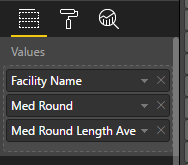
In Power BI, the data is in 3 columns:
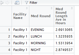
In R this looks like:
For this to work in heatmaply, it needs to be reshaped to look like this:
in R, I can do this using dataframes and xtabs, but i have no idea how to do this using the 'Values' argument that pulls the data in from Power BI. I don't really undertsand what the %>% does, or what 'Values' actually is once it is inside R - is it a dataframe? I tried to reshape 'Values' using something like:
p <- Values %>%
  Values_reshaped <- as.data.frame.matrix(xtabs(Values[3] ~ Values[1] + Values[2], Values))
  heatmaply(Values_reshaped, k_col = 2, k_row = 2,
            scale_fill_gradient_fun = scale_fill_gradient2(low = "light blue", mid = "light blue", high = "black", midpoint = 1),
            dendrogram = FALSE)
But got errors in Power BI
======================

Error in model.frame.default(formula = Values[3] ~ Values[1] + Values[2],  :
  invalid type (list) for variable 'Values[3]'
Calls: as.data.frame.matrix ... xtabs -> eval -> eval -> <Anonymous> -> model.frame.default
Execution halted


Stack Trace:
Microsoft.PowerBI.ExploreServiceCommon.ScriptHandlerException: R script error.
etc...
At this point I feel like I'm going off road. Any pointers welcome!
If only the native R visual in Power BI supported interactive heatmaps....
- Mark as New
- Bookmark
- Subscribe
- Mute
- Subscribe to RSS Feed
- Permalink
- Report Inappropriate Content
For your requirement, I suggest you use "reshape" package to unpivot/pivot your data frame with cast/melt function. Please refer to links below:
Using the reshape package in R for pivot-table-like functionality
Pivot Tables in R with melt and cast
how to pivot/unpivot (cast/melt) data frame? [duplicate]
Regards,
- Mark as New
- Bookmark
- Subscribe
- Mute
- Subscribe to RSS Feed
- Permalink
- Report Inappropriate Content
Thanks @v-sihou-msft. I will look into that.
It's worth mentioning for now that PBI Service does not support heatmaply (possibly because it uses viridis?) so until that changes i've gone back to building an interactive heatmap using ggplot / plotly (which doesn't require reshaping data). However this doesn't behave very well as a dashboard tile in PBI service, so I'm now going further back to just using a stock matrix PBI with background colour conditional formatting (i've gone full circle!).
I have submitted a request to microsoft to provide support for heatmaply.
Helpful resources

New to Fabric Survey
If you have recently started exploring Fabric, we'd love to hear how it's going. Your feedback can help with product improvements.

Power BI DataViz World Championships - June 2026
A new Power BI DataViz World Championship is coming this June! Don't miss out on submitting your entry.

Join our Fabric User Panel
Share feedback directly with Fabric product managers, participate in targeted research studies and influence the Fabric roadmap.

| User | Count |
|---|---|
| 51 | |
| 37 | |
| 35 | |
| 19 | |
| 17 |
| User | Count |
|---|---|
| 72 | |
| 70 | |
| 39 | |
| 34 | |
| 23 |


