Fabric Data Days starts November 4th!
Advance your Data & AI career with 50 days of live learning, dataviz contests, hands-on challenges, study groups & certifications and more!
Get registered- Power BI forums
- Get Help with Power BI
- Desktop
- Service
- Report Server
- Power Query
- Mobile Apps
- Developer
- DAX Commands and Tips
- Custom Visuals Development Discussion
- Health and Life Sciences
- Power BI Spanish forums
- Translated Spanish Desktop
- Training and Consulting
- Instructor Led Training
- Dashboard in a Day for Women, by Women
- Galleries
- Data Stories Gallery
- Themes Gallery
- Contests Gallery
- QuickViz Gallery
- Quick Measures Gallery
- Visual Calculations Gallery
- Notebook Gallery
- Translytical Task Flow Gallery
- TMDL Gallery
- R Script Showcase
- Webinars and Video Gallery
- Ideas
- Custom Visuals Ideas (read-only)
- Issues
- Issues
- Events
- Upcoming Events
Get Fabric Certified for FREE during Fabric Data Days. Don't miss your chance! Request now
- Power BI forums
- Forums
- Get Help with Power BI
- Desktop
- Replication of Tableau Scatter plot
- Subscribe to RSS Feed
- Mark Topic as New
- Mark Topic as Read
- Float this Topic for Current User
- Bookmark
- Subscribe
- Printer Friendly Page
- Mark as New
- Bookmark
- Subscribe
- Mute
- Subscribe to RSS Feed
- Permalink
- Report Inappropriate Content
Replication of Tableau Scatter plot
Hey,
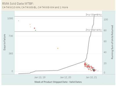
I have been trying to figure how to plot a scatter plot similar to the one I have created in tableau (as seen below)
Unfortunately, when I try and replicate this scatter plot in power bi, I don't get the same representation. This potentially can become time sensitive. Can someone show me how to replicate this graph even if its with one y-axis. Need help. Show and tell.
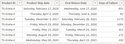
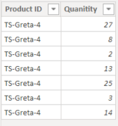
Below are two sample tables of the data I am using
I don't see where I can attach sample data. I do have screenshots. Will this work?
These are the two sample tables I have created.
Solved! Go to Solution.
- Mark as New
- Bookmark
- Subscribe
- Mute
- Subscribe to RSS Feed
- Permalink
- Report Inappropriate Content
Hi @Anonymous ,
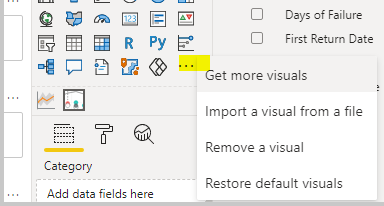
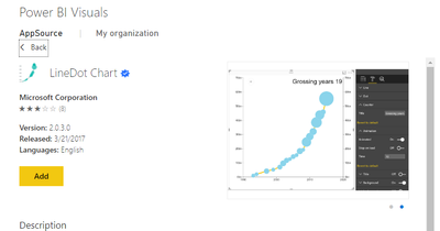
According to your needs, there may not be the same visual that powerbi desktop supports by default as created in Tableau. But you can find similar visual in custome viusal.
If the problem is still not resolved, please provide detailed error information and let me know immediately. Looking forward to your reply.
Best Regards,
Henry
If this post helps, then please consider Accept it as the solution to help the other members find it more quickly.
- Mark as New
- Bookmark
- Subscribe
- Mute
- Subscribe to RSS Feed
- Permalink
- Report Inappropriate Content
hi @Anonymous - can you please follow the steps highlighted in the below post to attach your data/pbix file OR copy paste your data in table format - this would be easier for anlysis on my end.
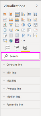
Also you can add warrantly lines in Power BI visuals using the options under the Analytics pane of Power BI.
Please find Mocrosoft documentation on the same: https://docs.microsoft.com/en-us/power-bi/transform-model/desktop-analytics-pane
Hope this helps!
Proud to be a Super User!
- Mark as New
- Bookmark
- Subscribe
- Mute
- Subscribe to RSS Feed
- Permalink
- Report Inappropriate Content
Can you please show me how to build out this scatter plot so I can replicate my tableau chart in power bi?
- Mark as New
- Bookmark
- Subscribe
- Mute
- Subscribe to RSS Feed
- Permalink
- Report Inappropriate Content
Helpful resources

Power BI Monthly Update - November 2025
Check out the November 2025 Power BI update to learn about new features.

Fabric Data Days
Advance your Data & AI career with 50 days of live learning, contests, hands-on challenges, study groups & certifications and more!

| User | Count |
|---|---|
| 97 | |
| 73 | |
| 50 | |
| 47 | |
| 44 |
