Join us at FabCon Vienna from September 15-18, 2025
The ultimate Fabric, Power BI, SQL, and AI community-led learning event. Save €200 with code FABCOMM.
Get registeredGo To
- Power BI forums
- Get Help with Power BI
- Desktop
- Service
- Report Server
- Power Query
- Mobile Apps
- Developer
- DAX Commands and Tips
- Custom Visuals Development Discussion
- Health and Life Sciences
- Power BI Spanish forums
- Translated Spanish Desktop
- Training and Consulting
- Instructor Led Training
- Dashboard in a Day for Women, by Women
- Galleries
- Data Stories Gallery
- Themes Gallery
- Contests Gallery
- Quick Measures Gallery
- Notebook Gallery
- Translytical Task Flow Gallery
- TMDL Gallery
- R Script Showcase
- Webinars and Video Gallery
- Ideas
- Custom Visuals Ideas (read-only)
- Issues
- Issues
- Events
- Upcoming Events
Turn on suggestions
Auto-suggest helps you quickly narrow down your search results by suggesting possible matches as you type.
Showing results for
Enhance your career with this limited time 50% discount on Fabric and Power BI exams. Ends September 15. Request your voucher.
- Power BI forums
- Forums
- Get Help with Power BI
- Desktop
- Replicate this excel chart/heatmap with percentage...
Reply
Topic Options
- Subscribe to RSS Feed
- Mark Topic as New
- Mark Topic as Read
- Float this Topic for Current User
- Bookmark
- Subscribe
- Printer Friendly Page
- Mark as New
- Bookmark
- Subscribe
- Mute
- Subscribe to RSS Feed
- Permalink
- Report Inappropriate Content
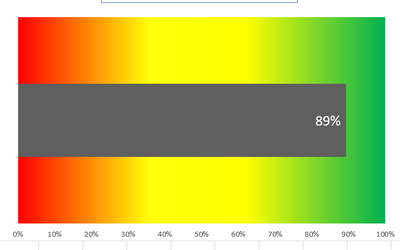
Replicate this excel chart/heatmap with percentage bar in PowerBI
10-03-2023
11:12 AM
Hi,
How can I replicate this Excel chart in Power BI. The gray bar is the overall percentage for a given vendor.
Any help is appreciated.
Thanks,
1 REPLY 1
- Mark as New
- Bookmark
- Subscribe
- Mute
- Subscribe to RSS Feed
- Permalink
- Report Inappropriate Content
10-03-2023
08:36 PM
@S_M_ , You can get the bar, using a measure like
divide([current measure], calculate([current measure], removefilter(Table[Vendor]) ) )
If the background is conditional formatting, you can not get 3 colors
Percent of Total and Percent of SubTotal https://www.youtube.com/watch?v=6jTildcV2ho
https://www.youtube.com/watch?v=cN8AO3_vmlY&t=24270s
Helpful resources
Featured Topics
Top Solution Authors
| User | Count |
|---|---|
| 68 | |
| 63 | |
| 59 | |
| 54 | |
| 28 |
Top Kudoed Authors
| User | Count |
|---|---|
| 182 | |
| 81 | |
| 64 | |
| 46 | |
| 38 |


