Fabric Data Days starts November 4th!
Advance your Data & AI career with 50 days of live learning, dataviz contests, hands-on challenges, study groups & certifications and more!
Get registered- Power BI forums
- Get Help with Power BI
- Desktop
- Service
- Report Server
- Power Query
- Mobile Apps
- Developer
- DAX Commands and Tips
- Custom Visuals Development Discussion
- Health and Life Sciences
- Power BI Spanish forums
- Translated Spanish Desktop
- Training and Consulting
- Instructor Led Training
- Dashboard in a Day for Women, by Women
- Galleries
- Data Stories Gallery
- Themes Gallery
- Contests Gallery
- Quick Measures Gallery
- Visual Calculations Gallery
- Notebook Gallery
- Translytical Task Flow Gallery
- TMDL Gallery
- R Script Showcase
- Webinars and Video Gallery
- Ideas
- Custom Visuals Ideas (read-only)
- Issues
- Issues
- Events
- Upcoming Events
Get Fabric Certified for FREE during Fabric Data Days. Don't miss your chance! Learn more
- Power BI forums
- Forums
- Get Help with Power BI
- Desktop
- Removing line breaks in line chart when data is a ...
- Subscribe to RSS Feed
- Mark Topic as New
- Mark Topic as Read
- Float this Topic for Current User
- Bookmark
- Subscribe
- Printer Friendly Page
- Mark as New
- Bookmark
- Subscribe
- Mute
- Subscribe to RSS Feed
- Permalink
- Report Inappropriate Content
Removing line breaks in line chart when data is a DAX measure COUNTROWS()
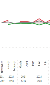
I'm using a DAX measure for the red line in the image below and want to figure out how to make the red line continuous (show 0):
Context:
The red line represents the number of issues created in a Kanban board on a specific date. On the X-axis, there are two time-related variables (milestones and date hierarchy). The DAX measure I'm using for the red line (Y-axis) is as follows:
Issues Created =
COUNTROWS(
FILTER(
Dataset,
Dataset[IssueAction] = "created"
)
)
Essentially, this DAX measure counts occurrences in the 'IssueAction' column that match 'created'. The line break occurs when I select certain categories in the slicers (e.g., specific departments). My stakeholders want this line to appear continuous.
How can I configure the plot to show zero when there are no occurrences, or is this an impossible task?
Unlike the solutions in other posts on this forum, I can't convert the y-axis to "categorical" because it's already continuous (I don't even have the option to convert).
I've been searching for a solution to this issue for several days, but I couldn't figure it out.
Could someone help me with this? I appreciate your time.
Solved! Go to Solution.
- Mark as New
- Bookmark
- Subscribe
- Mute
- Subscribe to RSS Feed
- Permalink
- Report Inappropriate Content
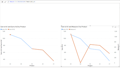
you can modify your code as the below logic:
var t =  TREATAS(values(dimdate[Date]) ,  'Table'[Date])
return
IF(
    not ISEMPTY( t ),
CALCULATE(
    COALESCE(SUM('Table'[sales]),0)
)
)
summary ;
the code will check if the date exists in your fact table, (base on your slicer date selection )
if exists , it will return the value and 0 in case of blank ,
if the date does not exist, it will return blank ,which in turn power bi will not show the row for it,
let me know if it works for you .
If my answer helped sort things out for you, i would appreciate a thumbs up 👍 and mark it as the solution ✅!
It makes a difference and might help someone else too. Thanks for spreading the good vibes! 🤠
- Mark as New
- Bookmark
- Subscribe
- Mute
- Subscribe to RSS Feed
- Permalink
- Report Inappropriate Content
To report on something that isn't there you need a disconnected table feeding your x axis.
- Mark as New
- Bookmark
- Subscribe
- Mute
- Subscribe to RSS Feed
- Permalink
- Report Inappropriate Content
Hello @stsok
use this measure :
measure = coalesce ( [measure] , 0 )
If my answer helped sort things out for you, i would appreciate a thumbs up 👍 and mark it as the solution ✅!
It makes a difference and might help someone else too. Thanks for spreading the good vibes! 🤠
- Mark as New
- Bookmark
- Subscribe
- Mute
- Subscribe to RSS Feed
- Permalink
- Report Inappropriate Content
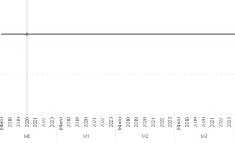
Thank you for your response. I implemented your suggestion, but now I'm encountering a new issue where all the years are being repeated for each milestone.
When I utilize only COUNTROWS(), this issue doesn't arise (original view provided below).
I believe the challenge lies in the necessity for two separate x-axes on the chart.
Is there a method to incorporate COALESCE() while preserving the order of both x-axes?
- Mark as New
- Bookmark
- Subscribe
- Mute
- Subscribe to RSS Feed
- Permalink
- Report Inappropriate Content
you can modify your code as the below logic:
var t =  TREATAS(values(dimdate[Date]) ,  'Table'[Date])
return
IF(
    not ISEMPTY( t ),
CALCULATE(
    COALESCE(SUM('Table'[sales]),0)
)
)
summary ;
the code will check if the date exists in your fact table, (base on your slicer date selection )
if exists , it will return the value and 0 in case of blank ,
if the date does not exist, it will return blank ,which in turn power bi will not show the row for it,
let me know if it works for you .
If my answer helped sort things out for you, i would appreciate a thumbs up 👍 and mark it as the solution ✅!
It makes a difference and might help someone else too. Thanks for spreading the good vibes! 🤠
Helpful resources

Fabric Data Days
Advance your Data & AI career with 50 days of live learning, contests, hands-on challenges, study groups & certifications and more!

Power BI Monthly Update - October 2025
Check out the October 2025 Power BI update to learn about new features.


