FabCon is coming to Atlanta
Join us at FabCon Atlanta from March 16 - 20, 2026, for the ultimate Fabric, Power BI, AI and SQL community-led event. Save $200 with code FABCOMM.
Register now!- Power BI forums
- Get Help with Power BI
- Desktop
- Service
- Report Server
- Power Query
- Mobile Apps
- Developer
- DAX Commands and Tips
- Custom Visuals Development Discussion
- Health and Life Sciences
- Power BI Spanish forums
- Translated Spanish Desktop
- Training and Consulting
- Instructor Led Training
- Dashboard in a Day for Women, by Women
- Galleries
- Data Stories Gallery
- Themes Gallery
- Contests Gallery
- QuickViz Gallery
- Quick Measures Gallery
- Visual Calculations Gallery
- Notebook Gallery
- Translytical Task Flow Gallery
- TMDL Gallery
- R Script Showcase
- Webinars and Video Gallery
- Ideas
- Custom Visuals Ideas (read-only)
- Issues
- Issues
- Events
- Upcoming Events
Get Fabric Certified for FREE during Fabric Data Days. Don't miss your chance! Request now
- Power BI forums
- Forums
- Get Help with Power BI
- Desktop
- Removing X axis values from chart
- Subscribe to RSS Feed
- Mark Topic as New
- Mark Topic as Read
- Float this Topic for Current User
- Bookmark
- Subscribe
- Printer Friendly Page
- Mark as New
- Bookmark
- Subscribe
- Mute
- Subscribe to RSS Feed
- Permalink
- Report Inappropriate Content
Removing X axis values from chart
I have a report where I am tracking production values daily and putting them on a line graph. I have this by calendar day and I want to be able to have a bookmark where the user will be able to switch between calendar day and business day.
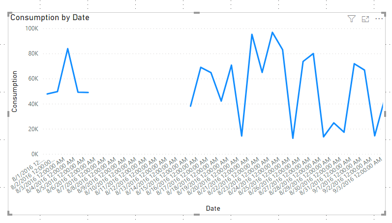
I have a pretty standard date table in my report and then I have an imported table where we have our company business days all mapped out. I successfully have a graph by calendar and and a graph by business day but when I look at the graph by business day there is a gap between the last business day of the last month and the first business day of the next month. For example it goes from 2/20/2020 to 3/1/2020 so there is an odd diagonal line in my line chart. Is there anyway I can get the visual to go from 2/20/2020 to 3/1/2020 without leaving space for the days between? Also if there is just a completely better way to do what I am trying to do I am open to it.
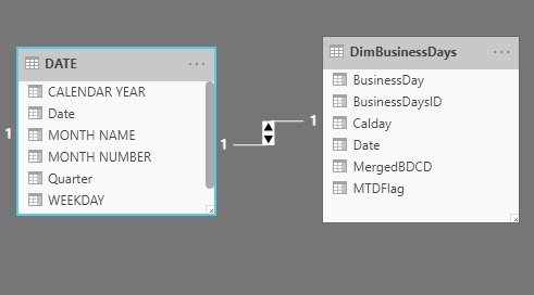
This is how my dates are set up. The date table was created with
DATE =
VAR MINYEAR = YEAR ( MIN ( Production[Day] ) )
VAR MAXYEAR = YEAR ( MAX ( Production[Day] ) )
RETURN
ADDCOLUMNS (
    FILTER (
        CALENDARAUTO( ),
        AND ( YEAR ( [DATE] ) >= MINYEAR, YEAR ( [DATE] ) <= MAXYEAR )
    ),
    "CALENDAR YEAR", "CY " & YEAR ( [DATE] ),
    "MONTH NAME", FORMAT ( [DATE], "MMMM" ),
    "MONTH NUMBER", MONTH ( [DATE] ),
    "WEEKDAY", FORMAT ( [DATE], "DDDD" ),
    "WEEKDAY NUMBER", WEEKDAY( [DATE] ),
    "Quarter", "Q" & TRUNC((MONTH([Date])-1)/3+1
))
And is linked to my business days table here. The business days are formatted 2/1/2020 to 2/20/2020 so its MM/"Business Day"/YYYY
This is what my graph looks like by business day and ideally I want to remove the yellow gaps between the days on the X axis.
Thank you.
Solved! Go to Solution.
- Mark as New
- Bookmark
- Subscribe
- Mute
- Subscribe to RSS Feed
- Permalink
- Report Inappropriate Content
Hi @Anonymous ,
Create a calendar table using below dax expression:
Table 2 = CALENDAR(MIN('Table'[Date]),MAX('Table'[Date]))
Then create relationships between the 2 tables.
Last in the line chart,use the calendar date as the X -axis,and you will see:
For the related .pbix file,pls click here.
Kelly
- Mark as New
- Bookmark
- Subscribe
- Mute
- Subscribe to RSS Feed
- Permalink
- Report Inappropriate Content
Follow on LinkedIn
@ me in replies or I'll lose your thread!!!
Instead of a Kudo, please vote for this idea
Become an expert!: Enterprise DNA
External Tools: MSHGQM
YouTube Channel!: Microsoft Hates Greg
Latest book!: DAX For Humans
DAX is easy, CALCULATE makes DAX hard...
- Mark as New
- Bookmark
- Subscribe
- Mute
- Subscribe to RSS Feed
- Permalink
- Report Inappropriate Content
Helpful resources

Power BI Monthly Update - November 2025
Check out the November 2025 Power BI update to learn about new features.

Fabric Data Days
Advance your Data & AI career with 50 days of live learning, contests, hands-on challenges, study groups & certifications and more!

| User | Count |
|---|---|
| 103 | |
| 80 | |
| 64 | |
| 50 | |
| 45 |


