FabCon is coming to Atlanta
Join us at FabCon Atlanta from March 16 - 20, 2026, for the ultimate Fabric, Power BI, AI and SQL community-led event. Save $200 with code FABCOMM.
Register now!- Power BI forums
- Get Help with Power BI
- Desktop
- Service
- Report Server
- Power Query
- Mobile Apps
- Developer
- DAX Commands and Tips
- Custom Visuals Development Discussion
- Health and Life Sciences
- Power BI Spanish forums
- Translated Spanish Desktop
- Training and Consulting
- Instructor Led Training
- Dashboard in a Day for Women, by Women
- Galleries
- Data Stories Gallery
- Themes Gallery
- Contests Gallery
- QuickViz Gallery
- Quick Measures Gallery
- Visual Calculations Gallery
- Notebook Gallery
- Translytical Task Flow Gallery
- TMDL Gallery
- R Script Showcase
- Webinars and Video Gallery
- Ideas
- Custom Visuals Ideas (read-only)
- Issues
- Issues
- Events
- Upcoming Events
The Power BI Data Visualization World Championships is back! Get ahead of the game and start preparing now! Learn more
- Power BI forums
- Forums
- Get Help with Power BI
- Desktop
- Re: Relationship
- Subscribe to RSS Feed
- Mark Topic as New
- Mark Topic as Read
- Float this Topic for Current User
- Bookmark
- Subscribe
- Printer Friendly Page
- Mark as New
- Bookmark
- Subscribe
- Mute
- Subscribe to RSS Feed
- Permalink
- Report Inappropriate Content
Relationship
Hi,
Need help.!
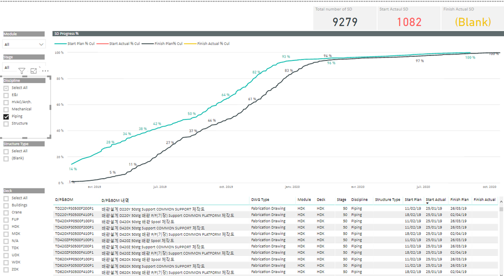
red line is supposed to appear in the graph. I think it's because of the relationship btw tables..
could you please let me know what i really missing?
thanks,
- Mark as New
- Bookmark
- Subscribe
- Mute
- Subscribe to RSS Feed
- Permalink
- Report Inappropriate Content
hi, @Anonymous
Please share your sample pbix file. You can upload it to OneDrive and post the link here. Do mask sensitive data before uploading.
Best Regards,
Lin
If this post helps, then please consider Accept it as the solution to help the other members find it more quickly.
- Mark as New
- Bookmark
- Subscribe
- Mute
- Subscribe to RSS Feed
- Permalink
- Report Inappropriate Content
Hi, can you get into the link below?
- Mark as New
- Bookmark
- Subscribe
- Mute
- Subscribe to RSS Feed
- Permalink
- Report Inappropriate Content
hi, @Anonymous
When you select "Piping" from Discipline, There really aren't any values(Start Actual % Cul ) in "Start Actual_Overall",
there should be something wrong with your model, what is your expected output when you select "Piping" from Discipline?
Best Regards,
Lin
If this post helps, then please consider Accept it as the solution to help the other members find it more quickly.
- Mark as New
- Bookmark
- Subscribe
- Mute
- Subscribe to RSS Feed
- Permalink
- Report Inappropriate Content
Hi, there is 1082 (start actual) progress. i want the red line appear in the graph..!
- Mark as New
- Bookmark
- Subscribe
- Mute
- Subscribe to RSS Feed
- Permalink
- Report Inappropriate Content
Hi,
I have got a query in power bi and the table what I'm trying to group or summarize then count has various coloums.
I want to show a cummulative % graph of Start, Finish Plan VS Start, Finish Actual by discipline.
Discipline / Plan Start Date/ Actual Start Date/ Plan Finish Date/ Actual Finish Date
Piping / 04/12/2018 / 01/02/2019 / 04/01/2019 / 08/02/2019
Piping / 06/12/2018 / 01/02/2019 / 04/01/2019 / 08/02/2019
Piping / 05/12/2018 / 01/02/2019 / 04/01/2019 / 08/02/2019
Piping / 07/12/2018 / 01/02/2019 / 04/01/2019/
Structure/ 04/01/2019 / 05/02/2019/
Structure/ 04/01/2019 / 05/02/2019/
Structure/ 03/01/2019 / 05/02/2019/
Structure/ 04/01/2019 / 08/02/2019 / 05/02/2019/
Machanical/ 04/01/2019/ 06/02/2019/
Machanical/ 05/04/2019/ 06/02/2019/
Machanical/ 05/07/2019/ 08/02/2019/ 06/02/2019/
What I need to group or summarize then count is look so:
- Calendar: have earliest to latest dates above talbe has
- for cumulative need to count blank as 0
- Total Number of Piping
Piping Table
Calendar/ Plan Start Date/ Actual Start Date/ Plan Finish Date/ Actual Finish Date / Plan Start Cul/ Total number
01/12/2018 1 1 1 1 1 80
02/12/2018 2 2 1 2 3 80
03/12/2018 4 2 1 3 7 80
04/12/2018 1 8 7 80
. 7 80
. 7 80
05/02/2019 1 8 7 80
06/02/2019 1 2 8 80
07/02/2019 1 1 2 9 80
08/02/2019 9 80
The goal is to take counted table by discipline to create cumulative graph that have 4 lines (Start plan date, Start actual date, Finish plan date and Finish actual date).
Thanks in advanced for any help.
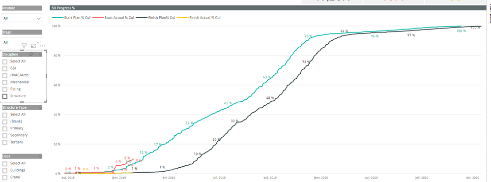
I've made a graph like so;
the problem is when i filter dicipline Piping ,for example, in the slicer. It doesn't show from 0% to 100%. so trying to make each dicipline tables.!
Helpful resources

Power BI Dataviz World Championships
The Power BI Data Visualization World Championships is back! Get ahead of the game and start preparing now!

| User | Count |
|---|---|
| 39 | |
| 38 | |
| 38 | |
| 28 | |
| 25 |
| User | Count |
|---|---|
| 124 | |
| 87 | |
| 70 | |
| 66 | |
| 65 |


