FabCon is coming to Atlanta
Join us at FabCon Atlanta from March 16 - 20, 2026, for the ultimate Fabric, Power BI, AI and SQL community-led event. Save $200 with code FABCOMM.
Register now!- Power BI forums
- Get Help with Power BI
- Desktop
- Service
- Report Server
- Power Query
- Mobile Apps
- Developer
- DAX Commands and Tips
- Custom Visuals Development Discussion
- Health and Life Sciences
- Power BI Spanish forums
- Translated Spanish Desktop
- Training and Consulting
- Instructor Led Training
- Dashboard in a Day for Women, by Women
- Galleries
- Data Stories Gallery
- Themes Gallery
- Contests Gallery
- QuickViz Gallery
- Quick Measures Gallery
- Visual Calculations Gallery
- Notebook Gallery
- Translytical Task Flow Gallery
- TMDL Gallery
- R Script Showcase
- Webinars and Video Gallery
- Ideas
- Custom Visuals Ideas (read-only)
- Issues
- Issues
- Events
- Upcoming Events
The Power BI Data Visualization World Championships is back! Get ahead of the game and start preparing now! Learn more
- Power BI forums
- Forums
- Get Help with Power BI
- Desktop
- Regarding Dynamic Y axis
- Subscribe to RSS Feed
- Mark Topic as New
- Mark Topic as Read
- Float this Topic for Current User
- Bookmark
- Subscribe
- Printer Friendly Page
- Mark as New
- Bookmark
- Subscribe
- Mute
- Subscribe to RSS Feed
- Permalink
- Report Inappropriate Content
Regarding Dynamic Y axis
Hi ,
I have 3 columns
1.start date
2.effort hours
3.duration
i want to display graph using stacked column chart
sample data :
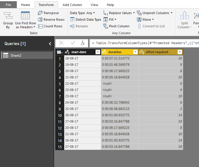
start-date duration effort required
18-08-17 0 00:07:31.514773 10
19-08-17 0 00:01:48.569579 9
20-08-17 0 00:06:17.669223 8
21-08-17 0 00:05:18.844028 10
22-08-17 <null> 9
23-08-17 <null> 9
23-08-17 <null> 10
24-08-17 0 00:06:32.708942 6
25-08-17 0 00:06:48.683115 2
26-08-17 0 00:01:00.933775 14
27-08-17 0 00:03:16.847788 10
20-08-17 0 00:06:17.669223 8
21-08-17 0 00:05:18.844028 10
26-08-17 0 00:01:00.933775 14
27-08-17 0 00:03:16.847788 10
requrement:
X-axis: start date
y-axis: should display duration and effort, based on slicer selection if we select duration it should should display start-date on x-axis and duration on yaxis ,if we select effort it should display start-date on x-axis and effort on y-axis.
Please help me
regards
Ravichadnra JL
- Mark as New
- Bookmark
- Subscribe
- Mute
- Subscribe to RSS Feed
- Permalink
- Report Inappropriate Content
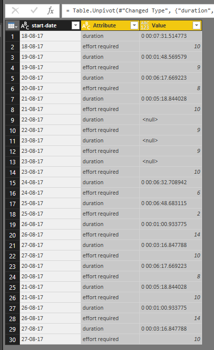
To display dynamic Y-axis, you need to modify the dataset by "Unpivot columns".
Then add the "Attribute" to the slicer, "value" to the Y-axis, However, the "Value" filed of the stacked column visual should be in number type, but "value" column above is of text type.
Best Regards
Maggie
Helpful resources

Power BI Monthly Update - November 2025
Check out the November 2025 Power BI update to learn about new features.

Fabric Data Days
Advance your Data & AI career with 50 days of live learning, contests, hands-on challenges, study groups & certifications and more!


