Join the Fabric User Panel to shape the future of Fabric.
Share feedback directly with Fabric product managers, participate in targeted research studies and influence the Fabric roadmap.
Sign up now- Power BI forums
- Get Help with Power BI
- Desktop
- Service
- Report Server
- Power Query
- Mobile Apps
- Developer
- DAX Commands and Tips
- Custom Visuals Development Discussion
- Health and Life Sciences
- Power BI Spanish forums
- Translated Spanish Desktop
- Training and Consulting
- Instructor Led Training
- Dashboard in a Day for Women, by Women
- Galleries
- Data Stories Gallery
- Themes Gallery
- Contests Gallery
- QuickViz Gallery
- Quick Measures Gallery
- Visual Calculations Gallery
- Notebook Gallery
- Translytical Task Flow Gallery
- TMDL Gallery
- R Script Showcase
- Webinars and Video Gallery
- Ideas
- Custom Visuals Ideas (read-only)
- Issues
- Issues
- Events
- Upcoming Events
Get Fabric certified for FREE! Don't miss your chance! Learn more
- Power BI forums
- Forums
- Get Help with Power BI
- Desktop
- Regarding Dynamic Y axis
- Subscribe to RSS Feed
- Mark Topic as New
- Mark Topic as Read
- Float this Topic for Current User
- Bookmark
- Subscribe
- Printer Friendly Page
- Mark as New
- Bookmark
- Subscribe
- Mute
- Subscribe to RSS Feed
- Permalink
- Report Inappropriate Content
Regarding Dynamic Y axis
Hi ,
I have 3 columns
1.start date
2.effort hours
3.duration
i want to display graph using stacked column chart
sample data :
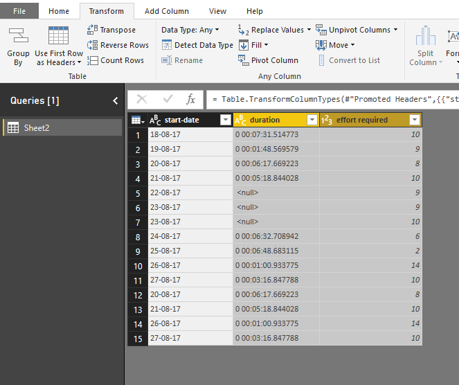
start-date duration effort required
18-08-17 0 00:07:31.514773 10
19-08-17 0 00:01:48.569579 9
20-08-17 0 00:06:17.669223 8
21-08-17 0 00:05:18.844028 10
22-08-17 <null> 9
23-08-17 <null> 9
23-08-17 <null> 10
24-08-17 0 00:06:32.708942 6
25-08-17 0 00:06:48.683115 2
26-08-17 0 00:01:00.933775 14
27-08-17 0 00:03:16.847788 10
20-08-17 0 00:06:17.669223 8
21-08-17 0 00:05:18.844028 10
26-08-17 0 00:01:00.933775 14
27-08-17 0 00:03:16.847788 10
requrement:
X-axis: start date
y-axis: should display duration and effort, based on slicer selection if we select duration it should should display start-date on x-axis and duration on yaxis ,if we select effort it should display start-date on x-axis and effort on y-axis.
Please help me
regards
Ravichadnra JL
- Mark as New
- Bookmark
- Subscribe
- Mute
- Subscribe to RSS Feed
- Permalink
- Report Inappropriate Content
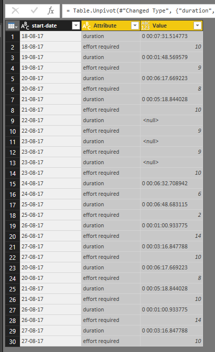
To display dynamic Y-axis, you need to modify the dataset by "Unpivot columns".
Then add the "Attribute" to the slicer, "value" to the Y-axis, However, the "Value" filed of the stacked column visual should be in number type, but "value" column above is of text type.
Best Regards
Maggie
Helpful resources

Join our Fabric User Panel
Share feedback directly with Fabric product managers, participate in targeted research studies and influence the Fabric roadmap.

| User | Count |
|---|---|
| 57 | |
| 53 | |
| 42 | |
| 18 | |
| 14 |
| User | Count |
|---|---|
| 111 | |
| 104 | |
| 36 | |
| 28 | |
| 27 |


