- Subscribe to RSS Feed
- Mark Topic as New
- Mark Topic as Read
- Float this Topic for Current User
- Bookmark
- Subscribe
- Printer Friendly Page
- Mark as New
- Bookmark
- Subscribe
- Mute
- Subscribe to RSS Feed
- Permalink
- Report Inappropriate Content
Radial Gauge charts with two value fields?
Hi everybody,
I use the gauge chart to display the sales volume of our company which works fine.
I would like to add an additional value for the sales volume which is in our pipeline.
Is there a way to add an additional value within the chart? If not what would you recommend to use to display
the confirmed sales volume and the upcoming sales volume and the coal?
Best regards,
Daniel
Solved! Go to Solution.
- Mark as New
- Bookmark
- Subscribe
- Mute
- Subscribe to RSS Feed
- Permalink
- Report Inappropriate Content
Hi @danielvt,
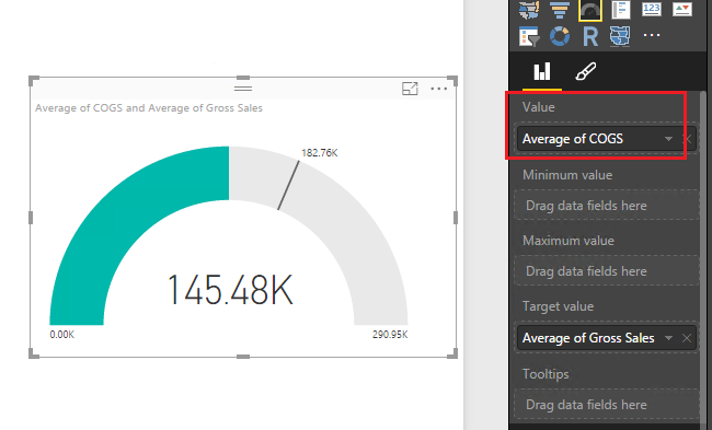
As mentioned before, we can only display one field value in a gauge visual, it's not supported to plot two fields values. Because we can only place one field in Value property:
To work around the issue, you can create a calculated column to return total value of confirmed and upcoming sales volume, then place this field in Value property.
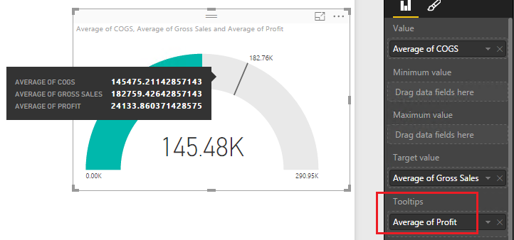
Or place upcoming sales volume in Tooltips property. When hovering on the visual, it will display upcoming value.
Best Regards,
Qiuyun Yu
If this post helps, then please consider Accept it as the solution to help the other members find it more quickly.
- Mark as New
- Bookmark
- Subscribe
- Mute
- Subscribe to RSS Feed
- Permalink
- Report Inappropriate Content
What measure did you create? I have a similar problem and would like to add 2 columns from 2 different data sets together. (To work around the issue, you can create a calculated column to return total value of confirmed and upcoming sales volume, then place this field in Value property.)
- Mark as New
- Bookmark
- Subscribe
- Mute
- Subscribe to RSS Feed
- Permalink
- Report Inappropriate Content
Hi @danielvt,
Firstly, I would suggest you take a look at this article about Radial Gauge visual: Tutorial: Radial Gauge charts in Power BI.
In your scenario, if you only place "the sales volume of our company" field in Value property, then you can place "the sales volume which is in our pipeline" in Target Value property, but you can not to place more one field in those two properties.
As you mentioned you want to display confirmed sales volume and the upcoming sales volume and the goal, I would like to know what's the relationship between those three fields? The goal is for total of confirmed sales volume and the upcoming sales or not? You can place confirmed sales volume in Value property and Goal in Target Value property. And upcoming sales in Tooltips Property.
If you have any question, please feel free to ask.
Best Regards,
Qiuyun Yu
If this post helps, then please consider Accept it as the solution to help the other members find it more quickly.
- Mark as New
- Bookmark
- Subscribe
- Mute
- Subscribe to RSS Feed
- Permalink
- Report Inappropriate Content
Hi Qiuyun,
thanks for you reply.
I would like to show the users two different things:
- The gap between the confirmed sales volume and the goal
- The gab between the confirmed sales volume+upcoming sales volume and the goal
As first idea I have greated the gauge chart and an additional slicer for the filtering.
From my point of view it would be perfekt, if I could differ the confirmed and upcoming sales volume
if both are displayed like on the following mockup.
The blue part is the confirmed sales volume and the red one the upcoming.
Could you send me a picture where I can find the tooltips property which you mentioned?
Best regards,
Daniel
- Mark as New
- Bookmark
- Subscribe
- Mute
- Subscribe to RSS Feed
- Permalink
- Report Inappropriate Content
I too would love to see a chart like this for the same exact situation. Sales + pipeline = total sales. And there should be different colors for the two different fields (i.e. sales and pipeline).
- Mark as New
- Bookmark
- Subscribe
- Mute
- Subscribe to RSS Feed
- Permalink
- Report Inappropriate Content
Hi @danielvt,
As mentioned before, we can only display one field value in a gauge visual, it's not supported to plot two fields values. Because we can only place one field in Value property:
To work around the issue, you can create a calculated column to return total value of confirmed and upcoming sales volume, then place this field in Value property.
Or place upcoming sales volume in Tooltips property. When hovering on the visual, it will display upcoming value.
Best Regards,
Qiuyun Yu
If this post helps, then please consider Accept it as the solution to help the other members find it more quickly.
Helpful resources
| Subject | Author | Posted | |
|---|---|---|---|
| 06-18-2024 11:56 PM | |||
| 11-17-2024 09:18 PM | |||
| 04-27-2022 06:08 AM | |||
| 09-10-2024 02:00 PM | |||
| 08-06-2024 10:49 PM |
| User | Count |
|---|---|
| 131 | |
| 102 | |
| 85 | |
| 53 | |
| 46 |


