A new Data Days event is coming soon!
This time we’re going bigger than ever. Fabric, Power BI, SQL, AI and more. We're covering it all. You won't want to miss it.
Learn more- Power BI forums
- Get Help with Power BI
- Desktop
- Service
- Report Server
- Power Query
- Mobile Apps
- Developer
- DAX Commands and Tips
- Custom Visuals Development Discussion
- Health and Life Sciences
- Power BI Spanish forums
- Translated Spanish Desktop
- Training and Consulting
- Instructor Led Training
- Dashboard in a Day for Women, by Women
- Galleries
- Data Stories Gallery
- Themes Gallery
- Contests Gallery
- QuickViz Gallery
- Quick Measures Gallery
- Visual Calculations Gallery
- Notebook Gallery
- Translytical Task Flow Gallery
- TMDL Gallery
- R Script Showcase
- Webinars and Video Gallery
- Ideas
- Custom Visuals Ideas (read-only)
- Issues
- Issues
- Events
- Upcoming Events
Level up your Power BI skills this month - build one visual each week and tell better stories with data! Get started
- Power BI forums
- Forums
- Get Help with Power BI
- Desktop
- Radar chart options
- Subscribe to RSS Feed
- Mark Topic as New
- Mark Topic as Read
- Float this Topic for Current User
- Bookmark
- Subscribe
- Printer Friendly Page
- Mark as New
- Bookmark
- Subscribe
- Mute
- Subscribe to RSS Feed
- Permalink
- Report Inappropriate Content
Radar chart options
Hi guys,
I have a queation about the radar chart.
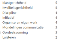
I have several competences added to a member of the team. Each competence gets a score between 1 and 5.
So for instance 1 of my members got the following score (picture 1)
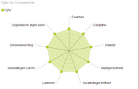
When i put this in a radar chart it looks like this (pictrure 2)
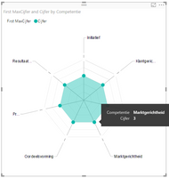
But when i have all my scores for instance on 4, it looks like this (picture 3)
What i want, is that my maximum score is always 5, so in picture 3 the radar should not go till this last line, but 1 before. You got my problem? Hope you can help me
Kind regards
Solved! Go to Solution.
- Mark as New
- Bookmark
- Subscribe
- Mute
- Subscribe to RSS Feed
- Permalink
- Report Inappropriate Content
Simple solution for this is to add maximum value for each competency that is 5 and bring both into Y Axis and change the colors..
- Mark as New
- Bookmark
- Subscribe
- Mute
- Subscribe to RSS Feed
- Permalink
- Report Inappropriate Content
Simple solution for this is to add maximum value for each competency that is 5 and bring both into Y Axis and change the colors..
- Mark as New
- Bookmark
- Subscribe
- Mute
- Subscribe to RSS Feed
- Permalink
- Report Inappropriate Content
Hi ,
I have chosen Max value 4 - for Red, Max Value 3 - for Orange, Max value 2 - for yellow , Max value 1 - Green.
But some how it is showing only lines but not filled colors. Could you pelase help me in this regard.
Thanks and Regards
Ravindra Babu Aluru
- Mark as New
- Bookmark
- Subscribe
- Mute
- Subscribe to RSS Feed
- Permalink
- Report Inappropriate Content
Thanks @cjayaneththi,
This is briljant and yet so easy haha! You're a genius!!
Also thanks for your reply @Eric_Zhang for testing some things out!
- Mark as New
- Bookmark
- Subscribe
- Mute
- Subscribe to RSS Feed
- Permalink
- Report Inappropriate Content
Hello
I have the same problem as @miltenburger but I still didn't understand your solution @cjayaneththi I'm sorry.
Can you be please more specific on how to add a maximum value ?
Thank you very much
- Mark as New
- Bookmark
- Subscribe
- Mute
- Subscribe to RSS Feed
- Permalink
- Report Inappropriate Content
You have to add the maximum value in your dataset, so create a new column max value, and put the values in
- Mark as New
- Bookmark
- Subscribe
- Mute
- Subscribe to RSS Feed
- Permalink
- Report Inappropriate Content
@miltenburger wrote:
Hi guys,
I have a queation about the radar chart.
I have several competences added to a member of the team. Each competence gets a score between 1 and 5.
So for instance 1 of my members got the following score (picture 1)
When i put this in a radar chart it looks like this (pictrure 2)
But when i have all my scores for instance on 4, it looks like this (picture 3)
What i want, is that my maximum score is always 5, so in picture 3 the radar should not go till this last line, but 1 before. You got my problem? Hope you can help me
Kind regards
I‘m afraid it is all by design, the 3rd pic is just as expected. Note that the level of grid lines doesn't indicate the very specific 1,2,3,4,5. You could test with 1,10,100,1000,10000. Once all categories has the same value, it shows as the 3rd picture.
Helpful resources

Power BI Monthly Update - April 2026
Check out the April 2026 Power BI update to learn about new features.

Data Days 2026 coming soon!
Sign up to receive a private message when registration opens and key events begin.

New to Fabric Survey
If you have recently started exploring Fabric, we'd love to hear how it's going. Your feedback can help with product improvements.

| User | Count |
|---|---|
| 39 | |
| 28 | |
| 28 | |
| 22 | |
| 18 |
| User | Count |
|---|---|
| 67 | |
| 37 | |
| 32 | |
| 26 | |
| 25 |


