FabCon is coming to Atlanta
Join us at FabCon Atlanta from March 16 - 20, 2026, for the ultimate Fabric, Power BI, AI and SQL community-led event. Save $200 with code FABCOMM.
Register now!- Power BI forums
- Get Help with Power BI
- Desktop
- Service
- Report Server
- Power Query
- Mobile Apps
- Developer
- DAX Commands and Tips
- Custom Visuals Development Discussion
- Health and Life Sciences
- Power BI Spanish forums
- Translated Spanish Desktop
- Training and Consulting
- Instructor Led Training
- Dashboard in a Day for Women, by Women
- Galleries
- Data Stories Gallery
- Themes Gallery
- Contests Gallery
- QuickViz Gallery
- Quick Measures Gallery
- Visual Calculations Gallery
- Notebook Gallery
- Translytical Task Flow Gallery
- TMDL Gallery
- R Script Showcase
- Webinars and Video Gallery
- Ideas
- Custom Visuals Ideas (read-only)
- Issues
- Issues
- Events
- Upcoming Events
The Power BI Data Visualization World Championships is back! Get ahead of the game and start preparing now! Learn more
- Power BI forums
- Forums
- Get Help with Power BI
- Desktop
- Re: R Visual with transparent background
- Subscribe to RSS Feed
- Mark Topic as New
- Mark Topic as Read
- Float this Topic for Current User
- Bookmark
- Subscribe
- Printer Friendly Page
- Mark as New
- Bookmark
- Subscribe
- Mute
- Subscribe to RSS Feed
- Permalink
- Report Inappropriate Content
R Visual with transparent background
Is it possible to create an R-Visual with a transparent background i.e. so that you can see an image added to the page background behing the plot the R-Visual generates?
Specifically I'm using ggplot2 and setting the fill of both plot.background andpanel.background to "transparent", but there still seems to be a white background between this and the background I can control through the PBI format options.
Solved! Go to Solution.
- Mark as New
- Bookmark
- Subscribe
- Mute
- Subscribe to RSS Feed
- Permalink
- Report Inappropriate Content
I don't know whether this will work with ggplot2 but in a visual I made based on the fmsb package I was able to work around this issue by using the par() function before the plotting was called:
# generic par function for graphical elements, call before the plotting
par(bg="transparent")

# this is wear the plotting of the visual actually happens
radarchart(data)
- Mark as New
- Bookmark
- Subscribe
- Mute
- Subscribe to RSS Feed
- Permalink
- Report Inappropriate Content
Any News on this issue in 2024 ??
- Mark as New
- Bookmark
- Subscribe
- Mute
- Subscribe to RSS Feed
- Permalink
- Report Inappropriate Content
I don't know whether this will work with ggplot2 but in a visual I made based on the fmsb package I was able to work around this issue by using the par() function before the plotting was called:
# generic par function for graphical elements, call before the plotting
par(bg="transparent")

# this is wear the plotting of the visual actually happens
radarchart(data)
- Mark as New
- Bookmark
- Subscribe
- Mute
- Subscribe to RSS Feed
- Permalink
- Report Inappropriate Content
I know this is an old thread but set the fill and the color of the element_rect layer equal to the background color
- Mark as New
- Bookmark
- Subscribe
- Mute
- Subscribe to RSS Feed
- Permalink
- Report Inappropriate Content
Hi @jfallt , the problem is that the page background is an image. I've not tested in a while, but have you been able to set the fill to transparent?
- Mark as New
- Bookmark
- Subscribe
- Mute
- Subscribe to RSS Feed
- Permalink
- Report Inappropriate Content
- Mark as New
- Bookmark
- Subscribe
- Mute
- Subscribe to RSS Feed
- Permalink
- Report Inappropriate Content
Hi
Do you solve the problem?
I have the same issue,too.
If you have already solved the problem, could you send me the method by email, cy-song@163.com ,please.
Thank you so much
I'm sorry
just try again
- Mark as New
- Bookmark
- Subscribe
- Mute
- Subscribe to RSS Feed
- Permalink
- Report Inappropriate Content
Were you able to figure this out?
- Mark as New
- Bookmark
- Subscribe
- Mute
- Subscribe to RSS Feed
- Permalink
- Report Inappropriate Content
Hi,
Could you figure this out?
- Mark as New
- Bookmark
- Subscribe
- Mute
- Subscribe to RSS Feed
- Permalink
- Report Inappropriate Content
No, I never found a solution for this
- Mark as New
- Bookmark
- Subscribe
- Mute
- Subscribe to RSS Feed
- Permalink
- Report Inappropriate Content
Is there a way this can be reported to Microsoft, because this really makes my visual not usable?
- Mark as New
- Bookmark
- Subscribe
- Mute
- Subscribe to RSS Feed
- Permalink
- Report Inappropriate Content
No, sorry. I never resolved this
- Mark as New
- Bookmark
- Subscribe
- Mute
- Subscribe to RSS Feed
- Permalink
- Report Inappropriate Content
Hi
Do you solve the problem?
I have the same issue,too.
If you have already solved the problem, could you send me the method by email, cy-song@163.com ,please.
Thank you so much
I'm sorry
just try again
- Mark as New
- Bookmark
- Subscribe
- Mute
- Subscribe to RSS Feed
- Permalink
- Report Inappropriate Content
Hi
Do you solve the problem?
I have the same issue,too.
If you have already solved the problem, could you send me the method by email, cy-song@163.com ,please.
Thank you so much
- Mark as New
- Bookmark
- Subscribe
- Mute
- Subscribe to RSS Feed
- Permalink
- Report Inappropriate Content
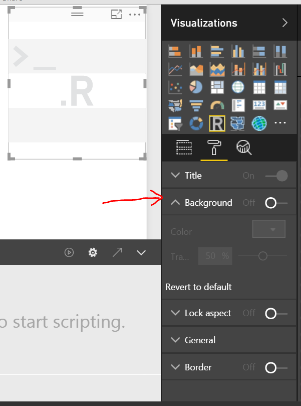
There is no option in Format pane to make the R visual background to be transparent. Only small part (around the R visual) can be transparent as below.
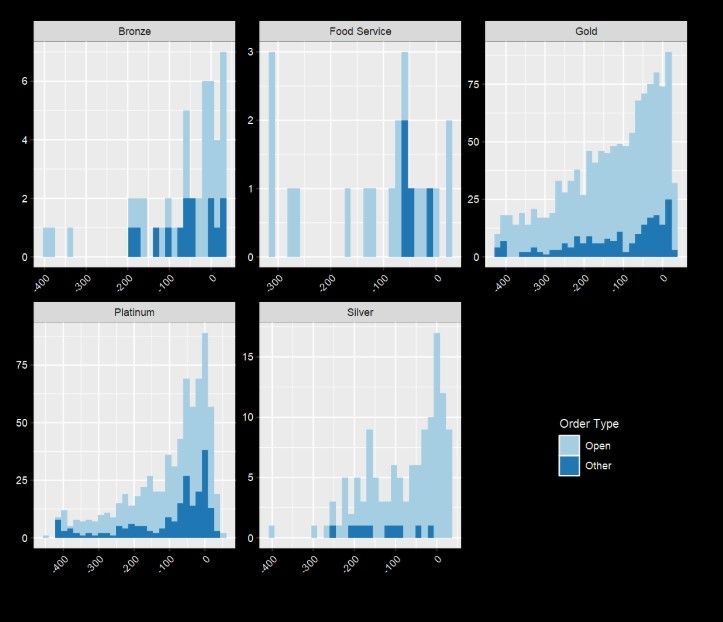
But we should be able to set bg="transparent" to make it to be transparent like below. Could you please share your R scripts written in the R script editor? Please also take a look at this link to see if it helps.
Best Regards,
Herbert
- Mark as New
- Bookmark
- Subscribe
- Mute
- Subscribe to RSS Feed
- Permalink
- Report Inappropriate Content
Thanks Herbert. This is the final part of my script:
g <- g + theme_void() +
theme(
    axis.text.x = element_text(angle = 45,size=11,vjust=0.9),
    legend.position="none",
    plot.background = element_rect(fill="transparent", color=NA),
    panel.background = element_rect(fill="transparent", color=NA)
  )

par(bg="transparent")

g
But as you can see I still have a white background:
- Mark as New
- Bookmark
- Subscribe
- Mute
- Subscribe to RSS Feed
- Permalink
- Report Inappropriate Content
How about the result if update the script as below? If problem still persists, could you please share your .pbix file?
panel.background = element_rect(fill = "transparent",colour = NA),
panel.grid.minor = element_blank(),
panel.grid.major = element_blank(),
plot.background = element_rect(fill = "transparent",colour = NA))
panel.background = theme_rect(fill = "transparent",colour = NA),
panel.grid.minor = theme_blank(),
panel.grid.major = theme_blank(),
plot.background = theme_rect(fill = "transparent",colour = NA)
Best Regards,
Herbert
- Mark as New
- Bookmark
- Subscribe
- Mute
- Subscribe to RSS Feed
- Permalink
- Report Inappropriate Content
I still have the same issue. I can't see how to upload a pbix, but here's the full code behind the visual.
"audience" is a text column providing the labels for my x-axis
"overlap" is an integer used to size the data points
"gindex" is a decimal, plotted on the y-axis
"indexColor" is either 1 or -1 and is used to colour the circles.
dataset <- data.frame(audience, overlap, gindex, indexColor)

library(ggplot2)

rescale <- function(x,over=dataset$overlap,minSize=5,maxSize=40) {
  x <- log(x)
  over <- log(over)

  rng <- range(over)

  ((x-rng[1])/(rng[2]-rng[1])) * (maxSize-minSize) + minSize

}

g <- ggplot(dataset,aes(audience,gindex))

#Lines

g <- g + geom_segment(aes(xend=audience,yend=0),linetype="dashed",size=1.5)

#Circles

g <- g + geom_point(aes(size=rescale(overlap),colour=indexColor)) +
  scale_size_identity() +
  scale_colour_gradientn(colours=c("#FF0000","#00FF00"))

#Ensure circles fit at top of plot (20 = maxSize used in rescale()/2) and
# remove gap between y-axis bottom of plot area

g <- g +
    scale_y_continuous(limits = c(0,max(dataset$gindex)+20), expand = c(0, 0))

#Labels for index values
g <- g + geom_text(aes(label=gindex), fontface = "bold")

#Remove unwanted styling,
#   Adjust axis labels
#
g <- g + theme_void() +
theme(
    axis.text.x = element_text(angle = 45,size=11,vjust=0.9),
    legend.position="none",
    panel.background = element_rect(fill = "transparent",colour = NA),
    panel.grid.minor = element_blank(),
    panel.grid.major = element_blank(),
    plot.background = element_rect(fill = "transparent",colour = NA)
  )

par(bg="transparent")

g
- Mark as New
- Bookmark
- Subscribe
- Mute
- Subscribe to RSS Feed
- Permalink
- Report Inappropriate Content
Hi
Do you solve the problem?
I have the same issue,too.
If you have already solved the problem, could you send me the method by email, cy-song@163.com ,please.
Thank you so much
- Mark as New
- Bookmark
- Subscribe
- Mute
- Subscribe to RSS Feed
- Permalink
- Report Inappropriate Content
- Mark as New
- Bookmark
- Subscribe
- Mute
- Subscribe to RSS Feed
- Permalink
- Report Inappropriate Content
Thanks Ankit. I do have that option set, but it just produces the result Herbert describes below.
Helpful resources

Power BI Dataviz World Championships
The Power BI Data Visualization World Championships is back! Get ahead of the game and start preparing now!

| User | Count |
|---|---|
| 39 | |
| 38 | |
| 38 | |
| 28 | |
| 27 |
| User | Count |
|---|---|
| 124 | |
| 88 | |
| 73 | |
| 66 | |
| 65 |
