FabCon is coming to Atlanta
Join us at FabCon Atlanta from March 16 - 20, 2026, for the ultimate Fabric, Power BI, AI and SQL community-led event. Save $200 with code FABCOMM.
Register now!- Power BI forums
- Get Help with Power BI
- Desktop
- Service
- Report Server
- Power Query
- Mobile Apps
- Developer
- DAX Commands and Tips
- Custom Visuals Development Discussion
- Health and Life Sciences
- Power BI Spanish forums
- Translated Spanish Desktop
- Training and Consulting
- Instructor Led Training
- Dashboard in a Day for Women, by Women
- Galleries
- Data Stories Gallery
- Themes Gallery
- Contests Gallery
- QuickViz Gallery
- Quick Measures Gallery
- Visual Calculations Gallery
- Notebook Gallery
- Translytical Task Flow Gallery
- TMDL Gallery
- R Script Showcase
- Webinars and Video Gallery
- Ideas
- Custom Visuals Ideas (read-only)
- Issues
- Issues
- Events
- Upcoming Events
The Power BI Data Visualization World Championships is back! Get ahead of the game and start preparing now! Learn more
- Power BI forums
- Forums
- Get Help with Power BI
- Desktop
- Question about graphics attributes
- Subscribe to RSS Feed
- Mark Topic as New
- Mark Topic as Read
- Float this Topic for Current User
- Bookmark
- Subscribe
- Printer Friendly Page
- Mark as New
- Bookmark
- Subscribe
- Mute
- Subscribe to RSS Feed
- Permalink
- Report Inappropriate Content
Question about graphics attributes
Hi,
I am trying to create some application that, between other things, will show places at the map (lat. & long.) using different graphics options, such as size, color, shape etc. (getting info from some Excel file).
Up to now, I was succeeded to do it with 4 Excel info columns: Location Latitude Longitude Size.
I put each column at appropriate place at the Power BI GUI, and I see each point as green circle at appropriate place at the map, with appropriate size.
But I cannot understand how can I change other graphics attributes, such as color and shape (for example).
Is it possible?
Mark.
Solved! Go to Solution.
- Mark as New
- Bookmark
- Subscribe
- Mute
- Subscribe to RSS Feed
- Permalink
- Report Inappropriate Content
The same thing, but with pictures this time! All of these options are identical regardless of the data source - that's the promise of Power BI, no matter where your data comes from you can treat it all the same in PBI. In this case, the promise is true. The following color options are identical for all sources. It does not matter if your data is coming in from Excel. Here's what @Seth_C_Bauer and I have been saying.
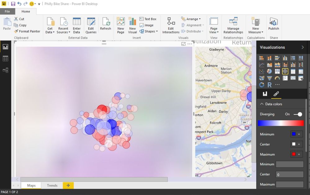
Saturation gives you a range between 2-3 colors based on the evaluation of a measure for the point plotted (depends on divergent or non-divergent)!

Your other option is to use the legend, which automatically assigns a unique color to every legend entry!
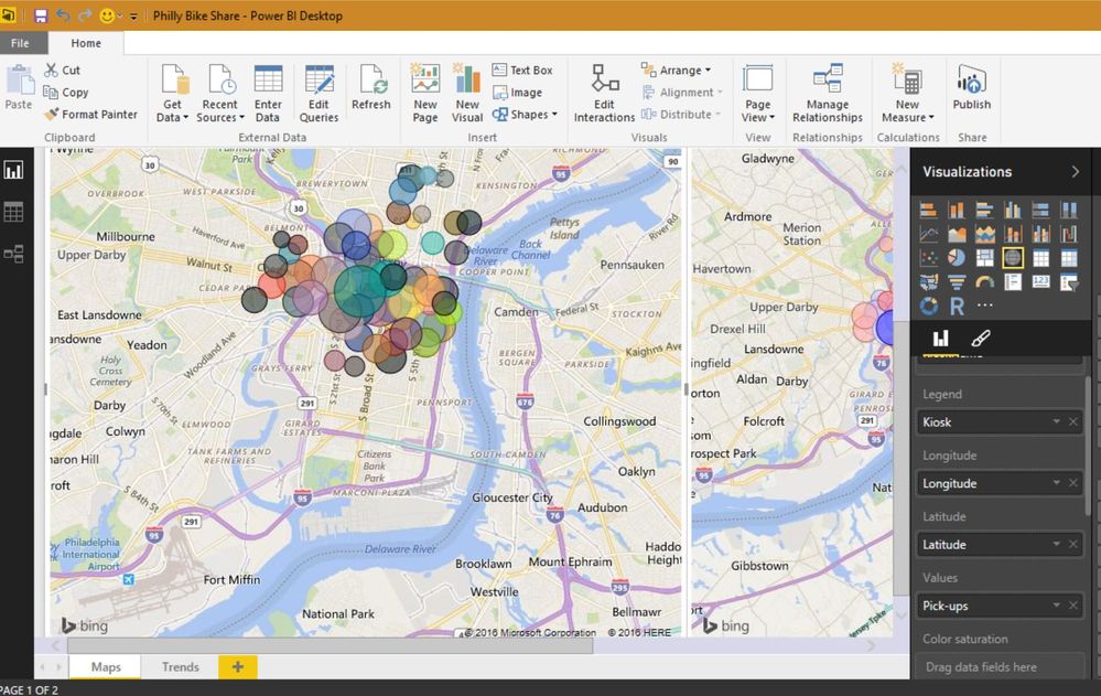
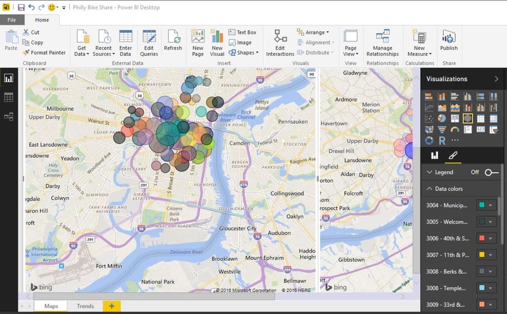
The keen observer will note that we used the same formatting menu, 'Data colors', for each of these options. Legend and color saturation are mutually exclusive in a map.
Have fun with your info from the Excel file.
- Mark as New
- Bookmark
- Subscribe
- Mute
- Subscribe to RSS Feed
- Permalink
- Report Inappropriate Content
Shape: no.
Color: You can use color saturation to set up a color scale based on numeric value.
You can change the color of specific legend entries manually.
- Mark as New
- Bookmark
- Subscribe
- Mute
- Subscribe to RSS Feed
- Permalink
- Report Inappropriate Content
Thank you for your answer.
OK, I understand that I cannot change the shape - it always will remain circle.
But what about color - it simply always will be green, with different levels of saturation?
Mark.
- Mark as New
- Bookmark
- Subscribe
- Mute
- Subscribe to RSS Feed
- Permalink
- Report Inappropriate Content
@Mark You can use a legend and select different colors in the format section (Paintbrush)
Looking for more Power BI tips, tricks & tools? Check out PowerBI.tips the site I co-own with Mike Carlo. Also, if you are near SE WI? Join our PUG Milwaukee Brew City PUG
- Mark as New
- Bookmark
- Subscribe
- Mute
- Subscribe to RSS Feed
- Permalink
- Report Inappropriate Content
OK, thank you, I will try it.
But, as I said, I need to get all the info from Excel file, and, as I understand, I cannot change the color using Excel (or any other external option) - only saturation. Is it true?
- Mark as New
- Bookmark
- Subscribe
- Mute
- Subscribe to RSS Feed
- Permalink
- Report Inappropriate Content
The same thing, but with pictures this time! All of these options are identical regardless of the data source - that's the promise of Power BI, no matter where your data comes from you can treat it all the same in PBI. In this case, the promise is true. The following color options are identical for all sources. It does not matter if your data is coming in from Excel. Here's what @Seth_C_Bauer and I have been saying.
Saturation gives you a range between 2-3 colors based on the evaluation of a measure for the point plotted (depends on divergent or non-divergent)!


Your other option is to use the legend, which automatically assigns a unique color to every legend entry!


The keen observer will note that we used the same formatting menu, 'Data colors', for each of these options. Legend and color saturation are mutually exclusive in a map.
Have fun with your info from the Excel file.
- Mark as New
- Bookmark
- Subscribe
- Mute
- Subscribe to RSS Feed
- Permalink
- Report Inappropriate Content
Thanks a lot for your explanations.
I am a new customer of Power BI, so not all is clear for me, but I will try to do what you are recommended.
Mark.
Helpful resources

Power BI Dataviz World Championships
The Power BI Data Visualization World Championships is back! Get ahead of the game and start preparing now!

| User | Count |
|---|---|
| 39 | |
| 37 | |
| 33 | |
| 32 | |
| 29 |
| User | Count |
|---|---|
| 133 | |
| 88 | |
| 85 | |
| 68 | |
| 64 |

