FabCon is coming to Atlanta
Join us at FabCon Atlanta from March 16 - 20, 2026, for the ultimate Fabric, Power BI, AI and SQL community-led event. Save $200 with code FABCOMM.
Register now!- Power BI forums
- Get Help with Power BI
- Desktop
- Service
- Report Server
- Power Query
- Mobile Apps
- Developer
- DAX Commands and Tips
- Custom Visuals Development Discussion
- Health and Life Sciences
- Power BI Spanish forums
- Translated Spanish Desktop
- Training and Consulting
- Instructor Led Training
- Dashboard in a Day for Women, by Women
- Galleries
- Data Stories Gallery
- Themes Gallery
- Contests Gallery
- QuickViz Gallery
- Quick Measures Gallery
- Visual Calculations Gallery
- Notebook Gallery
- Translytical Task Flow Gallery
- TMDL Gallery
- R Script Showcase
- Webinars and Video Gallery
- Ideas
- Custom Visuals Ideas (read-only)
- Issues
- Issues
- Events
- Upcoming Events
The Power BI Data Visualization World Championships is back! Get ahead of the game and start preparing now! Learn more
- Power BI forums
- Forums
- Get Help with Power BI
- Desktop
- Question about a SUMIF calculation in Power BI
- Subscribe to RSS Feed
- Mark Topic as New
- Mark Topic as Read
- Float this Topic for Current User
- Bookmark
- Subscribe
- Printer Friendly Page
- Mark as New
- Bookmark
- Subscribe
- Mute
- Subscribe to RSS Feed
- Permalink
- Report Inappropriate Content
Question about a SUMIF calculation in Power BI
Hello,
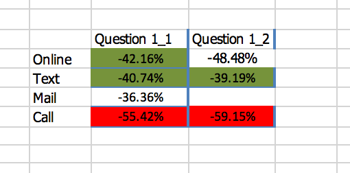
I have a formula that I was able to create in both Power BI and Excel. However, In Power BI I lost the functionaility that I really needed. Essentially I have all these different methods for which a customer can contact us and the for each method there is a calculation associated with their satisfaction. Essentially in Power BI I would like to be able to replicate what I can do in Excel. Basically, I need to be able to show the question column name and the results for each (this is a net promoter score calculation with a weight associated with it). I would like to be able to show the below numbers and color only those where the count of customers is greater than 50 (as an example) and the green and red colors would be based on the scores provided. Links to the files are below. My big problem is the inability to color code or exclude fields if the response count isn't over a specific number and then color coding the columns individually based on the scores provided.
https://drive.google.com/open?id=1sCdZnJSTtpwWhgGeUXc08wmbkImDAK26
https://drive.google.com/file/d/15iHZiuEb0MQt_OkAWYB9Yu-R9blg-1oX/view?usp=sharing
- Mark as New
- Bookmark
- Subscribe
- Mute
- Subscribe to RSS Feed
- Permalink
- Report Inappropriate Content
Hello,
I have a formula that I was able to create in both Power BI and Excel. However, In Power BI I lost the functionaility that I really needed. Essentially I have all these different methods for which a customer can contact us and the for each method there is a calculation associated with their satisfaction. Essentially in Power BI I would like to be able to replicate what I can do in Excel. Basically, I need to be able to show the question column name and the results for each (this is a net promoter score calculation with a weight associated with it). I would like to be able to show the below numbers and color only those where the count of customers is greater than 50 (as an example) and the green and red colors would be based on the scores provided. Links to the files are below. My big problem is the inability to color code or exclude fields if the response count isn't over a specific number and then color coding the columns individually based on the scores provided. Please note, the main thing is that I need to figure out how I can leverage the conditional formatting for the color requirement. Even if the process is manual that is OK also!
https://drive.google.com/open?id=1sCdZnJSTtpwWhgGeUXc08wmbkImDAK26
https://drive.google.com/file/d/15iHZiuEb0MQt_OkAWYB9Yu-R9blg-1oX/view?usp=sharing
- Mark as New
- Bookmark
- Subscribe
- Mute
- Subscribe to RSS Feed
- Permalink
- Report Inappropriate Content
Hi @nmckbcs
Just provided solution in another thread, i hope you will get an idea if you refer this.
Thanks
Raj
- Mark as New
- Bookmark
- Subscribe
- Mute
- Subscribe to RSS Feed
- Permalink
- Report Inappropriate Content
It makes a little sense but would need to know how to apply that to my issue. Any suggestions?
- Mark as New
- Bookmark
- Subscribe
- Mute
- Subscribe to RSS Feed
- Permalink
- Report Inappropriate Content
Can you explain what issue you are facing in conditional formatting? As per your email, you are able to get the values and you can do formatting for each column based on the value.....
Thanks
Raj
- Mark as New
- Bookmark
- Subscribe
- Mute
- Subscribe to RSS Feed
- Permalink
- Report Inappropriate Content
- Mark as New
- Bookmark
- Subscribe
- Mute
- Subscribe to RSS Feed
- Permalink
- Report Inappropriate Content
Hi @nmckbcs,
I would suggest you transform your data structure then it would be easy. Please refer to the demo in the attachment.
Best Regards,
Dale
If this post helps, then please consider Accept it as the solution to help the other members find it more quickly.
Helpful resources

Power BI Dataviz World Championships
The Power BI Data Visualization World Championships is back! Get ahead of the game and start preparing now!

| User | Count |
|---|---|
| 39 | |
| 38 | |
| 38 | |
| 28 | |
| 27 |
| User | Count |
|---|---|
| 124 | |
| 88 | |
| 73 | |
| 66 | |
| 65 |


