- Power BI forums
- Updates
- News & Announcements
- Get Help with Power BI
- Desktop
- Service
- Report Server
- Power Query
- Mobile Apps
- Developer
- DAX Commands and Tips
- Custom Visuals Development Discussion
- Health and Life Sciences
- Power BI Spanish forums
- Translated Spanish Desktop
- Power Platform Integration - Better Together!
- Power Platform Integrations (Read-only)
- Power Platform and Dynamics 365 Integrations (Read-only)
- Training and Consulting
- Instructor Led Training
- Dashboard in a Day for Women, by Women
- Galleries
- Community Connections & How-To Videos
- COVID-19 Data Stories Gallery
- Themes Gallery
- Data Stories Gallery
- R Script Showcase
- Webinars and Video Gallery
- Quick Measures Gallery
- 2021 MSBizAppsSummit Gallery
- 2020 MSBizAppsSummit Gallery
- 2019 MSBizAppsSummit Gallery
- Events
- Ideas
- Custom Visuals Ideas
- Issues
- Issues
- Events
- Upcoming Events
- Community Blog
- Power BI Community Blog
- Custom Visuals Community Blog
- Community Support
- Community Accounts & Registration
- Using the Community
- Community Feedback
Earn a 50% discount on the DP-600 certification exam by completing the Fabric 30 Days to Learn It challenge.
- Power BI forums
- Forums
- Get Help with Power BI
- Desktop
- Question about Box and Whisker chart
- Subscribe to RSS Feed
- Mark Topic as New
- Mark Topic as Read
- Float this Topic for Current User
- Bookmark
- Subscribe
- Printer Friendly Page
- Mark as New
- Bookmark
- Subscribe
- Mute
- Subscribe to RSS Feed
- Permalink
- Report Inappropriate Content
Question about Box and Whisker chart
I am in need of preparing dashboard with some statistical visualizations. Among others I need to show Boxplot chart.
I downloaded Box and Whisker by MAQ Software (which has ‘PBI Certified’ flag).
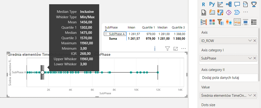
Trying it out I realized it gives me strange results, different that the ones I got using measures in the table / matrix.
I checked the data manually - the table numbers are correct.
Does anyone know / can explain mechanisms of this Box and Whisker by MAQ Software?
Measures in the table:
Mean = AVERAGE(Flow[TimeOnSubphase]),
Quartile 1 = PERCENTILE.inc(Flow[TimeOnSubphase],.25),
Median = MEDIAN(Flow[TimeOnSubphase]),
Quartile 3 = PERCENTILE.INC(Flow[TimeOnSubphase],.75)
Solved! Go to Solution.
- Mark as New
- Bookmark
- Subscribe
- Mute
- Subscribe to RSS Feed
- Permalink
- Report Inappropriate Content
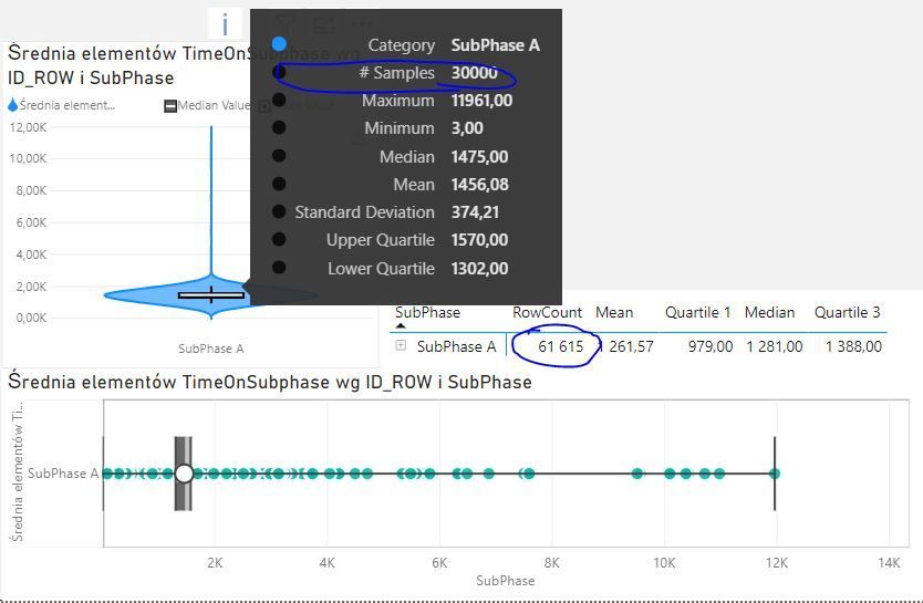
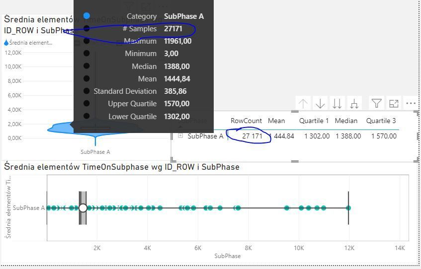
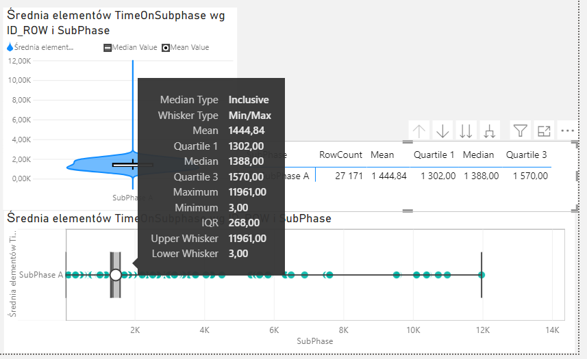
I finally figured out the answer to my question. The Box and Whisker by MAQ Software has limitation of 30000 sampling rows. I guess that it just simply disregards the rest of the rows... You can observe it when using another statistical visualization called Violin plot - this one also has limitation of 30k rows, which is visible on the tooltip. In first screen you can see comparison between Violin tooltip and my data - I had raw data with 60k+ rows. When I did some filtering on my data and went below 30k the numbers on both viz and table became consistent (screen 2 and 3).
In my humble opinion there should be some information about this limitation…


