Fabric Data Days starts November 4th!
Advance your Data & AI career with 50 days of live learning, dataviz contests, hands-on challenges, study groups & certifications and more!
Get registered- Power BI forums
- Get Help with Power BI
- Desktop
- Service
- Report Server
- Power Query
- Mobile Apps
- Developer
- DAX Commands and Tips
- Custom Visuals Development Discussion
- Health and Life Sciences
- Power BI Spanish forums
- Translated Spanish Desktop
- Training and Consulting
- Instructor Led Training
- Dashboard in a Day for Women, by Women
- Galleries
- Data Stories Gallery
- Themes Gallery
- Contests Gallery
- QuickViz Gallery
- Quick Measures Gallery
- Visual Calculations Gallery
- Notebook Gallery
- Translytical Task Flow Gallery
- TMDL Gallery
- R Script Showcase
- Webinars and Video Gallery
- Ideas
- Custom Visuals Ideas (read-only)
- Issues
- Issues
- Events
- Upcoming Events
Get Fabric Certified for FREE during Fabric Data Days. Don't miss your chance! Request now
- Power BI forums
- Forums
- Get Help with Power BI
- Desktop
- Re: Quadrant Chart and Scatter Chart NOT showing Y...
- Subscribe to RSS Feed
- Mark Topic as New
- Mark Topic as Read
- Float this Topic for Current User
- Bookmark
- Subscribe
- Printer Friendly Page
- Mark as New
- Bookmark
- Subscribe
- Mute
- Subscribe to RSS Feed
- Permalink
- Report Inappropriate Content
Quadrant Chart and Scatter Chart NOT showing Y axis values as expected
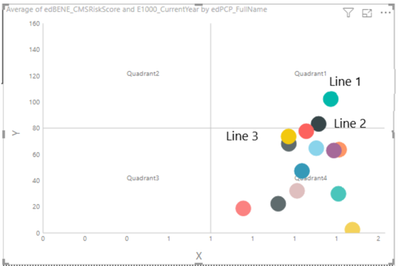
My E1000 Measure is not displaying correctly on the Quadrant Chart.
| Line 1 (Green) | 453 | 458 | 274 | 1010 | 102 |
| Line 3 (Yellow) | 337 | 330 | 202 | 980 | 83 |
| Line 2 (Black) | 430 | 373 | 224 | 868 | 74 |
Here is the picture of the Quadrant Chart. Scatter chart is doing the same thing. What am I doing wrong?
Solved! Go to Solution.
- Mark as New
- Bookmark
- Subscribe
- Mute
- Subscribe to RSS Feed
- Permalink
- Report Inappropriate Content
GO FIGURE! When I changed the PCP Name back to "Full Name" instead of Line 1, Line 2, Line 3, etc., the quadrant worked as expected. It must have been a hiccup with Power BI 😮
- Mark as New
- Bookmark
- Subscribe
- Mute
- Subscribe to RSS Feed
- Permalink
- Report Inappropriate Content
Hi @vstopp ,
I am not sure what desired result would you want. When you click PCP Line 1, what should the returned Y axis value be?
Best Regards,
Amy
- Mark as New
- Bookmark
- Subscribe
- Mute
- Subscribe to RSS Feed
- Permalink
- Report Inappropriate Content
GO FIGURE! When I changed the PCP Name back to "Full Name" instead of Line 1, Line 2, Line 3, etc., the quadrant worked as expected. It must have been a hiccup with Power BI 😮
- Mark as New
- Bookmark
- Subscribe
- Mute
- Subscribe to RSS Feed
- Permalink
- Report Inappropriate Content
Currently Line 1 is showing 102. When I click PCP Line 1, the quadrant shows 1010 (the desired result)
- Mark as New
- Bookmark
- Subscribe
- Mute
- Subscribe to RSS Feed
- Permalink
- Report Inappropriate Content
PS. The grand total for the E1000 is 748
Helpful resources

Power BI Monthly Update - November 2025
Check out the November 2025 Power BI update to learn about new features.

Fabric Data Days
Advance your Data & AI career with 50 days of live learning, contests, hands-on challenges, study groups & certifications and more!

| User | Count |
|---|---|
| 97 | |
| 70 | |
| 50 | |
| 42 | |
| 40 |

