Fabric Data Days starts November 4th!
Advance your Data & AI career with 50 days of live learning, dataviz contests, hands-on challenges, study groups & certifications and more!
Get registered- Power BI forums
- Get Help with Power BI
- Desktop
- Service
- Report Server
- Power Query
- Mobile Apps
- Developer
- DAX Commands and Tips
- Custom Visuals Development Discussion
- Health and Life Sciences
- Power BI Spanish forums
- Translated Spanish Desktop
- Training and Consulting
- Instructor Led Training
- Dashboard in a Day for Women, by Women
- Galleries
- Data Stories Gallery
- Themes Gallery
- Contests Gallery
- Quick Measures Gallery
- Visual Calculations Gallery
- Notebook Gallery
- Translytical Task Flow Gallery
- TMDL Gallery
- R Script Showcase
- Webinars and Video Gallery
- Ideas
- Custom Visuals Ideas (read-only)
- Issues
- Issues
- Events
- Upcoming Events
Join us at FabCon Atlanta from March 16 - 20, 2026, for the ultimate Fabric, Power BI, AI and SQL community-led event. Save $200 with code FABCOMM. Register now.
- Power BI forums
- Forums
- Get Help with Power BI
- Desktop
- Re: Python Visual - datestamps on x-Axis all over ...
- Subscribe to RSS Feed
- Mark Topic as New
- Mark Topic as Read
- Float this Topic for Current User
- Bookmark
- Subscribe
- Printer Friendly Page
- Mark as New
- Bookmark
- Subscribe
- Mute
- Subscribe to RSS Feed
- Permalink
- Report Inappropriate Content
Python Visual - datestamps on x-Axis all over the place
Hi,
I've created some Python visualisations and for the most part, they are working just fine.
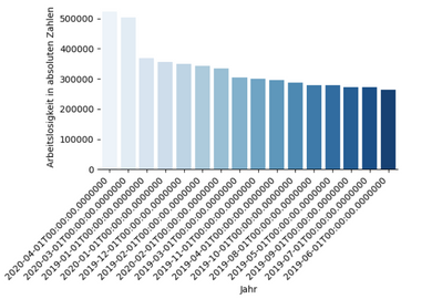
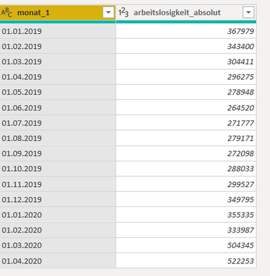
However, there is one visualisation, where I've got either bizarre date stamps (attachment 1),
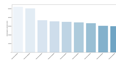
or if I convert the data to text in the query-editor, the order is getting disrupted (attachment 2).
In the query-editor, my data remains in the correct order and looks fine.
Any help regarding this problem would be very much appreciated!
Solved! Go to Solution.
- Mark as New
- Bookmark
- Subscribe
- Mute
- Subscribe to RSS Feed
- Permalink
- Report Inappropriate Content
Hi,
a week has passed and I managed to narrow the problem down to the following phenomenon:
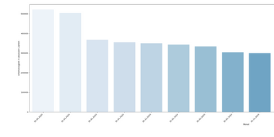
In most of my graphs, the time stamps on the x-axis are mixed up, even though the data is sorted
correctly in the data-menu.
I have made another screenshot of the behaviour to further clear up the problem:
As the visualisation is created with Python Visual, I am not able to sort the data manually in the report-menu.
Furthermore, it looks like only the labels on the x-axis are mixed up, the data itself seems to be sorted correctly.
Thanks for any answers regarding this problem.
- Mark as New
- Bookmark
- Subscribe
- Mute
- Subscribe to RSS Feed
- Permalink
- Report Inappropriate Content
Hi @DH27 ,
What's the data type of monat_1 column in Attachment 3?
Do we have sort by feature in the visual?
Best Regards,
Jay
- Mark as New
- Bookmark
- Subscribe
- Mute
- Subscribe to RSS Feed
- Permalink
- Report Inappropriate Content
Hi @Anonymous
thanks for your comment, the data type is text.
Unfortunately, I don't have the sort by feature for this visual.
- Mark as New
- Bookmark
- Subscribe
- Mute
- Subscribe to RSS Feed
- Permalink
- Report Inappropriate Content
Hi @DH27 ,
Since i can't restore your scenario, can you share your file to me if you don't have any Confidential Information?
Best Regards,
Jay
- Mark as New
- Bookmark
- Subscribe
- Mute
- Subscribe to RSS Feed
- Permalink
- Report Inappropriate Content
Hi @Anonymous
below you will find a Power BI file with the unemployment figures I am working on.
The first page has the problem with the mixed up dates, which I was showing in my
inital message in attachment 2, and the second page has the weird time format
of attachment 1.
I have used matplotlib and seaborn to create the visualisations.
Thanks again for your help,
DH27
Helpful resources

Fabric Data Days
Advance your Data & AI career with 50 days of live learning, contests, hands-on challenges, study groups & certifications and more!

Power BI Monthly Update - October 2025
Check out the October 2025 Power BI update to learn about new features.

| User | Count |
|---|---|
| 75 | |
| 36 | |
| 31 | |
| 29 | |
| 26 |
