Join us at the 2025 Microsoft Fabric Community Conference
Microsoft Fabric Community Conference 2025, March 31 - April 2, Las Vegas, Nevada. Use code MSCUST for a $150 discount.
Register now- Power BI forums
- Get Help with Power BI
- Desktop
- Service
- Report Server
- Power Query
- Mobile Apps
- Developer
- DAX Commands and Tips
- Custom Visuals Development Discussion
- Health and Life Sciences
- Power BI Spanish forums
- Translated Spanish Desktop
- Training and Consulting
- Instructor Led Training
- Dashboard in a Day for Women, by Women
- Galleries
- Webinars and Video Gallery
- Data Stories Gallery
- Themes Gallery
- Contests Gallery
- Quick Measures Gallery
- R Script Showcase
- COVID-19 Data Stories Gallery
- Community Connections & How-To Videos
- 2021 MSBizAppsSummit Gallery
- 2020 MSBizAppsSummit Gallery
- 2019 MSBizAppsSummit Gallery
- Events
- Ideas
- Custom Visuals Ideas
- Issues
- Issues
- Events
- Upcoming Events
The Power BI DataViz World Championships are on! With four chances to enter, you could win a spot in the LIVE Grand Finale in Las Vegas. Show off your skills.
- Power BI forums
- Forums
- Get Help with Power BI
- Desktop
- Putting a measure on x axis
- Subscribe to RSS Feed
- Mark Topic as New
- Mark Topic as Read
- Float this Topic for Current User
- Bookmark
- Subscribe
- Printer Friendly Page
- Mark as New
- Bookmark
- Subscribe
- Mute
- Subscribe to RSS Feed
- Permalink
- Report Inappropriate Content
Putting a measure on x axis
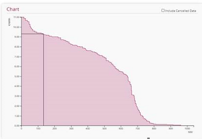
Hello, I have to create a chart like the one on in the picture below where on the Y axis I need to see bidPriceAmount and on the X axis the cumulativeBidQtyByPriceAmount.
The cumulativeBidQtyByPriceAmount is accumulated bidQty per bidPriceAmount (first is highest bidPriceAmount where the cumulativeBidQtyByPriceAmount is equal as the bidQty).
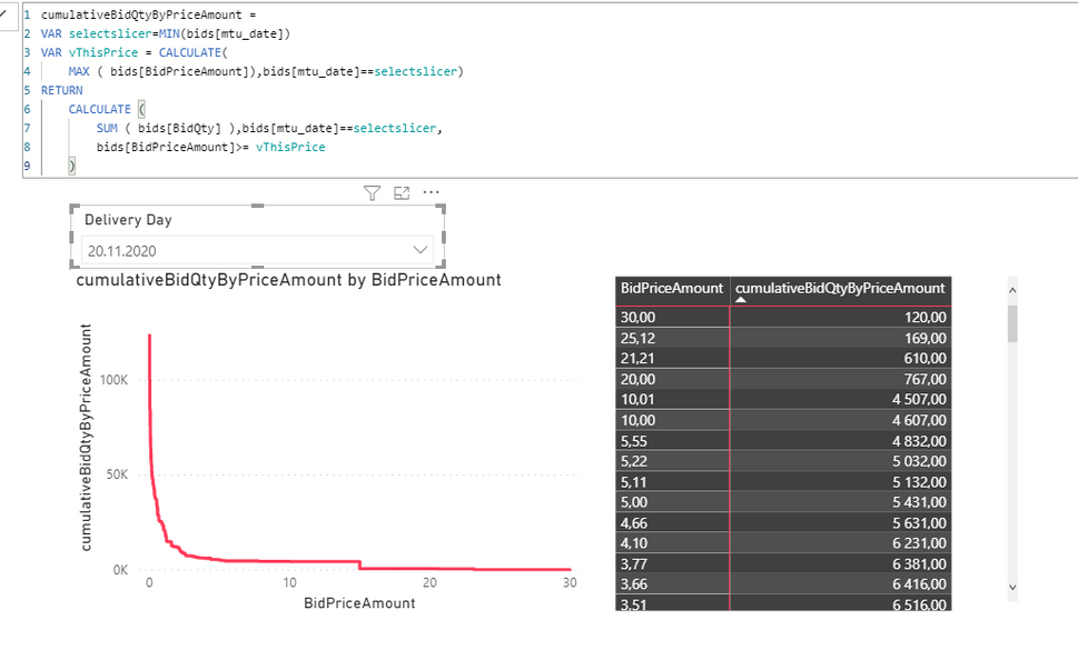
I managed to create the below. I created the measure for running totals which is working nicely with the slicer for Delivery Day.
The chart created is nice but I need to switch the axis somehow because I need to show the cumulativeBidQtyByPriceAmount in a stepped line chart on the X axis (and the BidPriceAmount on Y axis) which PowerBI won't let me to do because it is a measure.
Is there perhaps a way to switch the axis or do anything else to get to the intended result as shown in the first picture?
Any help is appreciated. Thank you very much
- Mark as New
- Bookmark
- Subscribe
- Mute
- Subscribe to RSS Feed
- Permalink
- Report Inappropriate Content
Hi @puchrova ,
Measure cannot be used as x-axis.
DAX measure are based on row context so any given value from slicers, filters, interactions with other visualizations and so on can influence your result.
Best Regards,
Liang
If this post helps, then please consider Accept it as the solution to help the other members find it more quickly.
- Mark as New
- Bookmark
- Subscribe
- Mute
- Subscribe to RSS Feed
- Permalink
- Report Inappropriate Content
@puchrova , for that you have to use scatter visual or bucket the X-axis measure
https://www.daxpatterns.com/dynamic-segmentation/
https://www.daxpatterns.com/static-segmentation/
Helpful resources
| User | Count |
|---|---|
| 121 | |
| 72 | |
| 71 | |
| 57 | |
| 50 |
| User | Count |
|---|---|
| 167 | |
| 83 | |
| 68 | |
| 65 | |
| 55 |


