A new Data Days event is coming soon!
This time we’re going bigger than ever. Fabric, Power BI, SQL, AI and more. We're covering it all. You won't want to miss it.
Learn more- Power BI forums
- Get Help with Power BI
- Desktop
- Service
- Report Server
- Power Query
- Mobile Apps
- Developer
- DAX Commands and Tips
- Custom Visuals Development Discussion
- Health and Life Sciences
- Power BI Spanish forums
- Translated Spanish Desktop
- Training and Consulting
- Instructor Led Training
- Dashboard in a Day for Women, by Women
- Galleries
- Data Stories Gallery
- Themes Gallery
- Contests Gallery
- QuickViz Gallery
- Quick Measures Gallery
- Visual Calculations Gallery
- Notebook Gallery
- Translytical Task Flow Gallery
- TMDL Gallery
- R Script Showcase
- Webinars and Video Gallery
- Ideas
- Custom Visuals Ideas (read-only)
- Issues
- Issues
- Events
- Upcoming Events
Level up your Power BI skills this month - build one visual each week and tell better stories with data! Get started
- Power BI forums
- Forums
- Get Help with Power BI
- Desktop
- Production Time Visualization without Dates
- Subscribe to RSS Feed
- Mark Topic as New
- Mark Topic as Read
- Float this Topic for Current User
- Bookmark
- Subscribe
- Printer Friendly Page
- Mark as New
- Bookmark
- Subscribe
- Mute
- Subscribe to RSS Feed
- Permalink
- Report Inappropriate Content
Production Time Visualization without Dates
I'm trying to come up with a visualization that shows production time over a 90 days period without using Start and End dates. I have the start and end dates but when using those in a visualization it just staggers the start date and end date (See pic below using the "as Timeline" visual) where what I'm intersted in is the pathway each product takes to completion while having the start and end normalized.
I played around with a stacked bar chart but the issue there is that some of the products go back to the same line over the course of the production pathway and the bar chart will just combine them.
A simplified sample table is shown below
Any help would be great!
Thanks
| Name | Production Order | Type | Start Date | End Date | Production Days |
| Product X | 1 | Line 1 | 10/1/2018 | 10/7/2018 | 6 |
| Product X | 2 | Line 4 | 10/7/2018 | 10/17/2018 | 10 |
| Product X | 3 | Line 3 | 10/17/2018 | 10/19/2018 | 2 |
| Product X | 4 | Line 1 | 10/19/2018 | 10/23/2018 | 4 |
| Product X | 5 | Line 4 | 10/23/2018 | 12/29/2018 | 67 |
| Product J | 1 | Line 2 | 10/6/2018 | 10/16/2018 | 10 |
| Product J | 2 | Line 5 | 10/16/2018 | 10/26/2018 | 10 |
| Product J | 3 | Line 4 | 10/26/2018 | 1/3/2019 | 69 |
- Mark as New
- Bookmark
- Subscribe
- Mute
- Subscribe to RSS Feed
- Permalink
- Report Inappropriate Content
Hi @Anonymous,
For "as Timeline" visual, Ihave no idea. However, you could try another visual.
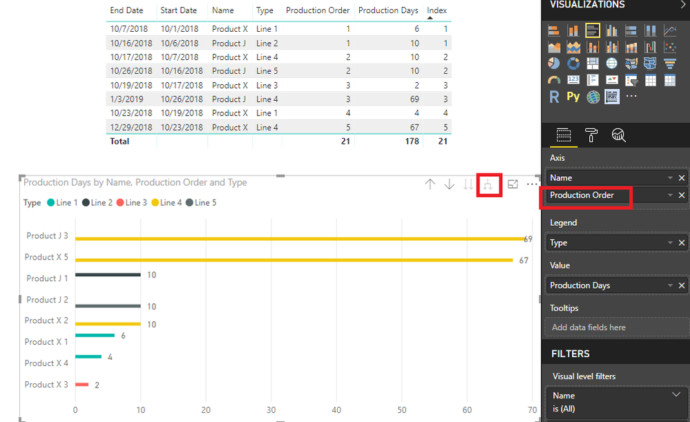
You could create a Clustered bar chart like below so that some of the products go back to the same line over the course of the production pathway and the bar chart will not combine them.
Best Regards,
Cherry
If this post helps, then please consider Accept it as the solution to help the other members find it more quickly.
Helpful resources

Power BI Monthly Update - April 2026
Check out the April 2026 Power BI update to learn about new features.

Data Days 2026 coming soon!
Sign up to receive a private message when registration opens and key events begin.

New to Fabric Survey
If you have recently started exploring Fabric, we'd love to hear how it's going. Your feedback can help with product improvements.

| User | Count |
|---|---|
| 37 | |
| 28 | |
| 28 | |
| 19 | |
| 18 |
| User | Count |
|---|---|
| 69 | |
| 38 | |
| 32 | |
| 28 | |
| 24 |


