- Power BI forums
- Updates
- News & Announcements
- Get Help with Power BI
- Desktop
- Service
- Report Server
- Power Query
- Mobile Apps
- Developer
- DAX Commands and Tips
- Custom Visuals Development Discussion
- Health and Life Sciences
- Power BI Spanish forums
- Translated Spanish Desktop
- Power Platform Integration - Better Together!
- Power Platform Integrations (Read-only)
- Power Platform and Dynamics 365 Integrations (Read-only)
- Training and Consulting
- Instructor Led Training
- Dashboard in a Day for Women, by Women
- Galleries
- Community Connections & How-To Videos
- COVID-19 Data Stories Gallery
- Themes Gallery
- Data Stories Gallery
- R Script Showcase
- Webinars and Video Gallery
- Quick Measures Gallery
- 2021 MSBizAppsSummit Gallery
- 2020 MSBizAppsSummit Gallery
- 2019 MSBizAppsSummit Gallery
- Events
- Ideas
- Custom Visuals Ideas
- Issues
- Issues
- Events
- Upcoming Events
- Community Blog
- Power BI Community Blog
- Custom Visuals Community Blog
- Community Support
- Community Accounts & Registration
- Using the Community
- Community Feedback
Register now to learn Fabric in free live sessions led by the best Microsoft experts. From Apr 16 to May 9, in English and Spanish.
- Power BI forums
- Forums
- Get Help with Power BI
- Desktop
- Producing Pie Charts and Bar charts via percentage...
- Subscribe to RSS Feed
- Mark Topic as New
- Mark Topic as Read
- Float this Topic for Current User
- Bookmark
- Subscribe
- Printer Friendly Page
- Mark as New
- Bookmark
- Subscribe
- Mute
- Subscribe to RSS Feed
- Permalink
- Report Inappropriate Content
Producing Pie Charts and Bar charts via percentages for groups
Hi,
I wonder if someone can help?
I have 3 stores, Red, Pink. For Red and Pink, I have cards detailing units sold between: (Small)0-100, (medium)101-500 (large) 501+. Which is great. On PBI I need to create a a bar chart showing both stores and the % of small, medium and large units sold. I also need to create a pie chart again in % showing % of small stores units sold v % of total units sold.
I attach PBI Sample report if anyone would like to take a look. Thank you.
https://drive.google.com/file/d/1GYAYxZaBMaxY5beGC-NRbI87lBxfNPte/view?usp=sharing
Solved! Go to Solution.
- Mark as New
- Bookmark
- Subscribe
- Mute
- Subscribe to RSS Feed
- Permalink
- Report Inappropriate Content
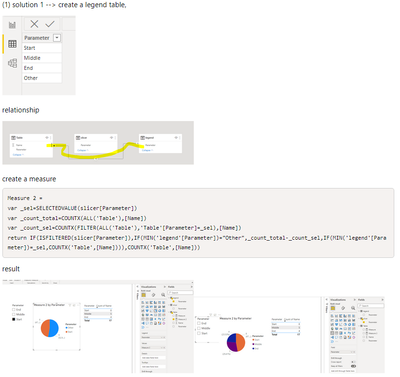
Hi @lennox25
please refer to my solution in this post with the similar question, Solved: Make pie chart show % of total population when fil... - Microsoft Power BI Community
Here are 2 solutions in that post for your reference,
For example, you can create a table containing ‘All Stores' and 'Small Stores'.
If you need more help, please let me know.
Best Regards,
Community Support Team _Tang
If this post helps, please consider Accept it as the solution to help the other members find it more quickly.
- Mark as New
- Bookmark
- Subscribe
- Mute
- Subscribe to RSS Feed
- Permalink
- Report Inappropriate Content
Hi @lennox25 ,
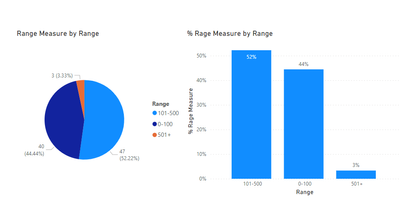
Use below measure for bar chart it will work same as Pie chart shows and make sure format measure as Percentage
% Rage Measure =
DIVIDE (
[Range Measure],
CALCULATE (
SUMX (
SUMMARIZE (
'Units Sold Range',
'Units Sold Range'[Range],
"X", [Range Measure]
),
[X]
),
ALL ( 'Units Sold Range' )
),
0
)
If this post helps, then please consider Accept it as the solution, Appreciate your Kudos!!
- Mark as New
- Bookmark
- Subscribe
- Mute
- Subscribe to RSS Feed
- Permalink
- Report Inappropriate Content
Hi @Jayee - What Im after is a pie chart (which Ive done in Excel) that looks like this. Is this possible?
- Mark as New
- Bookmark
- Subscribe
- Mute
- Subscribe to RSS Feed
- Permalink
- Report Inappropriate Content
Hi @lennox25
please refer to my solution in this post with the similar question, Solved: Make pie chart show % of total population when fil... - Microsoft Power BI Community
Here are 2 solutions in that post for your reference,
For example, you can create a table containing ‘All Stores' and 'Small Stores'.
If you need more help, please let me know.
Best Regards,
Community Support Team _Tang
If this post helps, please consider Accept it as the solution to help the other members find it more quickly.
- Mark as New
- Bookmark
- Subscribe
- Mute
- Subscribe to RSS Feed
- Permalink
- Report Inappropriate Content
Hi @lennox25
If you have data structure in power bi same as excel you have while creating this Yes it is possible.
If this post helps, then please consider Accept it as the solution, Appreciate your Kudos!!
- Mark as New
- Bookmark
- Subscribe
- Mute
- Subscribe to RSS Feed
- Permalink
- Report Inappropriate Content
Hi @lennox25 ,
For Pie Chart select Range Measure and Range fields in pie chart and in format options select "Percent of total"
Thanks,
Jay
- Mark as New
- Bookmark
- Subscribe
- Mute
- Subscribe to RSS Feed
- Permalink
- Report Inappropriate Content
Hi @Jayee - Thank you for this. But what I need is to show the % of Small along with % of Total so it would look like 52% Small and 48% Total.
Helpful resources

Microsoft Fabric Learn Together
Covering the world! 9:00-10:30 AM Sydney, 4:00-5:30 PM CET (Paris/Berlin), 7:00-8:30 PM Mexico City

Power BI Monthly Update - April 2024
Check out the April 2024 Power BI update to learn about new features.

| User | Count |
|---|---|
| 114 | |
| 100 | |
| 81 | |
| 70 | |
| 62 |
| User | Count |
|---|---|
| 147 | |
| 116 | |
| 104 | |
| 88 | |
| 65 |


