FabCon is coming to Atlanta
Join us at FabCon Atlanta from March 16 - 20, 2026, for the ultimate Fabric, Power BI, AI and SQL community-led event. Save $200 with code FABCOMM.
Register now!- Power BI forums
- Get Help with Power BI
- Desktop
- Service
- Report Server
- Power Query
- Mobile Apps
- Developer
- DAX Commands and Tips
- Custom Visuals Development Discussion
- Health and Life Sciences
- Power BI Spanish forums
- Translated Spanish Desktop
- Training and Consulting
- Instructor Led Training
- Dashboard in a Day for Women, by Women
- Galleries
- Data Stories Gallery
- Themes Gallery
- Contests Gallery
- Quick Measures Gallery
- Notebook Gallery
- Translytical Task Flow Gallery
- TMDL Gallery
- R Script Showcase
- Webinars and Video Gallery
- Ideas
- Custom Visuals Ideas (read-only)
- Issues
- Issues
- Events
- Upcoming Events
To celebrate FabCon Vienna, we are offering 50% off select exams. Ends October 3rd. Request your discount now.
- Power BI forums
- Forums
- Get Help with Power BI
- Desktop
- Problems with continous and categorical x axis (bo...
- Subscribe to RSS Feed
- Mark Topic as New
- Mark Topic as Read
- Float this Topic for Current User
- Bookmark
- Subscribe
- Printer Friendly Page
- Mark as New
- Bookmark
- Subscribe
- Mute
- Subscribe to RSS Feed
- Permalink
- Report Inappropriate Content
Problems with continous and categorical x axis (both values and chart styling)
Dear all,
would like to get your help in the following. Got a date table (date hierarchy column) connected with sales table. Would like to show the periodical evolution of the total sales amount on customers The continous chart type shows the correct total values for the y axis (somewhat 16M per period within 2020, see below).
continous (correct):
When I change to categorical the overall sum amounts considerably less (somewhat 0.4M per period within 2020, see below).
categorical(incorrect):
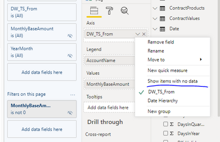
OK, so I go with the continous type, so far so good. Now my problem is that, when I have a customer with items with no data(see screeenshot of this customer below), I would like to see a gap in the chart - in this particular case stacked area chart having a blank area between August 2020 and May 2021. Adjusting the show items with no data for the axis option does not help(see below.)
To wrap up, switching to categorical x axis type together with the active Show items with no data option DOES solve the visual problem, however I am running into the problem described in the beginning which is that I am getting WRONG values for the totals (see second screenshot in this post). Can you please help me in 1) displaying the correct values (which I am currently getting with continous chart type) as well as displaying correct visual (ideally stacked area chart with blank values for periods with no data, see below)
correct:
Thank you in advance for your help
Best,
Tomas
Solved! Go to Solution.
- Mark as New
- Bookmark
- Subscribe
- Mute
- Subscribe to RSS Feed
- Permalink
- Report Inappropriate Content
Hi @TomasSamu ,
As mentioned before, I will attach a sample file.
Best Regards,
Liang
If this post helps, then please consider Accept it as the solution to help the other members find it more quickly.
- Mark as New
- Bookmark
- Subscribe
- Mute
- Subscribe to RSS Feed
- Permalink
- Report Inappropriate Content
Hi @TomasSamu ,
Create a measure like this :
Total Incident = IF(ISBLANK(SUM(table[MonthlyBaseAmout])),0,SUM(table[MonthlyBaseAmout]))Drag the measure into the value field.
Use a hierarchy of date columns and retain only the year / month.
Best Regards,
Liang
If this post helps, then please consider Accept it as the solution to help the other members find it more quickly.
- Mark as New
- Bookmark
- Subscribe
- Mute
- Subscribe to RSS Feed
- Permalink
- Report Inappropriate Content
Hello,
thanks for the resnponse @V-lianl-msft , however I am not sure what this measure solves. Tried this out but does not seem to work. Should this solve the problem with data inacurracy I am getting from categorical x axis type?
Maybe my explanation was a little messy so try to clarify once again.
So, my first question is why am I getting different values (on y axis) for categorical and continuous x axis types? This happens when my slicers are not active (hence no filter applied). Categorical is indeed inaccurate in my case. The categorical x axis type however allows me to display a chart with blank area for the periods for which there are no values (show items with no data option active). See my last screenshot in my first post for reference. I would like to combine the 2 together - obviously I need correct values (continuous) and good visual (categorical). Opting for one of the x-axis type solvews one of the 2 issues which is insufficient.
Hope I clarified.
Thanks in advance!
Tomas
- Mark as New
- Bookmark
- Subscribe
- Mute
- Subscribe to RSS Feed
- Permalink
- Report Inappropriate Content
Hi @TomasSamu ,
As mentioned before, I will attach a sample file.
Best Regards,
Liang
If this post helps, then please consider Accept it as the solution to help the other members find it more quickly.


