A new Data Days event is coming soon!
This time we’re going bigger than ever. Fabric, Power BI, SQL, AI and more. We're covering it all. You won't want to miss it.
Learn more- Power BI forums
- Get Help with Power BI
- Desktop
- Service
- Report Server
- Power Query
- Mobile Apps
- Developer
- DAX Commands and Tips
- Custom Visuals Development Discussion
- Health and Life Sciences
- Power BI Spanish forums
- Translated Spanish Desktop
- Training and Consulting
- Instructor Led Training
- Dashboard in a Day for Women, by Women
- Galleries
- Data Stories Gallery
- Themes Gallery
- Contests Gallery
- QuickViz Gallery
- Quick Measures Gallery
- Visual Calculations Gallery
- Notebook Gallery
- Translytical Task Flow Gallery
- TMDL Gallery
- R Script Showcase
- Webinars and Video Gallery
- Ideas
- Custom Visuals Ideas (read-only)
- Issues
- Issues
- Events
- Upcoming Events
Did you hear? There's a new SQL AI Developer certification (DP-800). Start preparing now and be one of the first to get certified. Register now
- Power BI forums
- Forums
- Get Help with Power BI
- Desktop
- Re: Problem with line graph
- Subscribe to RSS Feed
- Mark Topic as New
- Mark Topic as Read
- Float this Topic for Current User
- Bookmark
- Subscribe
- Printer Friendly Page
- Mark as New
- Bookmark
- Subscribe
- Mute
- Subscribe to RSS Feed
- Permalink
- Report Inappropriate Content
Problem with line graph
Hello
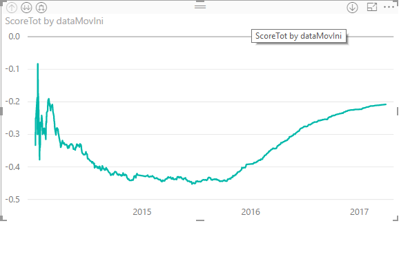
I have the following graph with no legend:
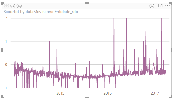
And this the same graph with added Legend
Why is that happening? This is wrecking my dashboard
- Mark as New
- Bookmark
- Subscribe
- Mute
- Subscribe to RSS Feed
- Permalink
- Report Inappropriate Content
Can you share your pbix, very hard to diagnose this issue without know how the legend item and the other data points are related.
I hope this helps,
Richard
Did I answer your question? Mark my post as a solution! Kudos Appreciated!
Proud to be a Super User!
- Mark as New
- Bookmark
- Subscribe
- Mute
- Subscribe to RSS Feed
- Permalink
- Report Inappropriate Content
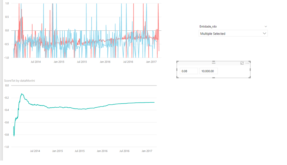
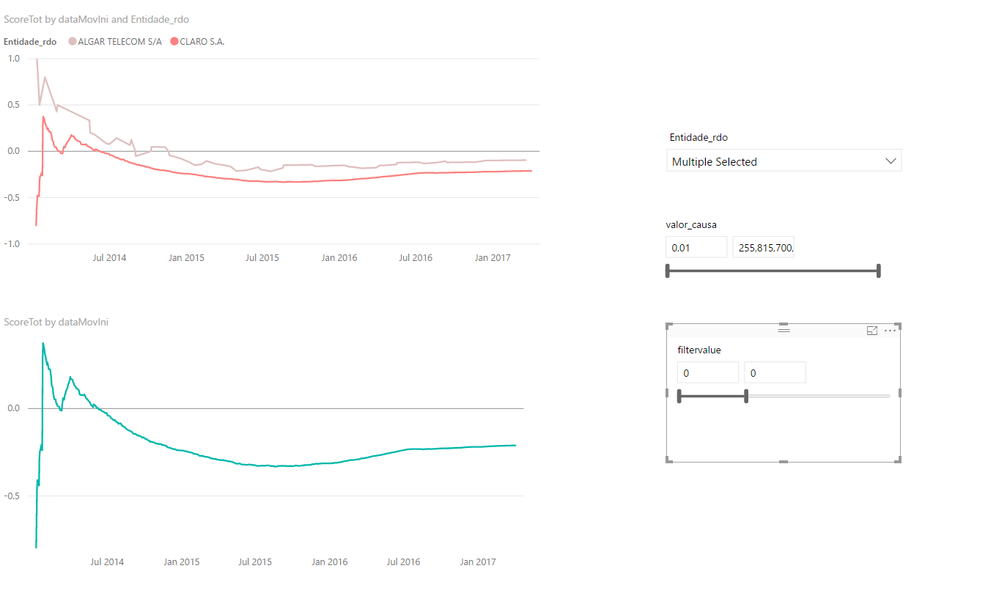
I can but will take time but have a look. With an extra filter in a differen column i have the issue
The filter is a simpler slide - let me know if you can figure out -if not I ll sent the file
without the filter, no problem
- Mark as New
- Bookmark
- Subscribe
- Mute
- Subscribe to RSS Feed
- Permalink
- Report Inappropriate Content
What value are you using for the slicer and how is it related to the filter and measure?
I hope this helps,
Richard
Did I answer your question? Mark my post as a solution! Kudos Appreciated!
Proud to be a Super User!
- Mark as New
- Bookmark
- Subscribe
- Mute
- Subscribe to RSS Feed
- Permalink
- Report Inappropriate Content
Unrelated... the slide measure is not used on the measure (below) - the only difference between the correct graph and the messy one is that I removed the slide on a column that is not used on the measure.
ScoreTot =
CALCULATE (
(sumX(FILTER(Dados, Dados[resultado]="a"),Dados[Numrec]*[PesoAcordo])-
sumX(FILTER(Dados, Dados[resultado]="p"),Dados[Numrec])+
sumX(FILTER(Dados, Dados[resultado]="i"),Dados[Numrec])-
sumX(FILTER(Dados, Dados[resultado]="r"),Dados[Numrec])+
sumX(FILTER(Dados, Dados[resultado]="e"),Dados[Numrec])
)/sum(Dados[NumRecords]),
FILTER(ALL ( Dados[dataMovIni] ),
Dados[dataMovIni] <= MAX ( Dados[dataMovIni] ) )
)
- Mark as New
- Bookmark
- Subscribe
- Mute
- Subscribe to RSS Feed
- Permalink
- Report Inappropriate Content
My guess is that the slice value is effecting the filter context of your measure.
I hope this helps,
Richard
Did I answer your question? Mark my post as a solution! Kudos Appreciated!
Proud to be a Super User!
- Mark as New
- Bookmark
- Subscribe
- Mute
- Subscribe to RSS Feed
- Permalink
- Report Inappropriate Content
I did a calculated column when 1 is for values > 10000 and 0 for less. It worked -
**bleep**, how come a slices is different than a calculated column????????
Helpful resources

Power BI Monthly Update - April 2026
Check out the April 2026 Power BI update to learn about new features.

Data Days 2026 coming soon!
Sign up to receive a private message when registration opens and key events begin.

New to Fabric Survey
If you have recently started exploring Fabric, we'd love to hear how it's going. Your feedback can help with product improvements.

| User | Count |
|---|---|
| 34 | |
| 31 | |
| 25 | |
| 20 | |
| 16 |
| User | Count |
|---|---|
| 60 | |
| 48 | |
| 29 | |
| 23 | |
| 23 |


