FabCon is coming to Atlanta
Join us at FabCon Atlanta from March 16 - 20, 2026, for the ultimate Fabric, Power BI, AI and SQL community-led event. Save $200 with code FABCOMM.
Register now!- Power BI forums
- Get Help with Power BI
- Desktop
- Service
- Report Server
- Power Query
- Mobile Apps
- Developer
- DAX Commands and Tips
- Custom Visuals Development Discussion
- Health and Life Sciences
- Power BI Spanish forums
- Translated Spanish Desktop
- Training and Consulting
- Instructor Led Training
- Dashboard in a Day for Women, by Women
- Galleries
- Data Stories Gallery
- Themes Gallery
- Contests Gallery
- QuickViz Gallery
- Quick Measures Gallery
- Visual Calculations Gallery
- Notebook Gallery
- Translytical Task Flow Gallery
- TMDL Gallery
- R Script Showcase
- Webinars and Video Gallery
- Ideas
- Custom Visuals Ideas (read-only)
- Issues
- Issues
- Events
- Upcoming Events
View all the Fabric Data Days sessions on demand. View schedule
- Power BI forums
- Forums
- Get Help with Power BI
- Desktop
- Re: Problem using 12-hour time format on X axis of...
- Subscribe to RSS Feed
- Mark Topic as New
- Mark Topic as Read
- Float this Topic for Current User
- Bookmark
- Subscribe
- Printer Friendly Page
- Mark as New
- Bookmark
- Subscribe
- Mute
- Subscribe to RSS Feed
- Permalink
- Report Inappropriate Content
Problem using 12-hour time format on X axis of an area chart
Hello Everyone,
I hope you all are doing great.
I am having a problem using an area graph to show hourly call traffic on the Y-axis and time on the X-axis. The X-axis is showing the 24-hour time format, but the client wants to see a 12-hour time format on the X-axis. I am sharing all the screenshots of the same to help you understand the problem well.
I am able to plot the area chart as follows:
But I want to show the area chart as follows:
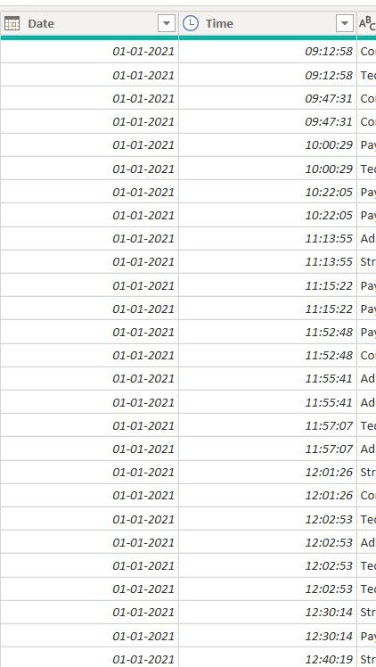
I have the data as follows:
From the above time column, I have extracted the hour to use the same in the area chart.
Could you please help me out with this?
Thank you in anticipation.
Solved! Go to Solution.
- Mark as New
- Bookmark
- Subscribe
- Mute
- Subscribe to RSS Feed
- Permalink
- Report Inappropriate Content
| Thanks to the great efforts by MS engineers to simplify syntax of DAX! Most beginners are SUCCESSFULLY MISLED to think that they could easily master DAX; but it turns out that the intricacy of the most frequently used RANKX() is still way beyond their comprehension! |
DAX is simple, but NOT EASY! |
- Mark as New
- Bookmark
- Subscribe
- Mute
- Subscribe to RSS Feed
- Permalink
- Report Inappropriate Content
Thank you so much, sir/ma'am, it's working like a charm. I really appreciate your help.
Helpful resources

Power BI Monthly Update - November 2025
Check out the November 2025 Power BI update to learn about new features.

Fabric Data Days
Advance your Data & AI career with 50 days of live learning, contests, hands-on challenges, study groups & certifications and more!


