- Subscribe to RSS Feed
- Mark Topic as New
- Mark Topic as Read
- Float this Topic for Current User
- Bookmark
- Subscribe
- Printer Friendly Page
- Mark as New
- Bookmark
- Subscribe
- Mute
- Subscribe to RSS Feed
- Permalink
- Report Inappropriate Content

Problem filtering a radar chart by a measure of a related table
Hi!
My case scenario is a bit complex to explain, so I attach a link to a dummy pbix file to support the explanation of my question: https://we.tl/t-0iqAlDfHs3
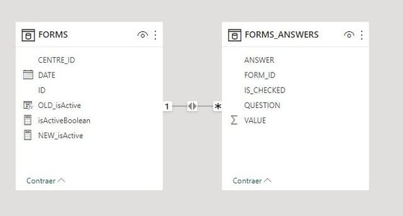
I have two tables with a FORMS.ID 1:*FORMS_ANSWERS.FORM_ID relation:
I have two measures, NEW_isActive, that returns the last form ID of each center, and isActiveBoolean that returns 1 or 0 depending if NEW_isActive returns an Id or not. I want my charts to show just the data of the active forms, in other words, I need them to show just the data from the forms which id is in NEW_isActive, or what's the same, the ones with isActiveBoolean=1.
I am showing it correctly in the bar chart, but I am having trouble to filter the data on the radar chart.
On the bar chart, I am showing the amount of marked answers of each answer of each question on the active forms. For example, to the question "Are you happy?", two centers have answered "Yes" and one has answered "No":
There are actually four forms completed, but since 2 belongs to the center with ID 1, the oldest one is not being displayed:
I was able to make the correct filters on the bar chart thanks to @Pragati11 , who explained to me that I needed to show the FORM_ID on the X axis.
Now, I am trying to make the same filter on the radar chart, where I want to show the sum of the value of the answers of each question, also just having in mind the active forms, but I don't know how to filter this chart by the active forms.
To make it easier to see the expected results, I am showing in the bar chart tooltips the sum of the value of each anwser. So, for example, for the question "Are you happy", "No" has a value of 2, "Yes" has a value of 2 (each of the yes answer has value 1, so 1*2=2), so the sum of the answers for "Are you happy?" should be 4, but the radar chart shows 5, because it's adding the answer of the inactive form.
The measure isActiveBoolean is in the FORMS table, I don't fully understand why even by filtering the chart with isActiveBoolean=1 is still showing all the forms and not just the active ones.
If there's something that wasn't very clear, you can ask me for more explanations.
Any help would be appreciated, thanks! Regads!!
Solved! Go to Solution.
- Mark as New
- Bookmark
- Subscribe
- Mute
- Subscribe to RSS Feed
- Permalink
- Report Inappropriate Content

HI @Fátima ,
Definitely go ahead and try some other charts. It will completly depend on what insights you are trying to show through this chart.
- Mark as New
- Bookmark
- Subscribe
- Mute
- Subscribe to RSS Feed
- Permalink
- Report Inappropriate Content

Hi @Fátima ,
I think you are again making the same mistake by noy moving FORM ID to radar chart. If you FORM ID to radar chart then the visual works perfectly fine with your measure Active Boolean filter.
- Mark as New
- Bookmark
- Subscribe
- Mute
- Subscribe to RSS Feed
- Permalink
- Report Inappropriate Content

Hi @Pragati11 , thanks for your answer!
What I still don't understand is where do I have to put the FORM_ID field so that I still have the questions as the categories of the radar chart. I tried adding it to the Y axis, but I don't think that is correct, and I wasn't able to do it with the visual filters. Could you please send me a screenshot on how yo solved it for it to work?
Regards!!
- Mark as New
- Bookmark
- Subscribe
- Mute
- Subscribe to RSS Feed
- Permalink
- Report Inappropriate Content

HI @Fátima ,
I have a question. WHy you are using radar chart? Radar chart won't allow you to move multiple fields.
Also it is a custom visual. Can't you use some other visual?
- Mark as New
- Bookmark
- Subscribe
- Mute
- Subscribe to RSS Feed
- Permalink
- Report Inappropriate Content

Hi again!
It was a request on the initial requirements of the project I'm in to use it to compare this data, but if there is no possibility to do what I need with a radar chart, I will change to other one.
Regards!
- Mark as New
- Bookmark
- Subscribe
- Mute
- Subscribe to RSS Feed
- Permalink
- Report Inappropriate Content

HI @Fátima ,
Definitely go ahead and try some other charts. It will completly depend on what insights you are trying to show through this chart.
Helpful resources
| User | Count |
|---|---|
| 122 | |
| 104 | |
| 83 | |
| 52 | |
| 45 |


