FabCon is coming to Atlanta
Join us at FabCon Atlanta from March 16 - 20, 2026, for the ultimate Fabric, Power BI, AI and SQL community-led event. Save $200 with code FABCOMM.
Register now!- Power BI forums
- Get Help with Power BI
- Desktop
- Service
- Report Server
- Power Query
- Mobile Apps
- Developer
- DAX Commands and Tips
- Custom Visuals Development Discussion
- Health and Life Sciences
- Power BI Spanish forums
- Translated Spanish Desktop
- Training and Consulting
- Instructor Led Training
- Dashboard in a Day for Women, by Women
- Galleries
- Data Stories Gallery
- Themes Gallery
- Contests Gallery
- QuickViz Gallery
- Quick Measures Gallery
- Visual Calculations Gallery
- Notebook Gallery
- Translytical Task Flow Gallery
- TMDL Gallery
- R Script Showcase
- Webinars and Video Gallery
- Ideas
- Custom Visuals Ideas (read-only)
- Issues
- Issues
- Events
- Upcoming Events
The Power BI Data Visualization World Championships is back! Get ahead of the game and start preparing now! Learn more
- Power BI forums
- Forums
- Get Help with Power BI
- Desktop
- Re: PowerBi Exporting Data in Weird Layout
- Subscribe to RSS Feed
- Mark Topic as New
- Mark Topic as Read
- Float this Topic for Current User
- Bookmark
- Subscribe
- Printer Friendly Page
- Mark as New
- Bookmark
- Subscribe
- Mute
- Subscribe to RSS Feed
- Permalink
- Report Inappropriate Content
PowerBi Exporting Data in Weird Layout
Hi all,
I have been using PowerBi for about a month and things have been going well albeit slowly while I get used to how it all works.
Currently, I am trying to export some data from a visualization in PowerBi Desktop but when I do the data in the CSV is in such a strange format I can not use it to create a chart.
The table in PowerBi looks like this:
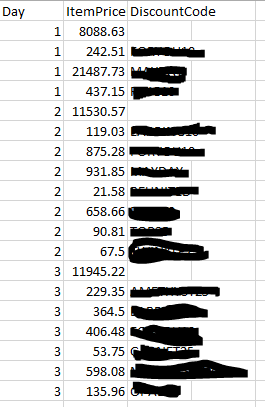
However, when I then export the data I'd assume that it would be almost identical but instead, t is separating the dates into individual rows which makes it hard to manage in Excel like so:
Why is powerBi exporting the data in such a strange format? I want it to be the same as in the visualisation and combine the data by day. Then by the discountcode as a column, instead of each row being a new one for all data points.
- Mark as New
- Bookmark
- Subscribe
- Mute
- Subscribe to RSS Feed
- Permalink
- Report Inappropriate Content
Hi @Luke_Gems,
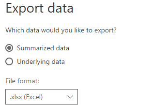
As @spuder mentioned, the export data option only exports the raw data in your table view. It won't keep the visual structure after exporting to CSV file. It looks like you used a matrix to display data, the exported result might be what you stored in source table. So, you need to format the layout of these data in excel again to achieve your desired output.
Best regards,
Yuliana Gu
If this post helps, then please consider Accept it as the solution to help the other members find it more quickly.
- Mark as New
- Bookmark
- Subscribe
- Mute
- Subscribe to RSS Feed
- Permalink
- Report Inappropriate Content
Try with summarized export
- Mark as New
- Bookmark
- Subscribe
- Mute
- Subscribe to RSS Feed
- Permalink
- Report Inappropriate Content
Hi @Luke_Gems
These are the raw data power bi has.
These raw data will be visualized on that visual you'd like to have. Neither wether it is a table or a graph.
So you get as I said only raw data when you export them and have to visualize them in excel as well.
Easiest would be Pivot Table and Pivot Diagram.
Using Excel 2010? and higher you can nearby automatically generate an Pivot table. Because Excel makes a suggestion for that.
Try it, it is very easy. 🙂
Helpful resources

Power BI Dataviz World Championships
The Power BI Data Visualization World Championships is back! Get ahead of the game and start preparing now!

| User | Count |
|---|---|
| 38 | |
| 36 | |
| 33 | |
| 33 | |
| 29 |
| User | Count |
|---|---|
| 132 | |
| 86 | |
| 85 | |
| 68 | |
| 64 |


