- Subscribe to RSS Feed
- Mark Topic as New
- Mark Topic as Read
- Float this Topic for Current User
- Bookmark
- Subscribe
- Printer Friendly Page
- Mark as New
- Bookmark
- Subscribe
- Mute
- Subscribe to RSS Feed
- Permalink
- Report Inappropriate Content

Power BI Waterfall Chart with Custom Visual / Measures using 3 columns instead of just 1
Hi,
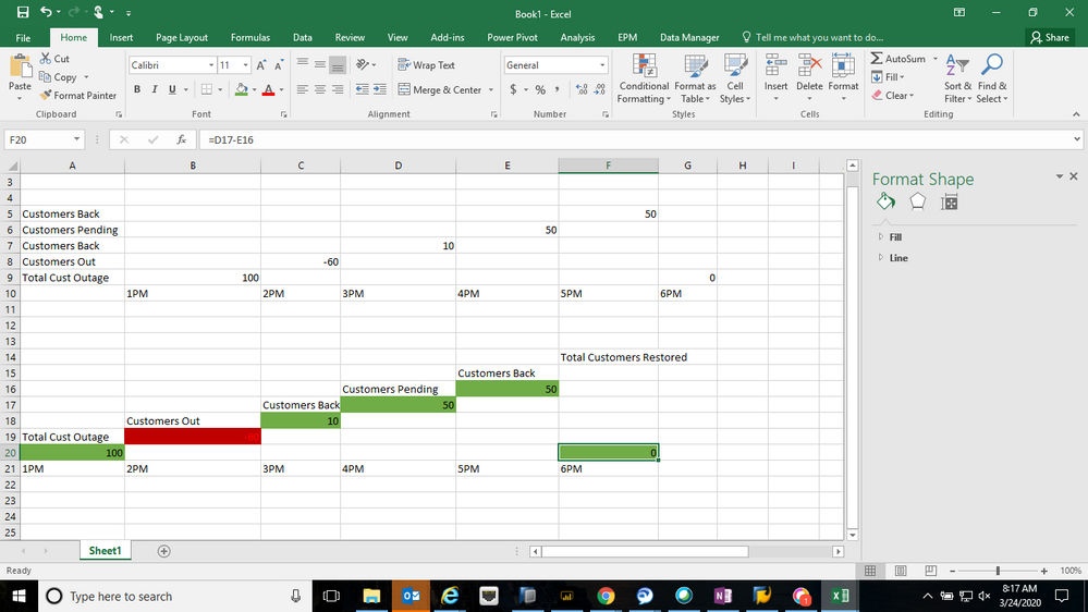
I am wondering if anyone knows how to create a waterfall chart with date/time being the axis but the values being taken from 3 columns / as they are seperate categories?
I have
Total Customers Outage
Customers Out
Customers Back
Customers Pending Help from Outage
Total Customers Restored
I want the waterfall chart in power bi to look like the below.
Solved! Go to Solution.
- Mark as New
- Bookmark
- Subscribe
- Mute
- Subscribe to RSS Feed
- Permalink
- Report Inappropriate Content

Hi @Anonymous ,
As we know, waterfall charts show a running total as Power BI adds and subtracts values. They're useful for understanding how an initial value (like net income) is affected by a series of positive and negative changes.
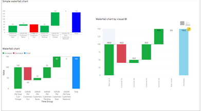
I have tested most types of waterfall charts(waterfall chart, simple waterfall chart and waterfall chart by visual BI) in power bi desktop, but all of them can just meet part of your requirement. None of them can show the value like a ladder as your posted picture because the growth of the next value depends on the previous value not restart as 0.
For further information about waterfall chart, you can refer the following Microsoft document:
https://docs.microsoft.com/en-us/power-bi/visuals/power-bi-visualization-waterfall-charts
Best Regards,
Yingjie Li
If this post helps then please consider Accept it as the solution to help the other members find it more quickly.
- Mark as New
- Bookmark
- Subscribe
- Mute
- Subscribe to RSS Feed
- Permalink
- Report Inappropriate Content

It is possible to create a waterfall chart with time along the axis and your categories under values in Power BI using Inforiver Analytics+.
To create the right type of waterfall chart, you need to first determine which of your numbers is a contributing value (i.e. an increase or decrease in the number of customers involved in the outage), and which value is a result or an interim total. For example, the number of customers pending help from the outage (your 4th value) is the difference between the number of customers out (value #2) and the number of customers back (value #3), which means that the bar for this value must start from zero and should be indicated as an intermediate total. In your data, there are three bars that are intermediate totals and must start from zero – the total customer outage, customers out, and the customers pending help.
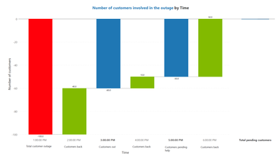
You need to organize your data structure as follows. Please note that you need one more contributing value between Total customer outage and Customers out to indicate when the number decreased from 100 customers to 60, which I have added at 2 PM here:
Here is the final result created in Power BI using Inforiver Analytics+ which has an Interim totals option, which allows you to designate the relevant bars as results so that they begin from zero.
To access the interim totals option, you can simply click on the bar and use the “Result” checkbox:
Alternatively, you can have just your contributing values and then use the “Add total” checkbox to add the interim totals that start from zero. Another possibility is you can also have positive values for all of your numbers and then use the “Invert” checkbox above to designate it as a negative value and to invert the bar.
You can get your copy of Inforiver Analytics+ as an add-on for Power BI by clicking here. For more information on waterfall charts in Power BI, you can refer to this webinar.
- Mark as New
- Bookmark
- Subscribe
- Mute
- Subscribe to RSS Feed
- Permalink
- Report Inappropriate Content

my two cents here...
using "simple waterfall" (look for it in 'get more visuals') you can select a value and "define as pillar" which works exactly as excel "set as total"
apparently i dont have permissions to upload image...sorry bout that
- Mark as New
- Bookmark
- Subscribe
- Mute
- Subscribe to RSS Feed
- Permalink
- Report Inappropriate Content

Hi @Anonymous ,
As we know, waterfall charts show a running total as Power BI adds and subtracts values. They're useful for understanding how an initial value (like net income) is affected by a series of positive and negative changes.
I have tested most types of waterfall charts(waterfall chart, simple waterfall chart and waterfall chart by visual BI) in power bi desktop, but all of them can just meet part of your requirement. None of them can show the value like a ladder as your posted picture because the growth of the next value depends on the previous value not restart as 0.
For further information about waterfall chart, you can refer the following Microsoft document:
https://docs.microsoft.com/en-us/power-bi/visuals/power-bi-visualization-waterfall-charts
Best Regards,
Yingjie Li
If this post helps then please consider Accept it as the solution to help the other members find it more quickly.
- Mark as New
- Bookmark
- Subscribe
- Mute
- Subscribe to RSS Feed
- Permalink
- Report Inappropriate Content
Helpful resources
| Subject | Author | Posted | |
|---|---|---|---|
| 04-03-2024 01:02 AM | |||
| 06-13-2018 06:15 AM | |||
| 02-19-2024 09:09 AM | |||
| 07-03-2024 12:12 AM | |||
| 01-27-2024 02:12 AM |
| User | Count |
|---|---|
| 123 | |
| 105 | |
| 84 | |
| 49 | |
| 46 |


