Join us at the 2025 Microsoft Fabric Community Conference
March 31 - April 2, 2025, in Las Vegas, Nevada. Use code MSCUST for a $150 discount! Early bird discount ends December 31.
Register Now- Power BI forums
- Get Help with Power BI
- Desktop
- Service
- Report Server
- Power Query
- Mobile Apps
- Developer
- DAX Commands and Tips
- Custom Visuals Development Discussion
- Health and Life Sciences
- Power BI Spanish forums
- Translated Spanish Desktop
- Training and Consulting
- Instructor Led Training
- Dashboard in a Day for Women, by Women
- Galleries
- Community Connections & How-To Videos
- COVID-19 Data Stories Gallery
- Themes Gallery
- Data Stories Gallery
- R Script Showcase
- Webinars and Video Gallery
- Quick Measures Gallery
- 2021 MSBizAppsSummit Gallery
- 2020 MSBizAppsSummit Gallery
- 2019 MSBizAppsSummit Gallery
- Events
- Ideas
- Custom Visuals Ideas
- Issues
- Issues
- Events
- Upcoming Events
Be one of the first to start using Fabric Databases. View on-demand sessions with database experts and the Microsoft product team to learn just how easy it is to get started. Watch now
- Power BI forums
- Forums
- Get Help with Power BI
- Desktop
- Power BI Visual
- Subscribe to RSS Feed
- Mark Topic as New
- Mark Topic as Read
- Float this Topic for Current User
- Bookmark
- Subscribe
- Printer Friendly Page
- Mark as New
- Bookmark
- Subscribe
- Mute
- Subscribe to RSS Feed
- Permalink
- Report Inappropriate Content
Power BI Visual
Hello PBI experts,
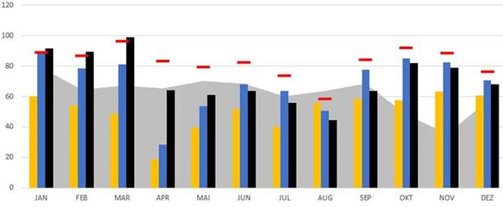
I would just like to know if the visual below is attainable in Power BI dektop?
We will have 5 values to be plotted here. Is it possible to combine area chart with bar graphs?
Thanks

JorgeAbiad
Solved! Go to Solution.
- Mark as New
- Bookmark
- Subscribe
- Mute
- Subscribe to RSS Feed
- Permalink
- Report Inappropriate Content
In the clustered bar line chart, you have line options like Shaded area and dots.
Use customize series under shape and change each line as per need
Refer
https://www.tutorialgateway.org/line-and-clustered-column-chart-in-power-bi/
At the Microsoft Analytics Community Conference, global leaders and influential voices are stepping up to share their knowledge and help you master the latest in Microsoft Fabric, Copilot, and Purview. ✨
️ November 12th-14th, 2024
Online Event
Register Here
- Mark as New
- Bookmark
- Subscribe
- Mute
- Subscribe to RSS Feed
- Permalink
- Report Inappropriate Content
Hi @JorgeAbiad ,
You can try to use 'Line and clustered column chart' visual to meet part of your requirement, just enable Shade area and change the Stroke width as 0 to hide the line in Shapes option.
For more information about this visual, you can refer:
- https://www.youtube.com/watch?v=wr2vA3lGK8w
- https://docs.microsoft.com/en-us/power-bi/visuals/power-bi-visualization-combo-chart
- https://www.tutorialgateway.org/line-and-clustered-column-chart-in-power-bi/
Best Regards,
Yingjie Li
If this post helps then please consider Accept it as the solution to help the other members find it more quickly.
- Mark as New
- Bookmark
- Subscribe
- Mute
- Subscribe to RSS Feed
- Permalink
- Report Inappropriate Content
In the clustered bar line chart, you have line options like Shaded area and dots.
Use customize series under shape and change each line as per need
Refer
https://www.tutorialgateway.org/line-and-clustered-column-chart-in-power-bi/
At the Microsoft Analytics Community Conference, global leaders and influential voices are stepping up to share their knowledge and help you master the latest in Microsoft Fabric, Copilot, and Purview. ✨
️ November 12th-14th, 2024
Online Event
Register Here
- Mark as New
- Bookmark
- Subscribe
- Mute
- Subscribe to RSS Feed
- Permalink
- Report Inappropriate Content
Hello @amitchandak ,
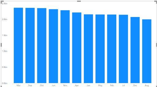
Thank you very much for this. However, I can't sort the values in X-axis. It should be like Jan, Feb, ...Dec. How do I achieve this?
Regards,
JorgeAbiad
- Mark as New
- Bookmark
- Subscribe
- Mute
- Subscribe to RSS Feed
- Permalink
- Report Inappropriate Content
Highlight the graph then on the top right hand corner of the graph click on the three dots then scroll down to sort by and select month
- Mark as New
- Bookmark
- Subscribe
- Mute
- Subscribe to RSS Feed
- Permalink
- Report Inappropriate Content
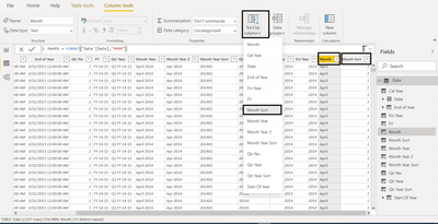
Assume your column is
Month = format([Date],"MMM")
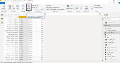
Create a sort column and mark it as the sort column of the first one
MM =format([Date],"MM")
https://docs.microsoft.com/en-us/power-bi/desktop-sort-by-column
At the Microsoft Analytics Community Conference, global leaders and influential voices are stepping up to share their knowledge and help you master the latest in Microsoft Fabric, Copilot, and Purview. ✨
️ November 12th-14th, 2024
Online Event
Register Here
Helpful resources

Join us at the Microsoft Fabric Community Conference
March 31 - April 2, 2025, in Las Vegas, Nevada. Use code MSCUST for a $150 discount!

We want your feedback!
Your insights matter. That’s why we created a quick survey to learn about your experience finding answers to technical questions.

Microsoft Fabric Community Conference 2025
Arun Ulag shares exciting details about the Microsoft Fabric Conference 2025, which will be held in Las Vegas, NV.

| User | Count |
|---|---|
| 123 | |
| 86 | |
| 73 | |
| 57 | |
| 52 |
| User | Count |
|---|---|
| 197 | |
| 133 | |
| 107 | |
| 69 | |
| 65 |


