FabCon is coming to Atlanta
Join us at FabCon Atlanta from March 16 - 20, 2026, for the ultimate Fabric, Power BI, AI and SQL community-led event. Save $200 with code FABCOMM.
Register now!- Power BI forums
- Get Help with Power BI
- Desktop
- Service
- Report Server
- Power Query
- Mobile Apps
- Developer
- DAX Commands and Tips
- Custom Visuals Development Discussion
- Health and Life Sciences
- Power BI Spanish forums
- Translated Spanish Desktop
- Training and Consulting
- Instructor Led Training
- Dashboard in a Day for Women, by Women
- Galleries
- Data Stories Gallery
- Themes Gallery
- Contests Gallery
- QuickViz Gallery
- Quick Measures Gallery
- Visual Calculations Gallery
- Notebook Gallery
- Translytical Task Flow Gallery
- TMDL Gallery
- R Script Showcase
- Webinars and Video Gallery
- Ideas
- Custom Visuals Ideas (read-only)
- Issues
- Issues
- Events
- Upcoming Events
The Power BI Data Visualization World Championships is back! Get ahead of the game and start preparing now! Learn more
- Power BI forums
- Forums
- Get Help with Power BI
- Desktop
- Re: Power BI - Time Intelligence "State-in-time" C...
- Subscribe to RSS Feed
- Mark Topic as New
- Mark Topic as Read
- Float this Topic for Current User
- Bookmark
- Subscribe
- Printer Friendly Page
- Mark as New
- Bookmark
- Subscribe
- Mute
- Subscribe to RSS Feed
- Permalink
- Report Inappropriate Content
Power BI - Time Intelligence "State-in-time" Chart
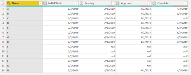
Hello! I am looking to create a graph that shows the status of different items (rows of data) based on the dates of different activities that are included in the columns.
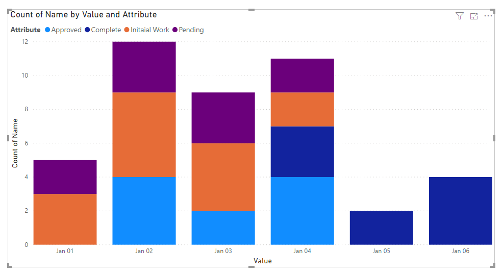
So, I would want on the x axis to be the month and on the y axis would be the count of instances. And it would be a stacked bar chart showing the count of items in each "Initial Work," "Pending," "Approved," and "Complete" on a given date. So for 1/1/19 I would see just a count of 3 for initial work. For 4/1/19 you would see 1 initial work, 3 pending, 5 approved, 3 complete in a stacked bar chart.
I am really just looking for some direction on the best way to tackle this problem. I am assuming I will need to have measures to count on a specific date saying if complete and approved are blank, then count, etc..., but I am not sure the best way to set it up (or if it is even possible??). Thank you in advance!!
Also - wanted to add that I can see how you could do this in excel easily with a few countif functions and create a table based on dates and use the second table for the chart... but this is a part of a larger project where we are setting up a dashboard, so if there is a way to keep it in BI that would be preferred.
Solved! Go to Solution.
- Mark as New
- Bookmark
- Subscribe
- Mute
- Subscribe to RSS Feed
- Permalink
- Report Inappropriate Content
Yes, I was able to find a solution! Basically I did the following:
- Create date master table that has all the relevant dates included.
- Create “Status Changes” table
- This is an unpivoted version of the source table - gives the “start date” for each status.
- Added status sort order column and use this to sort the table for non-alphabetical statuses.
- Calculate the Max status for each Name
- Calculate the last day in state based on the start date in the next state (or if it is the max status, then there is no last date)
- On the Date Master, create formulas to count the number of items in a certain status based on the date beginning and ending range.
Let me know if that helps or if you need any clarification!
- Mark as New
- Bookmark
- Subscribe
- Mute
- Subscribe to RSS Feed
- Permalink
- Report Inappropriate Content
Hi @swiley9 ,
Select the Name column and unpivot Others columns as below.
M code for your reference.
let
    Source = Table.FromRows(Json.Document(Binary.Decompress(Binary.FromText("i45WclTSUTLUN9Q3MjC0RGcaI5gmEGasTrSSE1jAiJAOU4QOZ3RlRhgG6yiBVboQoxLFNa7oyoyxakZyjRu6HHamGUKHO6rBeFR6oMrhUemJxUwTrCq90MIJgkAy3ugeRjYOrMIHZ+jAVPjiiGmECj8coY8jTmIB", BinaryEncoding.Base64), Compression.Deflate)), let _t = ((type text) meta [Serialized.Text = true]) in type table [Name = _t, #"Initaial Work" = _t, Pending = _t, Approved = _t, Complete = _t]),
    #"Changed Type" = Table.TransformColumnTypes(Source,{{"Name", type text}, {"Initaial Work", type date}, {"Pending", type date}, {"Approved", type date}, {"Complete", type date}}),
    #"Unpivoted Other Columns" = Table.UnpivotOtherColumns(#"Changed Type", {"Name"}, "Attribute", "Value")
in
    #"Unpivoted Other Columns"
Then we can create starcked column chart after applying the steps in power query.
For more details, please check the pbix as attached.
If this post helps, then please consider Accept it as the solution to help the others find it more quickly.
- Mark as New
- Bookmark
- Subscribe
- Mute
- Subscribe to RSS Feed
- Permalink
- Report Inappropriate Content
- Mark as New
- Bookmark
- Subscribe
- Mute
- Subscribe to RSS Feed
- Permalink
- Report Inappropriate Content
- Mark as New
- Bookmark
- Subscribe
- Mute
- Subscribe to RSS Feed
- Permalink
- Report Inappropriate Content
Yes, I was able to find a solution! Basically I did the following:
- Create date master table that has all the relevant dates included.
- Create “Status Changes” table
- This is an unpivoted version of the source table - gives the “start date” for each status.
- Added status sort order column and use this to sort the table for non-alphabetical statuses.
- Calculate the Max status for each Name
- Calculate the last day in state based on the start date in the next state (or if it is the max status, then there is no last date)
- On the Date Master, create formulas to count the number of items in a certain status based on the date beginning and ending range.
Let me know if that helps or if you need any clarification!
- Mark as New
- Bookmark
- Subscribe
- Mute
- Subscribe to RSS Feed
- Permalink
- Report Inappropriate Content
Thank you very much, kudos to you!
Any chance of sharing a PBIX?
- Mark as New
- Bookmark
- Subscribe
- Mute
- Subscribe to RSS Feed
- Permalink
- Report Inappropriate Content
You will have to unpivot the columns and convert them to row. e..g https://www.newtechdojo.com/unpivot-columns-in-power-bi/
Then use stacked column chart: https://docs.microsoft.com/en-us/power-bi/visuals/power-bi-visualization-combo-chart
Helpful resources

Power BI Dataviz World Championships
The Power BI Data Visualization World Championships is back! Get ahead of the game and start preparing now!

Power BI Monthly Update - November 2025
Check out the November 2025 Power BI update to learn about new features.

| User | Count |
|---|---|
| 59 | |
| 46 | |
| 42 | |
| 23 | |
| 18 |
| User | Count |
|---|---|
| 193 | |
| 123 | |
| 99 | |
| 67 | |
| 49 |


