A new Data Days event is coming soon!
This time we’re going bigger than ever. Fabric, Power BI, SQL, AI and more. We're covering it all. You won't want to miss it.
Learn more- Power BI forums
- Get Help with Power BI
- Desktop
- Service
- Report Server
- Power Query
- Mobile Apps
- Developer
- DAX Commands and Tips
- Custom Visuals Development Discussion
- Health and Life Sciences
- Power BI Spanish forums
- Translated Spanish Desktop
- Training and Consulting
- Instructor Led Training
- Dashboard in a Day for Women, by Women
- Galleries
- Data Stories Gallery
- Themes Gallery
- Contests Gallery
- QuickViz Gallery
- Quick Measures Gallery
- Visual Calculations Gallery
- Notebook Gallery
- Translytical Task Flow Gallery
- TMDL Gallery
- R Script Showcase
- Webinars and Video Gallery
- Ideas
- Custom Visuals Ideas (read-only)
- Issues
- Issues
- Events
- Upcoming Events
Did you hear? There's a new SQL AI Developer certification (DP-800). Start preparing now and be one of the first to get certified. Register now
- Power BI forums
- Forums
- Get Help with Power BI
- Desktop
- Re: Power BI- Risk Matrix- Scatter Chart- Count Di...
- Subscribe to RSS Feed
- Mark Topic as New
- Mark Topic as Read
- Float this Topic for Current User
- Bookmark
- Subscribe
- Printer Friendly Page
- Mark as New
- Bookmark
- Subscribe
- Mute
- Subscribe to RSS Feed
- Permalink
- Report Inappropriate Content
Power BI- Risk Matrix- Scatter Chart- Count Display
Hope i get some help to resolve the issue I'm facing.
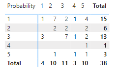
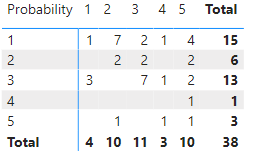
Created a Risk Matrix Below is the screenshot
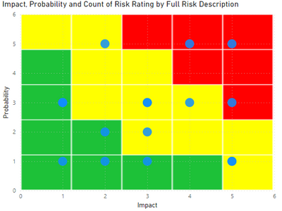
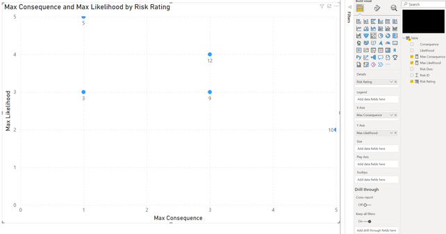
Trying to create a scatter chart and show the count of coordinates that is showing in the table above. Was successful in creating scatter chart but not able to show the count value in each of the X, Y coordinate. Any guidance or support on this is greatly appreciated. See the screenshot below, instead of dots, I need to show the counts.
- Mark as New
- Bookmark
- Subscribe
- Mute
- Subscribe to RSS Feed
- Permalink
- Report Inappropriate Content
Dear, did you manage to make the category label show the quantity and not the axes?
Best regards 🙂
- Mark as New
- Bookmark
- Subscribe
- Mute
- Subscribe to RSS Feed
- Permalink
- Report Inappropriate Content
- Mark as New
- Bookmark
- Subscribe
- Mute
- Subscribe to RSS Feed
- Permalink
- Report Inappropriate Content
Hello @Anonymous
A sample . pbix file would really help to provide you a quick solution.
Regards
Kumail Raza
- Mark as New
- Bookmark
- Subscribe
- Mute
- Subscribe to RSS Feed
- Permalink
- Report Inappropriate Content
Which visual are you using for that ? None of the scatter chart visuals that I can see support small multiples.
- Mark as New
- Bookmark
- Subscribe
- Mute
- Subscribe to RSS Feed
- Permalink
- Report Inappropriate Content
@lbendlin where are you seeing the small multiples?
If I have posted a response that resolves your question, please accept it as a solution to formally close the post.
Also, if you are as passionate about Power BI, DAX and data as I am, please feel free to reach out if you have any questions, queries, or if you simply want to connect and talk to another data geek!
Want to connect?www.linkedin.com/in/theoconias
- Mark as New
- Bookmark
- Subscribe
- Mute
- Subscribe to RSS Feed
- Permalink
- Report Inappropriate Content
In the screenshot you posted.
- Mark as New
- Bookmark
- Subscribe
- Mute
- Subscribe to RSS Feed
- Permalink
- Report Inappropriate Content
@lbendlin oh, for some reason it is there but greyed out. It's the standard scatter plot in Desktop. I think it was an oversight on the update. There's no option to use multiples but nonetheless, in the visual options, it is present but greyed.
If I have posted a response that resolves your question, please accept it as a solution to formally close the post.
Also, if you are as passionate about Power BI, DAX and data as I am, please feel free to reach out if you have any questions, queries, or if you simply want to connect and talk to another data geek!
Want to connect?www.linkedin.com/in/theoconias
- Mark as New
- Bookmark
- Subscribe
- Mute
- Subscribe to RSS Feed
- Permalink
- Report Inappropriate Content
Yes. I see that now too.
But the category label doesn't solve the original requirement.
- Mark as New
- Bookmark
- Subscribe
- Mute
- Subscribe to RSS Feed
- Permalink
- Report Inappropriate Content
@lbendlin you can achieve it by removing decimals or returning a max on the value dependent upon how you've got the numbers structured. I do it all the time when I'm generating reports for my clients and Audit / Risk Committees.
If I have posted a response that resolves your question, please accept it as a solution to formally close the post.
Also, if you are as passionate about Power BI, DAX and data as I am, please feel free to reach out if you have any questions, queries, or if you simply want to connect and talk to another data geek!
Want to connect?www.linkedin.com/in/theoconias
- Mark as New
- Bookmark
- Subscribe
- Mute
- Subscribe to RSS Feed
- Permalink
- Report Inappropriate Content
- Mark as New
- Bookmark
- Subscribe
- Mute
- Subscribe to RSS Feed
- Permalink
- Report Inappropriate Content
Hi @Anonymous
Well done on the Risk Matrix! Looks epic!
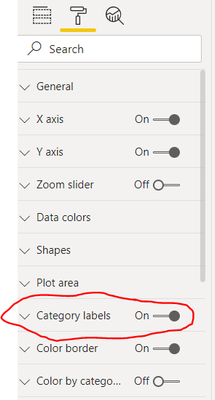
If you turn the Category Labels on, you should get a value for each of the items on the scatter chart (using Visual pane options) and this should give the total count for each marker.
Hoping that's what you're after? If not, let me know.
Cheers,
Theo
If I have posted a response that resolves your question, please accept it as a solution to formally close the post.
Also, if you are as passionate about Power BI, DAX and data as I am, please feel free to reach out if you have any questions, queries, or if you simply want to connect and talk to another data geek!
Want to connect?www.linkedin.com/in/theoconias
- Mark as New
- Bookmark
- Subscribe
- Mute
- Subscribe to RSS Feed
- Permalink
- Report Inappropriate Content
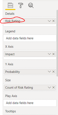
Thanks @TheoC , i have tried the solution that you have suggested. Insted of the count of the risks, It's displaying the Risk Rating of that Particular quardrent. Looks like the solution is infront of me and not able to figure out.
See the screenshots:
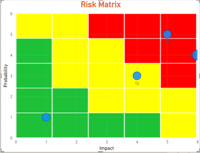
Also in the visual, the Dots have moved out of the plot area. Not sure why.
Thanks a lot for the support and guidance.
- Mark as New
- Bookmark
- Subscribe
- Mute
- Subscribe to RSS Feed
- Permalink
- Report Inappropriate Content
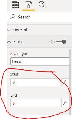
@Anonymous use the MAX on the value rather than the SUM. Also, just check the values of your X Axis. Not sure why it's showing 6? In both likelihood (probability) and consequence, max runs at 5 on both axis. For some reason, yours is showing 6?
If I have posted a response that resolves your question, please accept it as a solution to formally close the post.
Also, if you are as passionate about Power BI, DAX and data as I am, please feel free to reach out if you have any questions, queries, or if you simply want to connect and talk to another data geek!
Want to connect?www.linkedin.com/in/theoconias
- Mark as New
- Bookmark
- Subscribe
- Mute
- Subscribe to RSS Feed
- Permalink
- Report Inappropriate Content
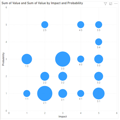
When I tried the Max, the size of the bubble has increased, that's it :-). For display reasons I have used the X and Y Axis values 0-6.
X and Y Values:
When i changed Sum to Max
The solution that I'm trying to achieve I could able to show in Matrix (Below is the screenshot), but mu management wants in above format.
- Mark as New
- Bookmark
- Subscribe
- Mute
- Subscribe to RSS Feed
- Permalink
- Report Inappropriate Content
this is caused by the summing of Impact and Probability. Remove the aggregations for the x and y axis fields.
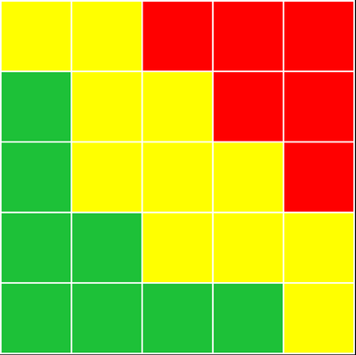
Can you share your background image?
- Mark as New
- Bookmark
- Subscribe
- Mute
- Subscribe to RSS Feed
- Permalink
- Report Inappropriate Content
@Anonymous from what I am assuming management want to see is the residual risk rating of each risk (i.e. Likelihood x Consequence). In theory, this should give each risk a rating out of 25 and each quantitative rating should have an accompanying qualitative rative of low through extreme (or chatastrophic, or something else subject to your organisation's risk management framework). Are you trying to show the Risk Rating (i.e. out of 25) or are you trying to show the axis rating (i.e. out of 5)?
If I have posted a response that resolves your question, please accept it as a solution to formally close the post.
Also, if you are as passionate about Power BI, DAX and data as I am, please feel free to reach out if you have any questions, queries, or if you simply want to connect and talk to another data geek!
Want to connect?www.linkedin.com/in/theoconias
- Mark as New
- Bookmark
- Subscribe
- Mute
- Subscribe to RSS Feed
- Permalink
- Report Inappropriate Content
@Anonymous and @lbendlin
Here is the output you're after:
If I have posted a response that resolves your question, please accept it as a solution to formally close the post.
Also, if you are as passionate about Power BI, DAX and data as I am, please feel free to reach out if you have any questions, queries, or if you simply want to connect and talk to another data geek!
Want to connect?www.linkedin.com/in/theoconias
- Mark as New
- Bookmark
- Subscribe
- Mute
- Subscribe to RSS Feed
- Permalink
- Report Inappropriate Content
@Anonymous @lbendlin
Apologies! Been with clients. Okay, so you want to do the following:
- Do a measure Max Likelihood = MAX ( Table[Likelihood] )
- Do a measure Max Consequence = MAX ( Table[Consequence] )
- Do a Calculated Column = Table[Likelihood] * Table[Consequence]
- Add the Measures on the X and Y Axis
- Add the Calculated Column as the Details field.
Apologies for earlier as I wasn't making very much sense when I was referring to the MAX and Risk Ratings. Hopefully the above makes more sense.
Also, you can change the Details to whatever you want and that will change the Category Label 🙂
Hope this helps!
Theo
If I have posted a response that resolves your question, please accept it as a solution to formally close the post.
Also, if you are as passionate about Power BI, DAX and data as I am, please feel free to reach out if you have any questions, queries, or if you simply want to connect and talk to another data geek!
Want to connect?www.linkedin.com/in/theoconias
- Mark as New
- Bookmark
- Subscribe
- Mute
- Subscribe to RSS Feed
- Permalink
- Report Inappropriate Content
@Anonymous did this resolve your issue? If so, please accept as solution.
If I have posted a response that resolves your question, please accept it as a solution to formally close the post.
Also, if you are as passionate about Power BI, DAX and data as I am, please feel free to reach out if you have any questions, queries, or if you simply want to connect and talk to another data geek!
Want to connect?www.linkedin.com/in/theoconias
- Mark as New
- Bookmark
- Subscribe
- Mute
- Subscribe to RSS Feed
- Permalink
- Report Inappropriate Content
Can you add the risk rating to the Size well? or would that not make sense?
Helpful resources

Power BI Monthly Update - April 2026
Check out the April 2026 Power BI update to learn about new features.

Data Days 2026 coming soon!
Sign up to receive a private message when registration opens and key events begin.

New to Fabric Survey
If you have recently started exploring Fabric, we'd love to hear how it's going. Your feedback can help with product improvements.

| User | Count |
|---|---|
| 34 | |
| 31 | |
| 25 | |
| 20 | |
| 16 |
| User | Count |
|---|---|
| 61 | |
| 49 | |
| 28 | |
| 23 | |
| 23 |
