FabCon is coming to Atlanta
Join us at FabCon Atlanta from March 16 - 20, 2026, for the ultimate Fabric, Power BI, AI and SQL community-led event. Save $200 with code FABCOMM.
Register now!- Power BI forums
- Get Help with Power BI
- Desktop
- Service
- Report Server
- Power Query
- Mobile Apps
- Developer
- DAX Commands and Tips
- Custom Visuals Development Discussion
- Health and Life Sciences
- Power BI Spanish forums
- Translated Spanish Desktop
- Training and Consulting
- Instructor Led Training
- Dashboard in a Day for Women, by Women
- Galleries
- Data Stories Gallery
- Themes Gallery
- Contests Gallery
- QuickViz Gallery
- Quick Measures Gallery
- Visual Calculations Gallery
- Notebook Gallery
- Translytical Task Flow Gallery
- TMDL Gallery
- R Script Showcase
- Webinars and Video Gallery
- Ideas
- Custom Visuals Ideas (read-only)
- Issues
- Issues
- Events
- Upcoming Events
The Power BI Data Visualization World Championships is back! Get ahead of the game and start preparing now! Learn more
- Power BI forums
- Forums
- Get Help with Power BI
- Desktop
- Power BI KPI 2.0 Order of values
- Subscribe to RSS Feed
- Mark Topic as New
- Mark Topic as Read
- Float this Topic for Current User
- Bookmark
- Subscribe
- Printer Friendly Page
- Mark as New
- Bookmark
- Subscribe
- Mute
- Subscribe to RSS Feed
- Permalink
- Report Inappropriate Content
Power BI KPI 2.0 Order of values
Hi All,
I needed an Area and Line chart and I read it somewhere to use the Power BI KPI2.0 chart, which allows me to select the type of chart for different values.
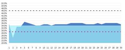
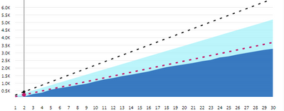
I did use this visual and it works, however, I am not able to arrange the values in the order I need them. For example, one is covered over by the other area.
All I want is dark blue in front and lighter blue at the back. I tried changing the order of my measures values in Fields but it didn't help. For the other chart, it works as expected.
The only difference in both the chart is the type of values is decimal for one and % for the other.
To my understanding, it shows the lesser value in front but it doesn't allow to change the order by area chart.
Any idea anyone?
- Mark as New
- Bookmark
- Subscribe
- Mute
- Subscribe to RSS Feed
- Permalink
- Report Inappropriate Content
The order is determined by the end (most recent) value. The area with the highest value on the right of your graph will always be "below" the others... and I do not think this is configurable...
- Mark as New
- Bookmark
- Subscribe
- Mute
- Subscribe to RSS Feed
- Permalink
- Report Inappropriate Content
- Mark as New
- Bookmark
- Subscribe
- Mute
- Subscribe to RSS Feed
- Permalink
- Report Inappropriate Content
Sorry, I didn't get it. It is not an issue of measure I think. All I am after is, how do I order which area chart should be displayed in the front
- Mark as New
- Bookmark
- Subscribe
- Mute
- Subscribe to RSS Feed
- Permalink
- Report Inappropriate Content
- Mark as New
- Bookmark
- Subscribe
- Mute
- Subscribe to RSS Feed
- Permalink
- Report Inappropriate Content
I need a line and area chart together. And placing two different visuals on each other could be difficult in terms of adjusting the Y-axis values.
I tried changing the transparency in the area chart option however, the alignment and order of the area chart is not consistent.
- Mark as New
- Bookmark
- Subscribe
- Mute
- Subscribe to RSS Feed
- Permalink
- Report Inappropriate Content
Hi @Anonymous,
Can you please share some dummy data with a similar data structure and expected results? It should help us clarify your scenario and test to coding formula.
How to Get Your Question Answered Quickly
Regards,
Xiaoxin Sheng
Helpful resources

Power BI Dataviz World Championships
The Power BI Data Visualization World Championships is back! Get ahead of the game and start preparing now!

| User | Count |
|---|---|
| 41 | |
| 38 | |
| 36 | |
| 30 | |
| 28 |
| User | Count |
|---|---|
| 128 | |
| 88 | |
| 79 | |
| 67 | |
| 62 |


