Join us at FabCon Vienna from September 15-18, 2025
The ultimate Fabric, Power BI, SQL, and AI community-led learning event. Save €200 with code FABCOMM.
Get registeredGo To
- Power BI forums
- Get Help with Power BI
- Desktop
- Service
- Report Server
- Power Query
- Mobile Apps
- Developer
- DAX Commands and Tips
- Custom Visuals Development Discussion
- Health and Life Sciences
- Power BI Spanish forums
- Translated Spanish Desktop
- Training and Consulting
- Instructor Led Training
- Dashboard in a Day for Women, by Women
- Galleries
- Data Stories Gallery
- Themes Gallery
- Contests Gallery
- Quick Measures Gallery
- Notebook Gallery
- Translytical Task Flow Gallery
- TMDL Gallery
- R Script Showcase
- Webinars and Video Gallery
- Ideas
- Custom Visuals Ideas (read-only)
- Issues
- Issues
- Events
- Upcoming Events
Turn on suggestions
Auto-suggest helps you quickly narrow down your search results by suggesting possible matches as you type.
Showing results for
Enhance your career with this limited time 50% discount on Fabric and Power BI exams. Ends September 15. Request your voucher.
- Power BI forums
- Forums
- Get Help with Power BI
- Desktop
- Power BI Help with Matrix table in calculating % b...
Reply
Topic Options
- Subscribe to RSS Feed
- Mark Topic as New
- Mark Topic as Read
- Float this Topic for Current User
- Bookmark
- Subscribe
- Printer Friendly Page
- Mark as New
- Bookmark
- Subscribe
- Mute
- Subscribe to RSS Feed
- Permalink
- Report Inappropriate Content
Power BI Help with Matrix table in calculating % by employee hrs by site
12-14-2022
04:43 AM
Team,
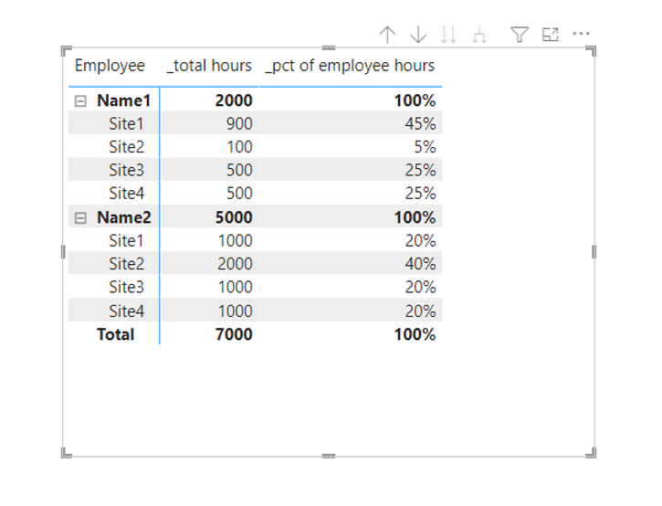
I am trying to do create a matrix table to plot Employee and Site in rows and total hrs and % of total hrs just for the specific employees in values.
When i plot this in power bi i get all rows 100% as seen in coloumn D. I would like to get the result as shown in coloumn E.
Solved! Go to Solution.
1 ACCEPTED SOLUTION
- Mark as New
- Bookmark
- Subscribe
- Mute
- Subscribe to RSS Feed
- Permalink
- Report Inappropriate Content
12-14-2022
05:25 AM
Measure:
_pct of employee hours =
DIVIDE(
    [_total hours], //_total hours = sum(hours)
    CALCULATE(
        [_total hours],
        ALL('Table'),
        VALUES('Table'[Employee])
    )
)
1 REPLY 1
- Mark as New
- Bookmark
- Subscribe
- Mute
- Subscribe to RSS Feed
- Permalink
- Report Inappropriate Content
12-14-2022
05:25 AM
Measure:
_pct of employee hours =
DIVIDE(
    [_total hours], //_total hours = sum(hours)
    CALCULATE(
        [_total hours],
        ALL('Table'),
        VALUES('Table'[Employee])
    )
)Helpful resources
Featured Topics
Top Solution Authors
| User | Count |
|---|---|
| 65 | |
| 59 | |
| 55 | |
| 54 | |
| 32 |
Top Kudoed Authors
| User | Count |
|---|---|
| 180 | |
| 88 | |
| 70 | |
| 46 | |
| 45 |


