A new Data Days event is coming soon!
This time we’re going bigger than ever. Fabric, Power BI, SQL, AI and more. We're covering it all. You won't want to miss it.
Learn more- Power BI forums
- Get Help with Power BI
- Desktop
- Service
- Report Server
- Power Query
- Mobile Apps
- Developer
- DAX Commands and Tips
- Custom Visuals Development Discussion
- Health and Life Sciences
- Power BI Spanish forums
- Translated Spanish Desktop
- Training and Consulting
- Instructor Led Training
- Dashboard in a Day for Women, by Women
- Galleries
- Data Stories Gallery
- Themes Gallery
- Contests Gallery
- QuickViz Gallery
- Quick Measures Gallery
- Visual Calculations Gallery
- Notebook Gallery
- Translytical Task Flow Gallery
- TMDL Gallery
- R Script Showcase
- Webinars and Video Gallery
- Ideas
- Custom Visuals Ideas (read-only)
- Issues
- Issues
- Events
- Upcoming Events
Level up your Power BI skills this month - build one visual each week and tell better stories with data! Get started
- Power BI forums
- Forums
- Get Help with Power BI
- Desktop
- Re: Power BI Graphs - Data Labels
- Subscribe to RSS Feed
- Mark Topic as New
- Mark Topic as Read
- Float this Topic for Current User
- Bookmark
- Subscribe
- Printer Friendly Page
- Mark as New
- Bookmark
- Subscribe
- Mute
- Subscribe to RSS Feed
- Permalink
- Report Inappropriate Content
Power BI Graphs - Data Labels
Hi
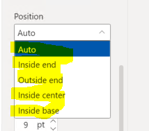
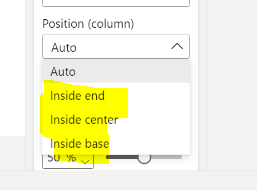
I have just upgraded to Power BI April 2022 - and I have just created a clustered bar chart and after a little while finding my way around the new formatting features - I have now have a question about the data labels that are in the chart - they same to have changed between versions? i have 2 screenshots if that helps - can anyone help as to why -
September 2021 (we had not upgraded for sometime)
April 2022 - Outside End is missing
Also does anyone know if you can get totals to show as a data label on a clustered bar chart?
Thanks
Karen
- Mark as New
- Bookmark
- Subscribe
- Mute
- Subscribe to RSS Feed
- Permalink
- Report Inappropriate Content
Hi @KarenL7,
Here is Line and clustered column chart With Custom Tooltip which will help you to get custom label placement outside the columns and also you can put total value as label you just need to create a dax measure to sum all the values(that you want the total of) and put it in label field.


Download link for the custom visual file in this page
https://pbivizedit.com/gallery/line-and-clustered-column-with-custom-tooltip
This was made with our Custom Visual creator tool PBIVizEdit.com. With this tool,
- anyone, irrespective of technical skills, can create their own visuals
- 15 minutes to create a visual from scratch
- opens up many additional attributes to edit (for e.g. labels, tooltips, legends position, etc)
Give this a shot and let us know if you face any problem/errors.
You can use the editor to modify your visual further (some modifications cannot be done in Power BI window and have to be in editor).
Thanks,
Team PBIVizEdit
- Mark as New
- Bookmark
- Subscribe
- Mute
- Subscribe to RSS Feed
- Permalink
- Report Inappropriate Content
Okay
I have found the answer to this - This does appear when I remove the legend - so it is nothing to do with the upgrade - my fault for getting frustrated with the new format so apologies for anyone who my read my question!
However I am curious to find out if anyone will know if the totals will appear on a stacked column chart when using a legend if anyone reads this post.
Thanks!
Karen
- Mark as New
- Bookmark
- Subscribe
- Mute
- Subscribe to RSS Feed
- Permalink
- Report Inappropriate Content
Hi @KarenL7
Thanks for reaching out to us.
What does the total look like on the stack column chart? Not sure which one you're referring to, is there any screenshots?
Best Regards,
Community Support Team _Tang
If this post helps, please consider Accept it as the solution to help the other members find it more quickly.
- Mark as New
- Bookmark
- Subscribe
- Mute
- Subscribe to RSS Feed
- Permalink
- Report Inappropriate Content
Hi
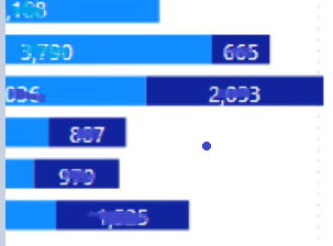
Just to confirm that the totals on the chart this is the stacked bar chart without the legend and has the totals on the outside end - Please see an example below
when I add in a legend the overall totals are removed and the data labels show for each individual - which is fine however -
I was just wondering how to show how to include the overall totals as well in the chart - but cant see an option anywhere as I would like to include them on some of my charts.
Thanks
karen
Helpful resources

Power BI Monthly Update - April 2026
Check out the April 2026 Power BI update to learn about new features.

Data Days 2026 coming soon!
Sign up to receive a private message when registration opens and key events begin.

New to Fabric Survey
If you have recently started exploring Fabric, we'd love to hear how it's going. Your feedback can help with product improvements.

| User | Count |
|---|---|
| 34 | |
| 29 | |
| 29 | |
| 21 | |
| 18 |
| User | Count |
|---|---|
| 68 | |
| 45 | |
| 33 | |
| 24 | |
| 23 |


