FabCon is coming to Atlanta
Join us at FabCon Atlanta from March 16 - 20, 2026, for the ultimate Fabric, Power BI, AI and SQL community-led event. Save $200 with code FABCOMM.
Register now!- Power BI forums
- Get Help with Power BI
- Desktop
- Service
- Report Server
- Power Query
- Mobile Apps
- Developer
- DAX Commands and Tips
- Custom Visuals Development Discussion
- Health and Life Sciences
- Power BI Spanish forums
- Translated Spanish Desktop
- Training and Consulting
- Instructor Led Training
- Dashboard in a Day for Women, by Women
- Galleries
- Data Stories Gallery
- Themes Gallery
- Contests Gallery
- QuickViz Gallery
- Quick Measures Gallery
- Visual Calculations Gallery
- Notebook Gallery
- Translytical Task Flow Gallery
- TMDL Gallery
- R Script Showcase
- Webinars and Video Gallery
- Ideas
- Custom Visuals Ideas (read-only)
- Issues
- Issues
- Events
- Upcoming Events
The Power BI Data Visualization World Championships is back! Get ahead of the game and start preparing now! Learn more
- Power BI forums
- Forums
- Get Help with Power BI
- Desktop
- Power BI Gauge Visual Issue
- Subscribe to RSS Feed
- Mark Topic as New
- Mark Topic as Read
- Float this Topic for Current User
- Bookmark
- Subscribe
- Printer Friendly Page
- Mark as New
- Bookmark
- Subscribe
- Mute
- Subscribe to RSS Feed
- Permalink
- Report Inappropriate Content
Power BI Gauge Visual Issue
I am using the gauge visual to display a calculated measure of the rank of a score, with the max value set to the number of areas.
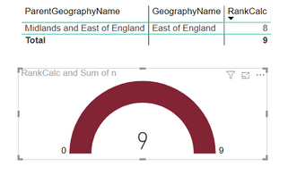
This seems to be working fine with some areas, but sometimes the gauge visual seems to add 1 to the calculated rank. See picture of incorrect gauge, and table above showing calculated rank.

However on the same series, the gauge shows the correct rank:
The fact that the rank returns correctly in the table, and additionally elsewhere in the report on line charts, it makes me think it is something to do with the gauge visual. Does anyone have any ideas?
- Mark as New
- Bookmark
- Subscribe
- Mute
- Subscribe to RSS Feed
- Permalink
- Report Inappropriate Content
Hi @StephShadwell ,
I think it should more be related to your filters you set in measure formula, it seems like its calculations only interact with specific fields. Can you please share you measure formula with some sample data? It is hard to troubleshoot your issue without any data.
How to Get Your Question Answered Quickly
Regards,
Xiaoxin Sheng
- Mark as New
- Bookmark
- Subscribe
- Mute
- Subscribe to RSS Feed
- Permalink
- Report Inappropriate Content
Hi,
Just to confirm, i have checked there is no default summation happening on the rank measure, and this is greyed out to don't summarise.
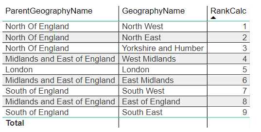
Apologies, i realised the table i included was probably not that helpful, as it was interacting with all the filters (see a better screenshot below):
As for the calculated rank measure, see DAX below:

Steph
- Mark as New
- Bookmark
- Subscribe
- Mute
- Subscribe to RSS Feed
- Permalink
- Report Inappropriate Content
HI @StephShadwell ,
I think it may be related to all function, can you please share pbix file with some dummy data for further test?
Notice: do mask on sensitive data before share.
Regards,
Xiaoxin Sheng
- Mark as New
- Bookmark
- Subscribe
- Mute
- Subscribe to RSS Feed
- Permalink
- Report Inappropriate Content
@Anonymous I have made a sample file available on one drive, https://1drv.ms/u/s!AsoxVmjjxqm_i0lQ96jcJK8-W7y0?e=2JULwK
Thanks
- Mark as New
- Bookmark
- Subscribe
- Mute
- Subscribe to RSS Feed
- Permalink
- Report Inappropriate Content
Hi StephShadwell,
Can you share how you created the gauge visual and the calculated rank?
I noticed your first visual displays the wrong total of rank, just like the gauge visual. I would assume that something is being summed with East of England. Are you using a slicer to filter the data shown in your screenshots?
I would also change the default summarization of rank to "Don't Summarize", because rank is something we generally do not want a total of.
- Mark as New
- Bookmark
- Subscribe
- Mute
- Subscribe to RSS Feed
- Permalink
- Report Inappropriate Content
Hi,
i think your Gauge is showing the total.
Please give Kudos for support.
If I answered your question, please mark my post as solution, this will also help others.
Please mark my post as solution, this will also help others.
Please give Kudos for support.
Marcus Wegener works as Full Stack Power BI Engineer at BI or DIE.
His mission is clear: "Get the most out of data, with Power BI."
twitter - LinkedIn - YouTube - website - podcast - Power BI Tutorials
Helpful resources

Power BI Dataviz World Championships
The Power BI Data Visualization World Championships is back! Get ahead of the game and start preparing now!

| User | Count |
|---|---|
| 39 | |
| 37 | |
| 33 | |
| 32 | |
| 29 |
| User | Count |
|---|---|
| 133 | |
| 88 | |
| 85 | |
| 68 | |
| 64 |


