FabCon is coming to Atlanta
Join us at FabCon Atlanta from March 16 - 20, 2026, for the ultimate Fabric, Power BI, AI and SQL community-led event. Save $200 with code FABCOMM.
Register now!- Power BI forums
- Get Help with Power BI
- Desktop
- Service
- Report Server
- Power Query
- Mobile Apps
- Developer
- DAX Commands and Tips
- Custom Visuals Development Discussion
- Health and Life Sciences
- Power BI Spanish forums
- Translated Spanish Desktop
- Training and Consulting
- Instructor Led Training
- Dashboard in a Day for Women, by Women
- Galleries
- Data Stories Gallery
- Themes Gallery
- Contests Gallery
- Quick Measures Gallery
- Notebook Gallery
- Translytical Task Flow Gallery
- TMDL Gallery
- R Script Showcase
- Webinars and Video Gallery
- Ideas
- Custom Visuals Ideas (read-only)
- Issues
- Issues
- Events
- Upcoming Events
Calling all Data Engineers! Fabric Data Engineer (Exam DP-700) live sessions are back! Starting October 16th. Sign up.
- Power BI forums
- Forums
- Get Help with Power BI
- Desktop
- Power BI : Conditional Formatting in Clustered Col...
- Subscribe to RSS Feed
- Mark Topic as New
- Mark Topic as Read
- Float this Topic for Current User
- Bookmark
- Subscribe
- Printer Friendly Page
- Mark as New
- Bookmark
- Subscribe
- Mute
- Subscribe to RSS Feed
- Permalink
- Report Inappropriate Content
Power BI : Conditional Formatting in Clustered Column Chart
Hi All,
I am working on chart where I need to compare prices of different categories over time period. I need to use Clustered column chart.
X Axis - Month
Y Axis - Price
Legend - Category
I have a bechmark value with me, if price is lower than that, then bar should appear in Red color. Is there a way I can apply this conditional formatting in Clustered Column chart? The moment I add anything in Legends section, the "fx" part under Data Colors is not visible.
@amitchandak @Greg_Deckler
Solved! Go to Solution.
- Mark as New
- Bookmark
- Subscribe
- Mute
- Subscribe to RSS Feed
- Permalink
- Report Inappropriate Content
Hi sahildoshi
You can not apply conditional formatting to a Cluster Column Chart because the Legend colour is static. ☹️☹️☹️
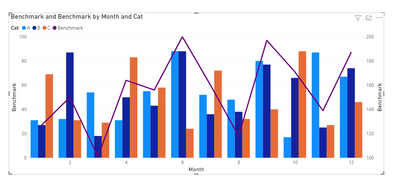
Please consider using a Line and Cluster Column Chart with:-
X Axis - Month
Column Y Axis - Price
Line y-axis = Benchmark
Legend - Category
It does not use conditional formating but is an excellent visual if you just have a few categories.
The graph could get very messy if you hace lots of categories
Please click thumbs up and accept as solution. Thanks 😀


