Fabric Data Days starts November 4th!
Advance your Data & AI career with 50 days of live learning, dataviz contests, hands-on challenges, study groups & certifications and more!
Get registered- Power BI forums
- Get Help with Power BI
- Desktop
- Service
- Report Server
- Power Query
- Mobile Apps
- Developer
- DAX Commands and Tips
- Custom Visuals Development Discussion
- Health and Life Sciences
- Power BI Spanish forums
- Translated Spanish Desktop
- Training and Consulting
- Instructor Led Training
- Dashboard in a Day for Women, by Women
- Galleries
- Data Stories Gallery
- Themes Gallery
- Contests Gallery
- QuickViz Gallery
- Quick Measures Gallery
- Visual Calculations Gallery
- Notebook Gallery
- Translytical Task Flow Gallery
- TMDL Gallery
- R Script Showcase
- Webinars and Video Gallery
- Ideas
- Custom Visuals Ideas (read-only)
- Issues
- Issues
- Events
- Upcoming Events
Get Fabric Certified for FREE during Fabric Data Days. Don't miss your chance! Request now
- Power BI forums
- Forums
- Get Help with Power BI
- Desktop
- Re: Possible to make line chart WITHOUT connecting...
- Subscribe to RSS Feed
- Mark Topic as New
- Mark Topic as Read
- Float this Topic for Current User
- Bookmark
- Subscribe
- Printer Friendly Page
- Mark as New
- Bookmark
- Subscribe
- Mute
- Subscribe to RSS Feed
- Permalink
- Report Inappropriate Content
Possible to make line chart WITHOUT connecting lines, only the dots?
Is there a way to show a line chart or a combo line and bar chart, but NOT show the connecting lines, just the dots?
In Excel you can easily do this, I was thinking this was now supported as a new PBI feature... However, I can not seem to find any documentation on that, or perhaps it was Zoom Charts?
Is this now supported (show dots no connecting lines) or did I just imagine all that?
🙂
Thanks!!
- Mark as New
- Bookmark
- Subscribe
- Mute
- Subscribe to RSS Feed
- Permalink
- Report Inappropriate Content
Hi @OneWithQuestion,
Currently, there is no such a supported functionality to change line to dot in a line chart or a combo line and bar chart.
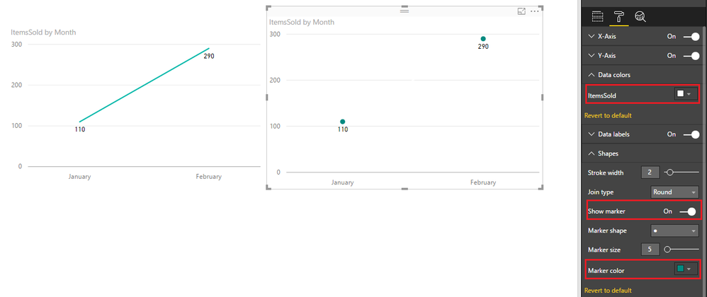
However, in Power BI desktop June update, we are allowed to show markers on each line. So, to work around your requirement, you could turn the "Show markers" on, then, set the line color to "White" (The same color as chart background color). In that case, the line will be hidden, only dots are visible.
Besides, some ideas about this feature request have been submitted in the following links, please vote them up.
Line and Stacked Column chart - Have an option to show dots instead of the connected line
Best regards,
Yuliana Gu
If this post helps, then please consider Accept it as the solution to help the other members find it more quickly.
- Mark as New
- Bookmark
- Subscribe
- Mute
- Subscribe to RSS Feed
- Permalink
- Report Inappropriate Content
In the latest update power BI, under Shapes, there is an option called Stroke Width. Just make it to 0
Helpful resources

Power BI Monthly Update - November 2025
Check out the November 2025 Power BI update to learn about new features.

Fabric Data Days
Advance your Data & AI career with 50 days of live learning, contests, hands-on challenges, study groups & certifications and more!

| User | Count |
|---|---|
| 97 | |
| 76 | |
| 52 | |
| 51 | |
| 46 |


