A new Data Days event is coming soon!
This time we’re going bigger than ever. Fabric, Power BI, SQL, AI and more. We're covering it all. You won't want to miss it.
Learn more- Power BI forums
- Get Help with Power BI
- Desktop
- Service
- Report Server
- Power Query
- Mobile Apps
- Developer
- DAX Commands and Tips
- Custom Visuals Development Discussion
- Health and Life Sciences
- Power BI Spanish forums
- Translated Spanish Desktop
- Training and Consulting
- Instructor Led Training
- Dashboard in a Day for Women, by Women
- Galleries
- Data Stories Gallery
- Themes Gallery
- Contests Gallery
- QuickViz Gallery
- Quick Measures Gallery
- Visual Calculations Gallery
- Notebook Gallery
- Translytical Task Flow Gallery
- TMDL Gallery
- R Script Showcase
- Webinars and Video Gallery
- Ideas
- Custom Visuals Ideas (read-only)
- Issues
- Issues
- Events
- Upcoming Events
Level up your Power BI skills this month - build one visual each week and tell better stories with data! Get started
- Power BI forums
- Forums
- Get Help with Power BI
- Desktop
- Re: Possible Analytics function: dynamic Total col...
- Subscribe to RSS Feed
- Mark Topic as New
- Mark Topic as Read
- Float this Topic for Current User
- Bookmark
- Subscribe
- Printer Friendly Page
- Mark as New
- Bookmark
- Subscribe
- Mute
- Subscribe to RSS Feed
- Permalink
- Report Inappropriate Content
Possible Analytics function: dynamic Total column in chart with USA States?
Hi Together!
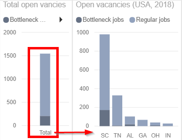
Currently I'm trying to visualize a dynamic total column in my chart with USA States (Red marked). The column should be seprated in bottleneck and regular jobs.
How I can realize it? Is there an analytics function like in other charts with a trendline or would it be possible with a measure?
At the moment I have just a solution with 2 charts, but I hope there's also one with just one chart.
Maybe there's somebody with an idea to realize that?
Would be awesome!
BR,
Sven
Solved! Go to Solution.
- Mark as New
- Bookmark
- Subscribe
- Mute
- Subscribe to RSS Feed
- Permalink
- Report Inappropriate Content
@Anonymous,
Drag [State] from the calculated table to Axis and measures below to Value.
Measure =
VAR s =
    SELECTEDVALUE ( 'Table'[State] )
RETURN
    IF (
        s = "Total",
        SUM ( ValueTable[Regular jobs] ),
        CALCULATE ( SUM ( ValueTable[Regular jobs] ), FactTable[State] = s )
    )
Measure 2 =
VAR s =
    SELECTEDVALUE ( 'Table'[State] )
RETURN
    IF (
        s = "Total",
        SUM ( ValueTable[Bottleneck jobs] ),
        CALCULATE ( SUM ( ValueTable[Bottleneck jobs] ), FactTable[State] = s )
    )
If this post helps, then please consider Accept it as the solution to help the other members find it more quickly.
- Mark as New
- Bookmark
- Subscribe
- Mute
- Subscribe to RSS Feed
- Permalink
- Report Inappropriate Content
Hi,
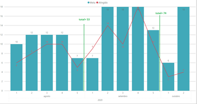
@v-chuncz-msft Do you have any idea how to calculate the total for the sum of the week of each month?
Thanks!
- Mark as New
- Bookmark
- Subscribe
- Mute
- Subscribe to RSS Feed
- Permalink
- Report Inappropriate Content
@Anonymous,
To use just one chart, you may add a calculated table and then create a measure.
Table =
UNION ( VALUES ( Table1[Column1] ), ROW ( "Column1", "Total" ) )
If this post helps, then please consider Accept it as the solution to help the other members find it more quickly.
- Mark as New
- Bookmark
- Subscribe
- Mute
- Subscribe to RSS Feed
- Permalink
- Report Inappropriate Content
Hi @v-chuncz-msft,
thank you for you idea, but how I can add now the sum of bottleneck and regular jobs for alle states and total?
Here's a part of my project and my connection.
I thought there would be a chart with the same "Total" function like with the table visualization.
Would be great if you could help me with this problem !

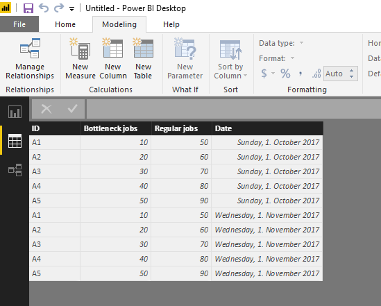
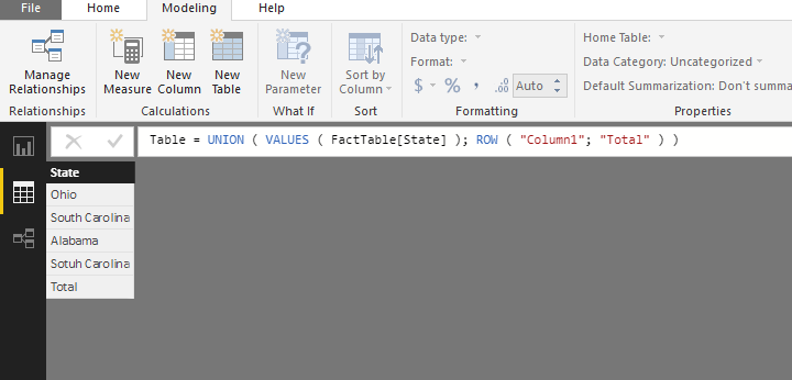

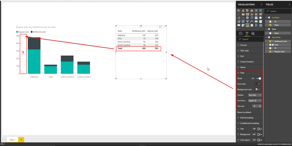
BR,
Sven
- Mark as New
- Bookmark
- Subscribe
- Mute
- Subscribe to RSS Feed
- Permalink
- Report Inappropriate Content
@Anonymous,
Drag [State] from the calculated table to Axis and measures below to Value.
Measure =
VAR s =
    SELECTEDVALUE ( 'Table'[State] )
RETURN
    IF (
        s = "Total",
        SUM ( ValueTable[Regular jobs] ),
        CALCULATE ( SUM ( ValueTable[Regular jobs] ), FactTable[State] = s )
    )
Measure 2 =
VAR s =
    SELECTEDVALUE ( 'Table'[State] )
RETURN
    IF (
        s = "Total",
        SUM ( ValueTable[Bottleneck jobs] ),
        CALCULATE ( SUM ( ValueTable[Bottleneck jobs] ), FactTable[State] = s )
    )
If this post helps, then please consider Accept it as the solution to help the other members find it more quickly.
- Mark as New
- Bookmark
- Subscribe
- Mute
- Subscribe to RSS Feed
- Permalink
- Report Inappropriate Content
Dear @v-chuncz-msft
Can you help me how can I implement the same with line values having % of total.
- Mark as New
- Bookmark
- Subscribe
- Mute
- Subscribe to RSS Feed
- Permalink
- Report Inappropriate Content
Hi @v-chuncz-msft;
thank you for your measure codes.
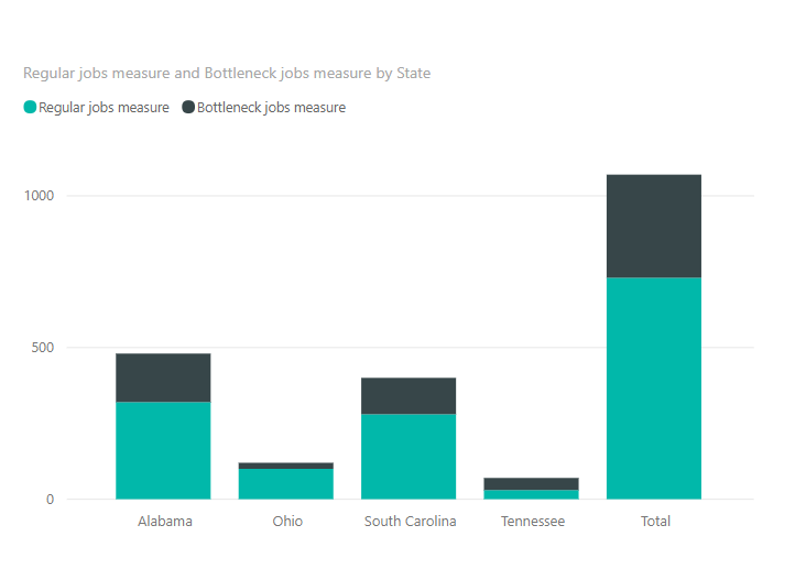
But unfortunately there's no other result:


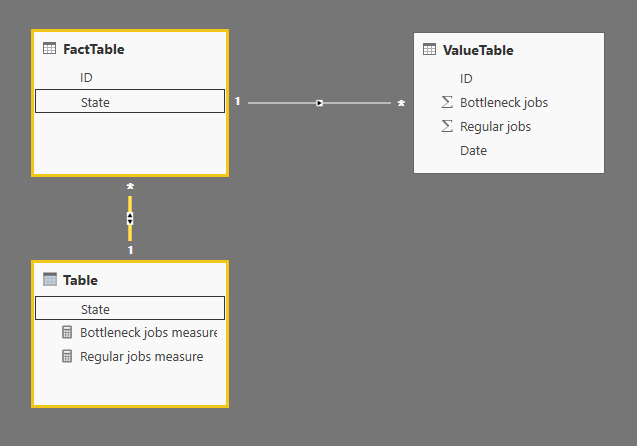
Do you have any ideas why there's no solution?
BR,
Sven
- Mark as New
- Bookmark
- Subscribe
- Mute
- Subscribe to RSS Feed
- Permalink
- Report Inappropriate Content
@Anonymous,
Remove the relationship between FactTable and Table.
If this post helps, then please consider Accept it as the solution to help the other members find it more quickly.
- Mark as New
- Bookmark
- Subscribe
- Mute
- Subscribe to RSS Feed
- Permalink
- Report Inappropriate Content
Dear @v-chuncz-msft,
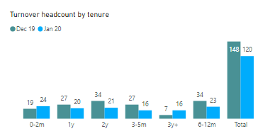
Can you advise on adding an index column in calculated table 'Table', so I can sort the order of tenure categories on my chart properly? Otherwise the solution works great!
Thanks.
- Mark as New
- Bookmark
- Subscribe
- Mute
- Subscribe to RSS Feed
- Permalink
- Report Inappropriate Content
- Mark as New
- Bookmark
- Subscribe
- Mute
- Subscribe to RSS Feed
- Permalink
- Report Inappropriate Content
Hello everyone,
I need the very same total but do not have any fact + value table.
I only have one table with let's say 2 columns :
State and amount
I need a bar chart with
Axis : state
Value : amount
with on the left or the right a basic total (like in Excel)
I tried clustered column chart. It works fine except there is no total option.
Do I miss something?
I then tried to follow v-chuncz-msft solution but could not modify it to make it works with my simple data.
Thanks for your help
Phil
- Mark as New
- Bookmark
- Subscribe
- Mute
- Subscribe to RSS Feed
- Permalink
- Report Inappropriate Content
<img>https://fhi360web-my.sharepoint.com/:i:/g/personal/mmahachi_fhi360_org/EfYZ7h1Q_MtCh0Djb1F9UkEBtMtz_7VTwZ5-rIzj6Dj1ig?e=yxlCKP</img>
The solution didn't work for me, could it be because I only have the "total" name in a lookup table and not the fact?
Helpful resources

Power BI Monthly Update - April 2026
Check out the April 2026 Power BI update to learn about new features.

Data Days 2026 coming soon!
Sign up to receive a private message when registration opens and key events begin.

New to Fabric Survey
If you have recently started exploring Fabric, we'd love to hear how it's going. Your feedback can help with product improvements.

| User | Count |
|---|---|
| 36 | |
| 33 | |
| 31 | |
| 24 | |
| 18 |
| User | Count |
|---|---|
| 70 | |
| 50 | |
| 33 | |
| 24 | |
| 24 |
