FabCon is coming to Atlanta
Join us at FabCon Atlanta from March 16 - 20, 2026, for the ultimate Fabric, Power BI, AI and SQL community-led event. Save $200 with code FABCOMM.
Register now!- Power BI forums
- Get Help with Power BI
- Desktop
- Service
- Report Server
- Power Query
- Mobile Apps
- Developer
- DAX Commands and Tips
- Custom Visuals Development Discussion
- Health and Life Sciences
- Power BI Spanish forums
- Translated Spanish Desktop
- Training and Consulting
- Instructor Led Training
- Dashboard in a Day for Women, by Women
- Galleries
- Data Stories Gallery
- Themes Gallery
- Contests Gallery
- Quick Measures Gallery
- Notebook Gallery
- Translytical Task Flow Gallery
- TMDL Gallery
- R Script Showcase
- Webinars and Video Gallery
- Ideas
- Custom Visuals Ideas (read-only)
- Issues
- Issues
- Events
- Upcoming Events
To celebrate FabCon Vienna, we are offering 50% off select exams. Ends October 3rd. Request your discount now.
- Power BI forums
- Forums
- Get Help with Power BI
- Desktop
- Popping bars in Bar graph based on Filter selectio...
- Subscribe to RSS Feed
- Mark Topic as New
- Mark Topic as Read
- Float this Topic for Current User
- Bookmark
- Subscribe
- Printer Friendly Page
- Mark as New
- Bookmark
- Subscribe
- Mute
- Subscribe to RSS Feed
- Permalink
- Report Inappropriate Content
Popping bars in Bar graph based on Filter selection
Hi Experts,
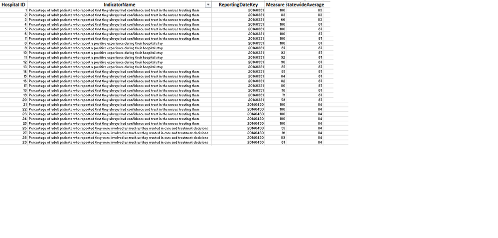
I am working on a report which includes HospitalsID, Performance Indicators for each hospital, Measure (how indicator if performing), Statewide Average (for each indicator)
The report is a Line and bar graph, which has
X axis - ReportingDate
Y Axis - Measure
We have a filter for the IndicatorName selection and a line graph intially on top of Bar which will show each Indicator's statewide average for that reporting period. I have duplicated HospitalID filter twice as we want to compare the results for two hospitals.
On filter selection for Hospital ID 1 , the first Bar should appear, and when we select HospitalID 2 in the second filter, second bar should appear. If the value in both filters is 'ALL' , then no bar should be visible.
I did not find the option to attach the file. So, i have captured screenshots of Sample Data and Expected output.
Please advise, how can we get this visual created in Power BI. Really in need and would appreciate your help.
Thanks.
- Mark as New
- Bookmark
- Subscribe
- Mute
- Subscribe to RSS Feed
- Permalink
- Report Inappropriate Content
@Anonymous,
You may take a look at the following post.
If this post helps, then please consider Accept it as the solution to help the other members find it more quickly.
- Mark as New
- Bookmark
- Subscribe
- Mute
- Subscribe to RSS Feed
- Permalink
- Report Inappropriate Content
Thanks Sam for your reply.
I have gone through the shared link.
Here the requirements are little different. I want a LINE should always appear showing the Statewide Average. And then we make multiple selection in the HospitalID filter (Kindle refer to the image in the Original post) then bars (based on number of selections made)should appear representing that Hospital IDs.
So the final visual should be a Combo chart, which have a Line(always there) and Bars which represents Hospital ID ,selected in the multiselect filter.
Please advise.
Thanks.


