A new Data Days event is coming soon!
This time we’re going bigger than ever. Fabric, Power BI, SQL, AI and more. We're covering it all. You won't want to miss it.
Learn more- Power BI forums
- Get Help with Power BI
- Desktop
- Service
- Report Server
- Power Query
- Mobile Apps
- Developer
- DAX Commands and Tips
- Custom Visuals Development Discussion
- Health and Life Sciences
- Power BI Spanish forums
- Translated Spanish Desktop
- Training and Consulting
- Instructor Led Training
- Dashboard in a Day for Women, by Women
- Galleries
- Data Stories Gallery
- Themes Gallery
- Contests Gallery
- QuickViz Gallery
- Quick Measures Gallery
- Visual Calculations Gallery
- Notebook Gallery
- Translytical Task Flow Gallery
- TMDL Gallery
- R Script Showcase
- Webinars and Video Gallery
- Ideas
- Custom Visuals Ideas (read-only)
- Issues
- Issues
- Events
- Upcoming Events
Level up your Power BI skills this month - build one visual each week and tell better stories with data! Get started
- Power BI forums
- Forums
- Get Help with Power BI
- Desktop
- Plotting multiple date values on a reference axis
- Subscribe to RSS Feed
- Mark Topic as New
- Mark Topic as Read
- Float this Topic for Current User
- Bookmark
- Subscribe
- Printer Friendly Page
- Mark as New
- Bookmark
- Subscribe
- Mute
- Subscribe to RSS Feed
- Permalink
- Report Inappropriate Content
Plotting multiple date values on a reference axis
I work with datasets that have multiple date/time values per row for task and activity type tracking.
I'm trying to vizualize the data against a reference axis rather than having to chose just one of the columns to be the x-axis.
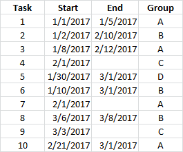
For example, assume I have 10 tasks. Each has a start date and some of them have an end date:
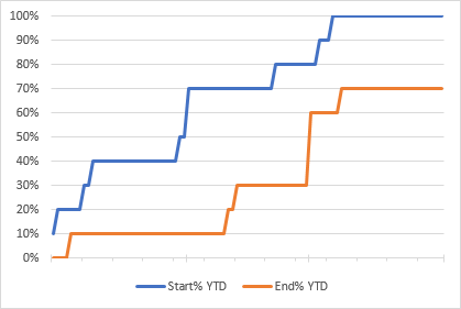
I want to know, for any particular time period, how many tasks have started and how many have finished eg I could summarize by month and calculate a 'to date' value:
And I can chart this type of data easily enough in Excel by building a reference date range to plot against:
If I create measures in Power BI and try to plot them I have to select either the Start dates or End dates as the x-axis which results in one of my measures being plotted incorrectly:
Here, the first task with an End date (#1 ending on 1/5) isn't plotted at 1/5/2017 on the x-axis but at 1/8/2017 which is when the next 'Start' date falls. Similarly the 2/10/2017 End for #2 doesn't appear at all, and the 2/12/2017 End for #3 appears at 2/21/2017 as total to date = 3.
I don't know if I can fix this by just changing my measures, but I figure I need to create some other refernce timeline to act as the x-axis.
Measures used:
YTDStart = CALCULATE ( COUNTX ( Tasks , [Start] ) , FILTER ( ALLSELECTED ( Tasks ) , [Start] <= MAX( [Start] ) ) )
YTDEnd = CALCULATE ( COUNTX ( Tasks , [End] ) , FILTER ( ALLSELECTED ( Tasks ) , [End] <= MAX ( [Start] ) ) )
Solved! Go to Solution.
- Mark as New
- Bookmark
- Subscribe
- Mute
- Subscribe to RSS Feed
- Permalink
- Report Inappropriate Content
Hi @mike_true80,
To calculate the count value of Start and End per month, you can create below measure:
StartPerMonth = CALCULATE(COUNTA('Table1'[Start]),FILTER(ALL(Table1), MONTH(Table1[Start])=MAX('calendar'[Month])))
EndPerMonth = CALCULATE(COUNTA('Table1'[End]),FILTER(ALL(Table1), MONTH(Table1[End])=MAX('calendar'[Month])))
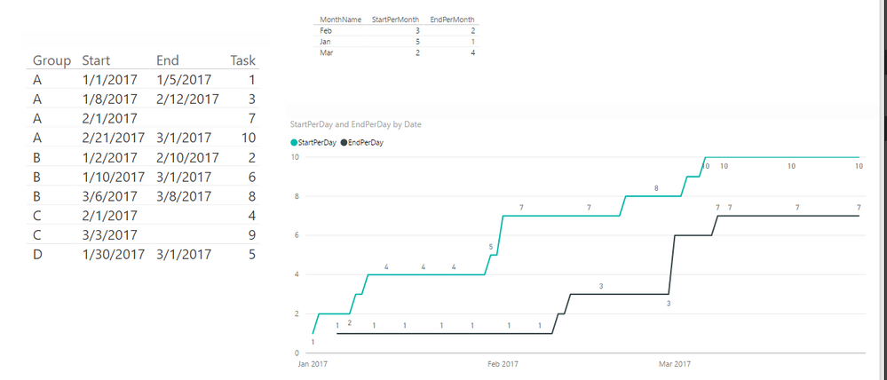
To plot a line chart to display count value of Start and End for each day, the measures should be below:
StartPerDay = CALCULATE(COUNTA(Table1[Start]),FILTER(ALL('Table1'),'Table1'[Start]<=MAX('calendar'[Date])))
EndPerDay = CALCULATE(COUNTA(Table1[Start]),ISBLANK('Table1'[End])=FALSE(),FILTER(ALL('Table1'),'Table1'[End]<=MAX('calendar'[Date])))
Please check attached .pbix file.
Best Regards,
Qiuyun Yu
If this post helps, then please consider Accept it as the solution to help the other members find it more quickly.
Helpful resources

Power BI Monthly Update - April 2026
Check out the April 2026 Power BI update to learn about new features.

Data Days 2026 coming soon!
Sign up to receive a private message when registration opens and key events begin.

New to Fabric Survey
If you have recently started exploring Fabric, we'd love to hear how it's going. Your feedback can help with product improvements.

| User | Count |
|---|---|
| 37 | |
| 28 | |
| 28 | |
| 19 | |
| 18 |
| User | Count |
|---|---|
| 69 | |
| 38 | |
| 32 | |
| 28 | |
| 24 |


