FabCon is coming to Atlanta
Join us at FabCon Atlanta from March 16 - 20, 2026, for the ultimate Fabric, Power BI, AI and SQL community-led event. Save $200 with code FABCOMM.
Register now!- Power BI forums
- Get Help with Power BI
- Desktop
- Service
- Report Server
- Power Query
- Mobile Apps
- Developer
- DAX Commands and Tips
- Custom Visuals Development Discussion
- Health and Life Sciences
- Power BI Spanish forums
- Translated Spanish Desktop
- Training and Consulting
- Instructor Led Training
- Dashboard in a Day for Women, by Women
- Galleries
- Data Stories Gallery
- Themes Gallery
- Contests Gallery
- Quick Measures Gallery
- Visual Calculations Gallery
- Notebook Gallery
- Translytical Task Flow Gallery
- TMDL Gallery
- R Script Showcase
- Webinars and Video Gallery
- Ideas
- Custom Visuals Ideas (read-only)
- Issues
- Issues
- Events
- Upcoming Events
Calling all Data Engineers! Fabric Data Engineer (Exam DP-700) live sessions are back! Starting October 16th. Sign up.
- Power BI forums
- Forums
- Get Help with Power BI
- Desktop
- Re: Plotting a date against two values insists on ...
- Subscribe to RSS Feed
- Mark Topic as New
- Mark Topic as Read
- Float this Topic for Current User
- Bookmark
- Subscribe
- Printer Friendly Page
- Mark as New
- Bookmark
- Subscribe
- Mute
- Subscribe to RSS Feed
- Permalink
- Report Inappropriate Content
Plotting a date against two values insists on doing calculations with the values
Hello,
I have a column of dates that I want to have on the X-axis and I want to graph the number of events that were approved and the number of events that were rejected on these days. I don't want Power BI to do anything with the numbers, just plot them for each day. When I click on the dropdown options for the values, I can do lots of calculations with them but not use it as is without any calculations, or so it seems.
The data I have spans 3 years, and no matter what I try in Power BI, the resulting graph only has 3 points whereas I was hoping to get a line following the values for each day over the 3 years.
How do I make a graph that simply plots the two lines of numbers against a day?
Thanks for your suggestions,
Hans
Solved! Go to Solution.
- Mark as New
- Bookmark
- Subscribe
- Mute
- Subscribe to RSS Feed
- Permalink
- Report Inappropriate Content
Found it, on the X-axis I needed to selext 'date' instead of the default 'date hiearchy'
- Mark as New
- Bookmark
- Subscribe
- Mute
- Subscribe to RSS Feed
- Permalink
- Report Inappropriate Content
You can click on the column and select "Dont Summarize" option from the Modelling Tab. And then try plotting the graph.
- Mark as New
- Bookmark
- Subscribe
- Mute
- Subscribe to RSS Feed
- Permalink
- Report Inappropriate Content
Thanks for your reply, the 'don't summarize' is set all the colums yet it does summarize.
- Mark as New
- Bookmark
- Subscribe
- Mute
- Subscribe to RSS Feed
- Permalink
- Report Inappropriate Content
Okay, then you need to just plot the Date on the X axis and the Events on the Y axis. In the dropdown for values, choose "Sum".
- Mark as New
- Bookmark
- Subscribe
- Mute
- Subscribe to RSS Feed
- Permalink
- Report Inappropriate Content
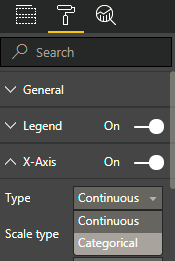
Also, go to the formatting pane and set the X axis Type to "Categorical".
- Mark as New
- Bookmark
- Subscribe
- Mute
- Subscribe to RSS Feed
- Permalink
- Report Inappropriate Content
Thanks for following up, the graph still has only 3 data points (for each year one) while I have over 600 days worth of data in my SQL table and hope to display a graph plotting the differnet values.
- Mark as New
- Bookmark
- Subscribe
- Mute
- Subscribe to RSS Feed
- Permalink
- Report Inappropriate Content
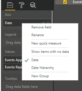
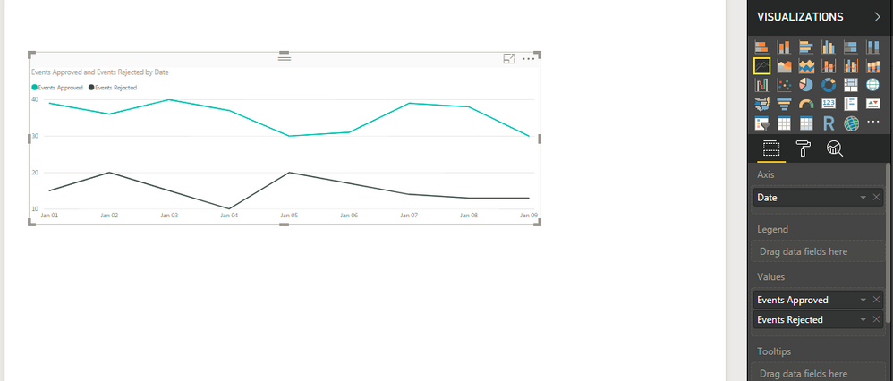
Are you using Date Hierarchy? If yes, then remove the hierarchy from X-Axis and select Date.
Then you can have the graph like this :
If still you are facing the issue, please share the pbix or any sample so that I can help you further.
- Mark as New
- Bookmark
- Subscribe
- Mute
- Subscribe to RSS Feed
- Permalink
- Report Inappropriate Content
Found it, on the X-axis I needed to selext 'date' instead of the default 'date hiearchy'
- Mark as New
- Bookmark
- Subscribe
- Mute
- Subscribe to RSS Feed
- Permalink
- Report Inappropriate Content
You may take a look at link below.
http://community.powerbi.com/t5/Desktop/Trend-from-History-Table/m-p/200304#M88115
If this post helps, then please consider Accept it as the solution to help the other members find it more quickly.
- Mark as New
- Bookmark
- Subscribe
- Mute
- Subscribe to RSS Feed
- Permalink
- Report Inappropriate Content
Hello,
I have a column of dates that I want to have on the X-axis and I want to graph the number of events that were approved and the number of events that were rejected on these days. I don't want Power BI to do anything with the numbers, just plot them for each day. When I click on the dropdown options for the values, I can do lots of calculations with them but not use it as is without any calculations, or so it seems.
The data I have spans 3 years, and no matter what I try in Power BI, the resulting graph only has a 3 points whereas I was hoping to get a line following the values for each day over the 3 years.
How do I make a graph that simply plots the two lines of numbers against a day?
Thanks for your suggestions,
Hans
Helpful resources

FabCon Global Hackathon
Join the Fabric FabCon Global Hackathon—running virtually through Nov 3. Open to all skill levels. $10,000 in prizes!

Power BI Monthly Update - October 2025
Check out the October 2025 Power BI update to learn about new features.


