FabCon is coming to Atlanta
Join us at FabCon Atlanta from March 16 - 20, 2026, for the ultimate Fabric, Power BI, AI and SQL community-led event. Save $200 with code FABCOMM.
Register now!- Power BI forums
- Get Help with Power BI
- Desktop
- Service
- Report Server
- Power Query
- Mobile Apps
- Developer
- DAX Commands and Tips
- Custom Visuals Development Discussion
- Health and Life Sciences
- Power BI Spanish forums
- Translated Spanish Desktop
- Training and Consulting
- Instructor Led Training
- Dashboard in a Day for Women, by Women
- Galleries
- Data Stories Gallery
- Themes Gallery
- Contests Gallery
- QuickViz Gallery
- Quick Measures Gallery
- Visual Calculations Gallery
- Notebook Gallery
- Translytical Task Flow Gallery
- TMDL Gallery
- R Script Showcase
- Webinars and Video Gallery
- Ideas
- Custom Visuals Ideas (read-only)
- Issues
- Issues
- Events
- Upcoming Events
Get Fabric Certified for FREE during Fabric Data Days. Don't miss your chance! Request now
- Power BI forums
- Forums
- Get Help with Power BI
- Desktop
- Re: Plot Min, Max, Average, Median values into a h...
- Subscribe to RSS Feed
- Mark Topic as New
- Mark Topic as Read
- Float this Topic for Current User
- Bookmark
- Subscribe
- Printer Friendly Page
- Mark as New
- Bookmark
- Subscribe
- Mute
- Subscribe to RSS Feed
- Permalink
- Report Inappropriate Content
Plot Min, Max, Average, Median values into a horizontal enumerated line in Power BI Desktop
I am trying to do a trivial task with Power BI Desktop. I have the following kind of data (totally dummy data):
| Name | Min | Max | Average | Median |
team A | 0 | 100 | 50 | 48 |
| team B | -10 | 1050 | 25 | 89 |
| team C | 5 | 122 | 78 | 78 |
And I want to create my own horizontal line with pre-defined (Start, End) points to plot for each team name the values of the Min, Max, Average, Median. And I filter the team name to adjust the numbers and the visual accordingly.
So far I have done the following static approach
The example above is totally non-dynamic because every point on the line is set by me. Also if for example, I select Team B with a higher median than average then the above visual line does not change the position of the relative spheres (in the image I posted, I have placed average always higher than the median which is not true for all the teams).
Thus, I would like to know if there is any fancy and well-plotted way to represent those 4 descriptive measures for a team name in a horizontal line that will respond when I use a different team. As I have noted on the image attached, the card visuals change when I change the team name. But the spheres do not move across the line.
My desired output
For Team B
For team C
I literally don't know if this is feasible in Power BI apart from the static approach I already did. Thank you in advance.
Regards.
- Mark as New
- Bookmark
- Subscribe
- Mute
- Subscribe to RSS Feed
- Permalink
- Report Inappropriate Content
@Anonymous
I am not sure I understand you correctly. However, you cannot enter minimum and maximum values in power bi, the app is used to create reports and share, it is doesn't not allow you to add any kinds of data into the reports, all data must from the original tables loaded into power bi.
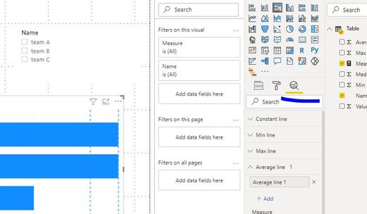
Regarding to the visual, power bi provides those plots in the format panel, you can just add the measure in the visual and add the lines accordingly.
Paul Zheng _ Community Support Team
If this post helps, please Accept it as the solution to help the other members find it more quickly.
- Mark as New
- Bookmark
- Subscribe
- Mute
- Subscribe to RSS Feed
- Permalink
- Report Inappropriate Content
Hello @Anonymous,
Thanks for your answer. To clarify it for you, my goal is to use a horizontal enumerated line and manually put 4 values on that line. Those 4 values are already in a tabular format. From what you have written I can assume that this is not feasible in Power BI. Also, I am aware of the bar plot chart and the use of multiple lines as you posted, but the use of lines instead of points is not what I desire.
For now, I can tell that I cannot resolve my issue.
Best regards,
Helpful resources

Power BI Monthly Update - November 2025
Check out the November 2025 Power BI update to learn about new features.

Fabric Data Days
Advance your Data & AI career with 50 days of live learning, contests, hands-on challenges, study groups & certifications and more!


